Scaling success with every event
Ticketsolve empowers every department of arts, culture, and events organizations to thrive. Through their holistic platform and close partnerships, the company helps teams achieve organisation-wide goals.
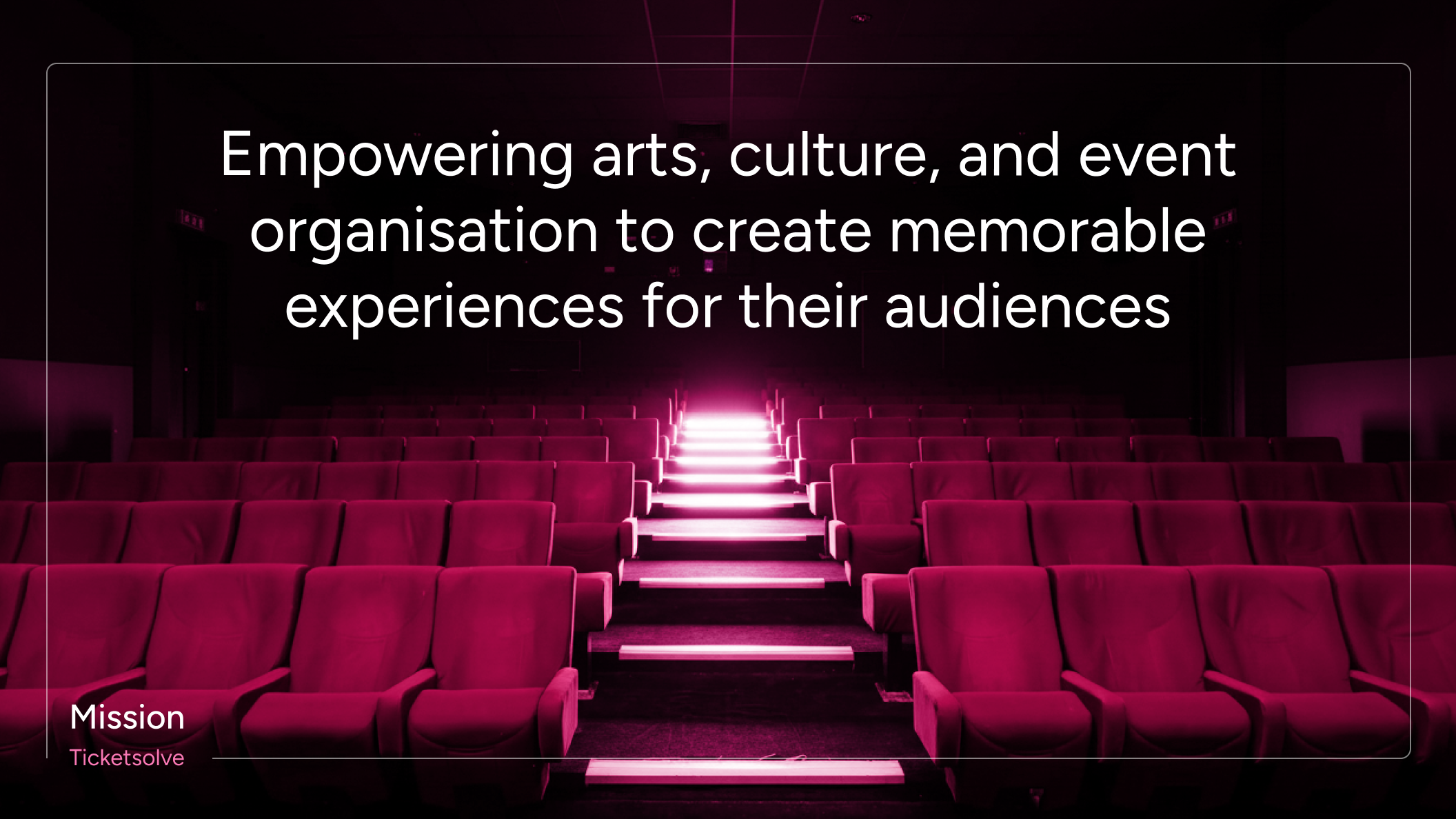
Ticketsolve set out to correct a perception gap. Despite offering end-to-end solutions for arts, culture, and event organizations, the company was primarily seen as a ticketing tool. The rebranding and website redesign focused on redefining this narrative, aligning the brand’s visual and verbal identity with its expanded role across multiple departments and use cases.

Concept & Strategy
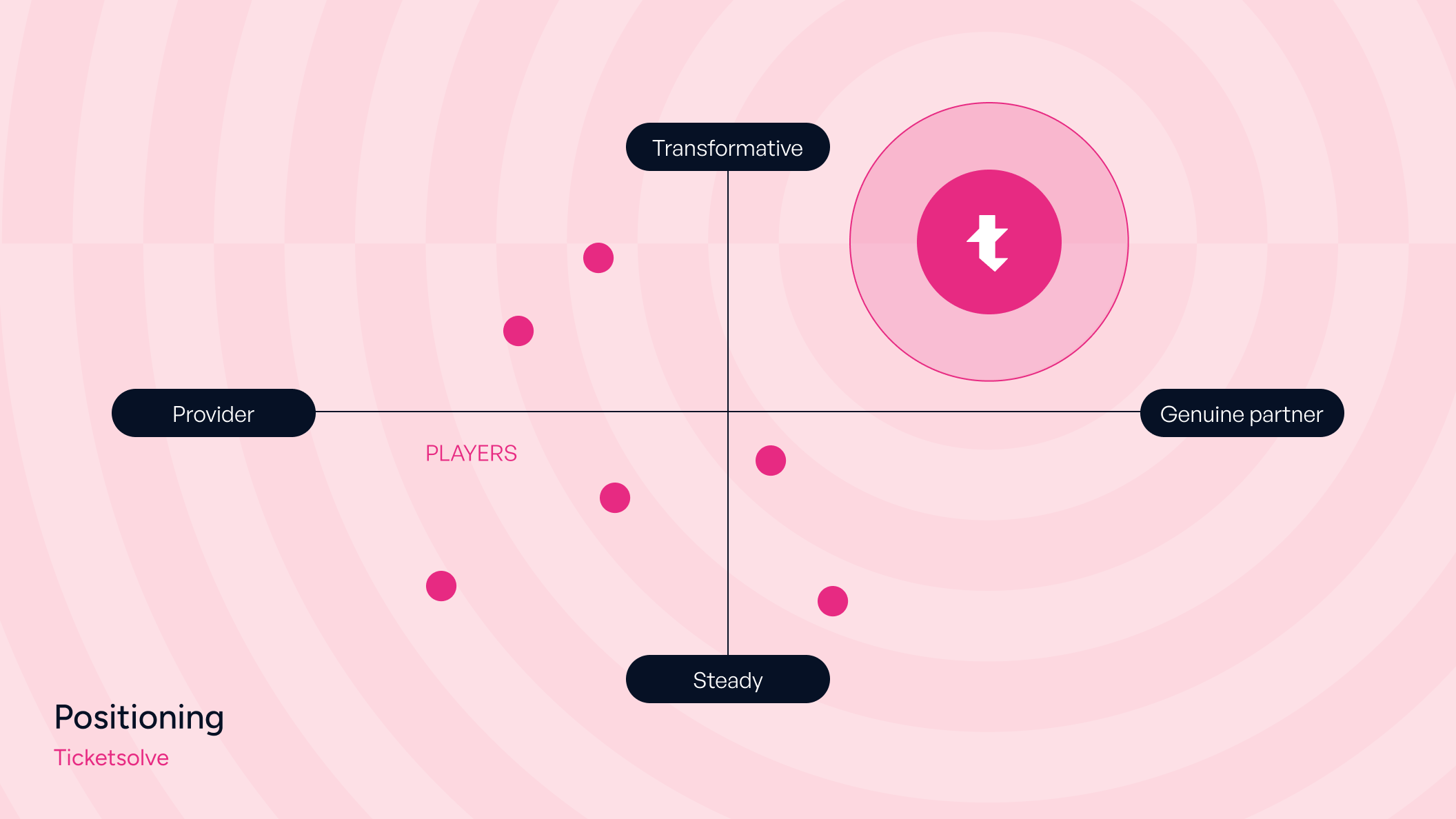
Rebrandings of established companies require precision, patience, confidence, and a strategic process. The updated visual identity needed to express Ticketsolve’s evolved value proposition while preserving existing brand equity and trust. For that reason, the project began with a comprehensive brand strategy phase before any design exploration. Ticketsolve’s brand strategy is structured around three core messaging pillars: growth, empowerment, and partnership. These pillars connect to every aspect of the visual identity and define how the brand shows up across touchpoints. From this foundation, the brand archetype emerged: the committed collaborator. Approachable and confident, Ticketsolve positions itself as a technology partner that works alongside its customers, building relationships based on trust, clarity, and shared progress.
Logo
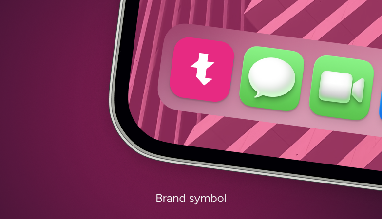
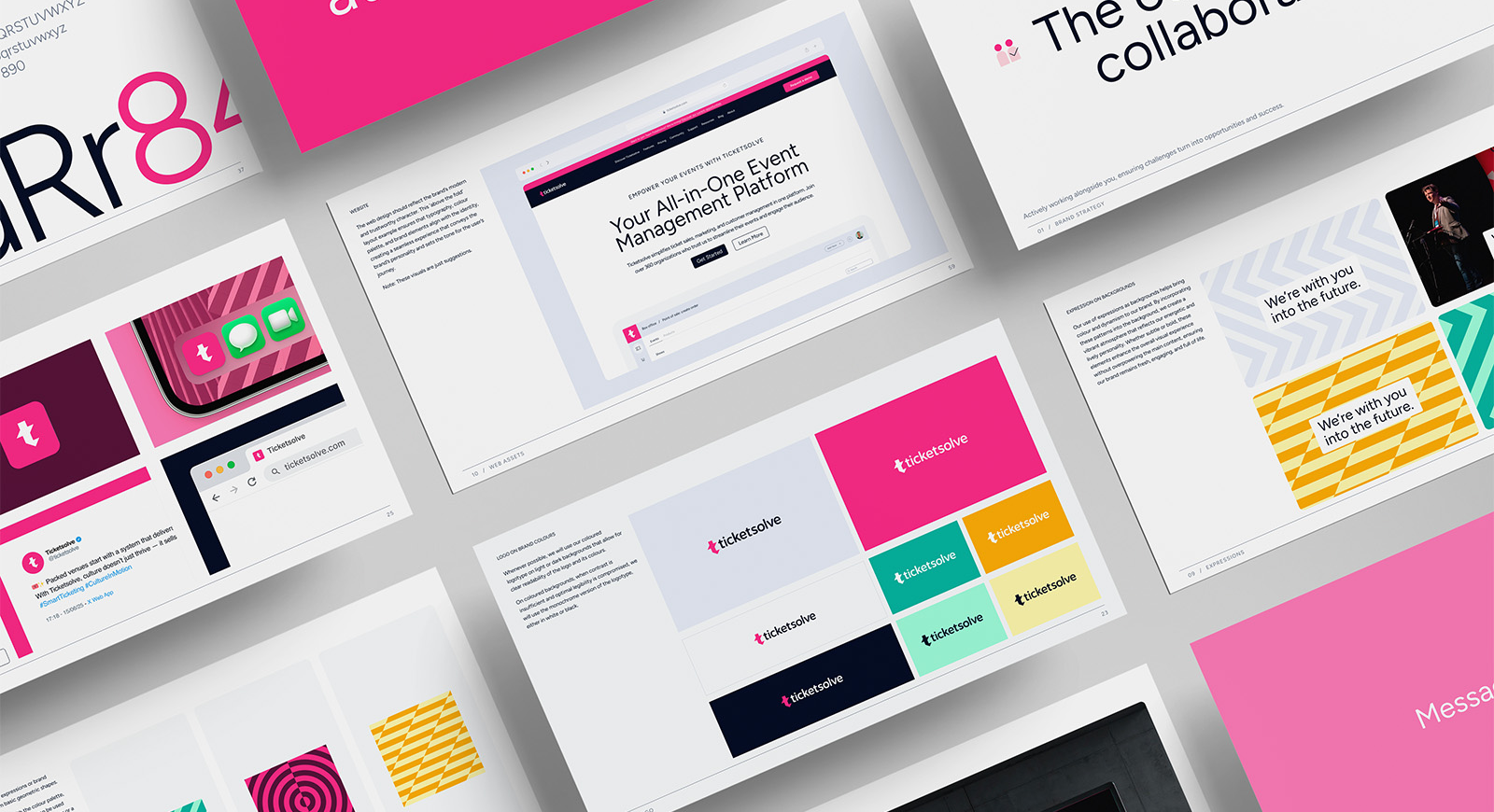
The Ticketsolve logo was refined to strengthen brand recognition and convey a more established, confident presence. The isotype retained its original shape to preserve brand equity, but was simplified and rendered in a single color: Ticketsolve’s signature Boldberry. The wordmark was reduced to black to shift attention away from the word “ticket” and toward the broader platform offering. This restraint creates a more balanced and sophisticated identity while supporting the brand’s repositioning.
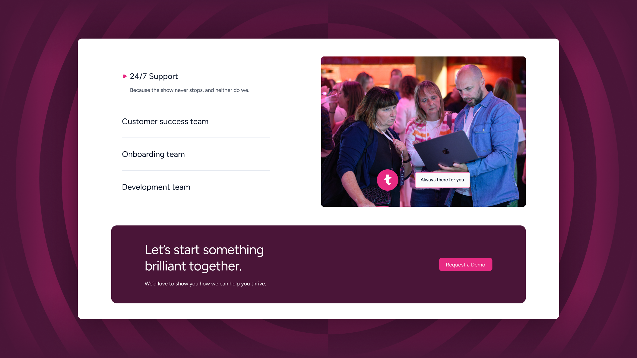
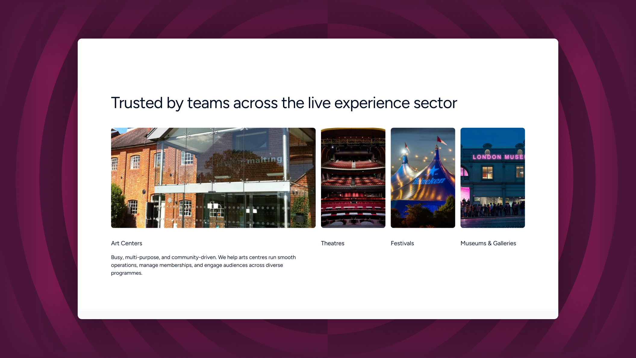
Imagery
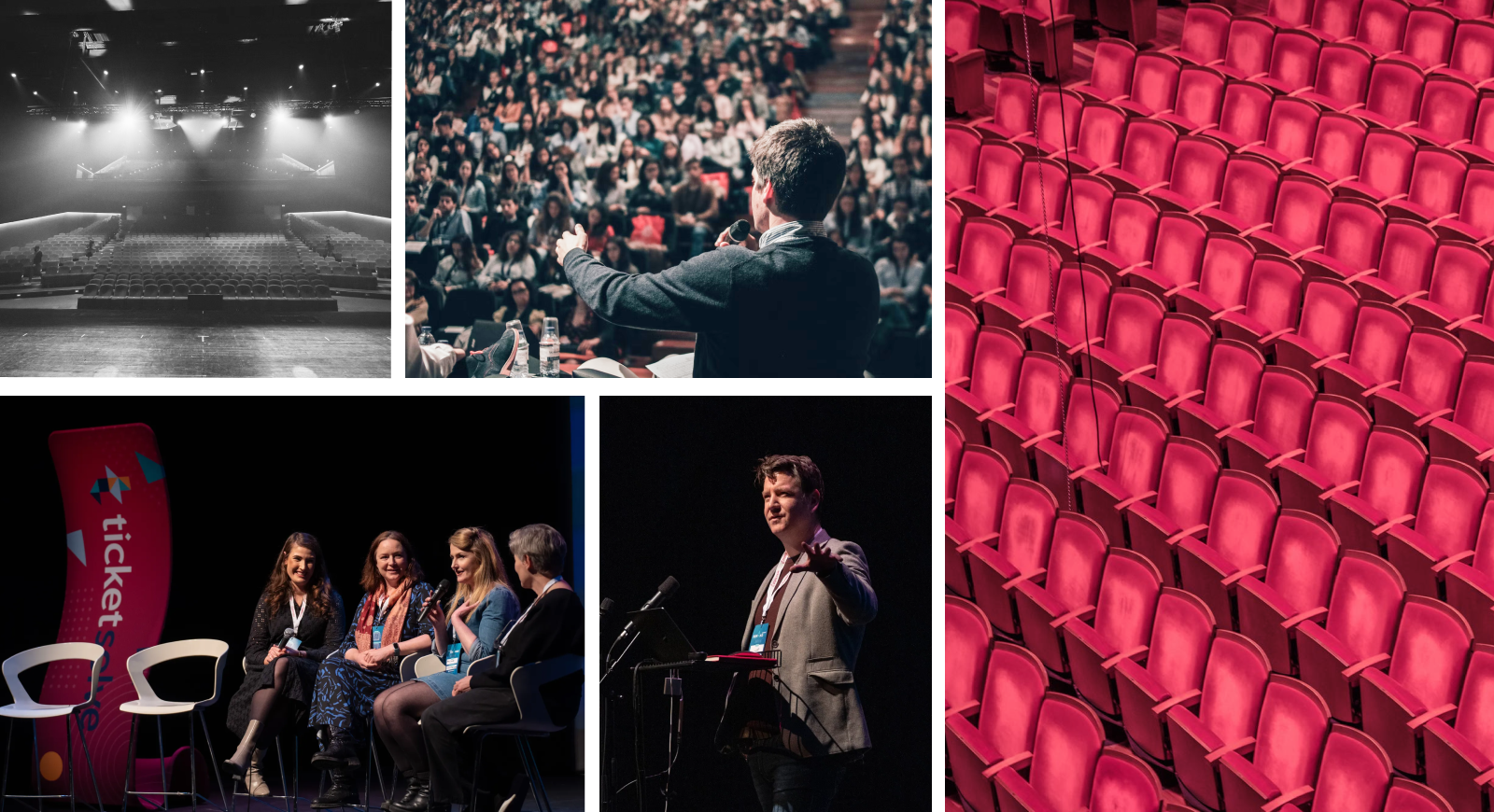
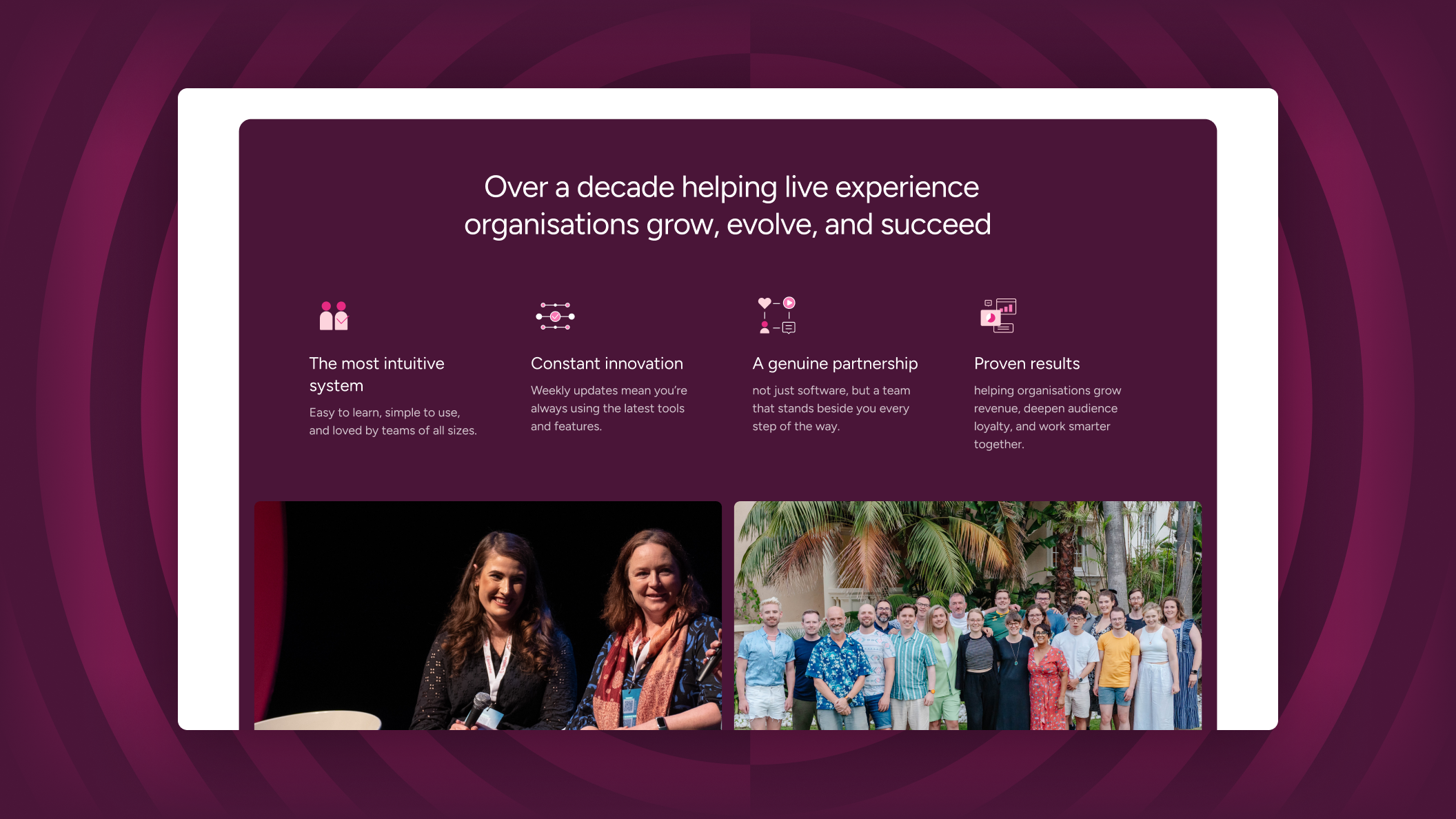
Connecting with audiences is central to Ticketsolve’s brand and equally important to its customers and partners. The imagery strategy reinforces this shared focus, supporting strong partnerships through a consistent and purposeful visual language. Photography emphasizes human authenticity, cultural energy, and diversity. By capturing genuine moments, vibrant interactions, and the dynamic atmosphere of live events, the visuals reflect the real-world impact of Ticketsolve’s platform and the communities it serves.
Illustration
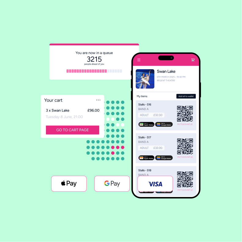
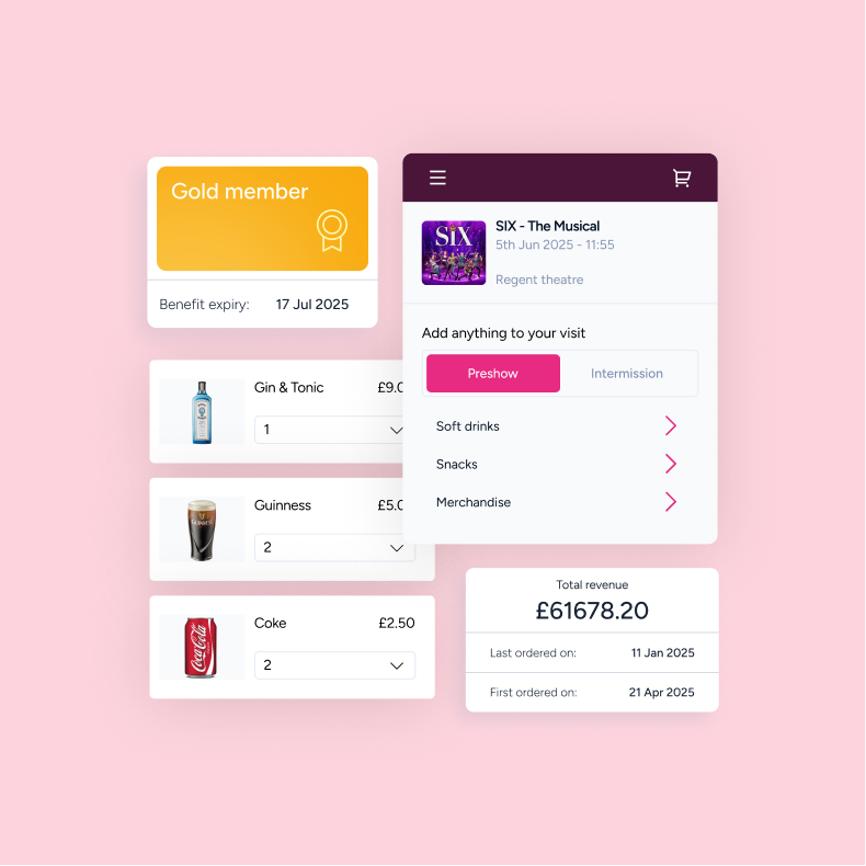

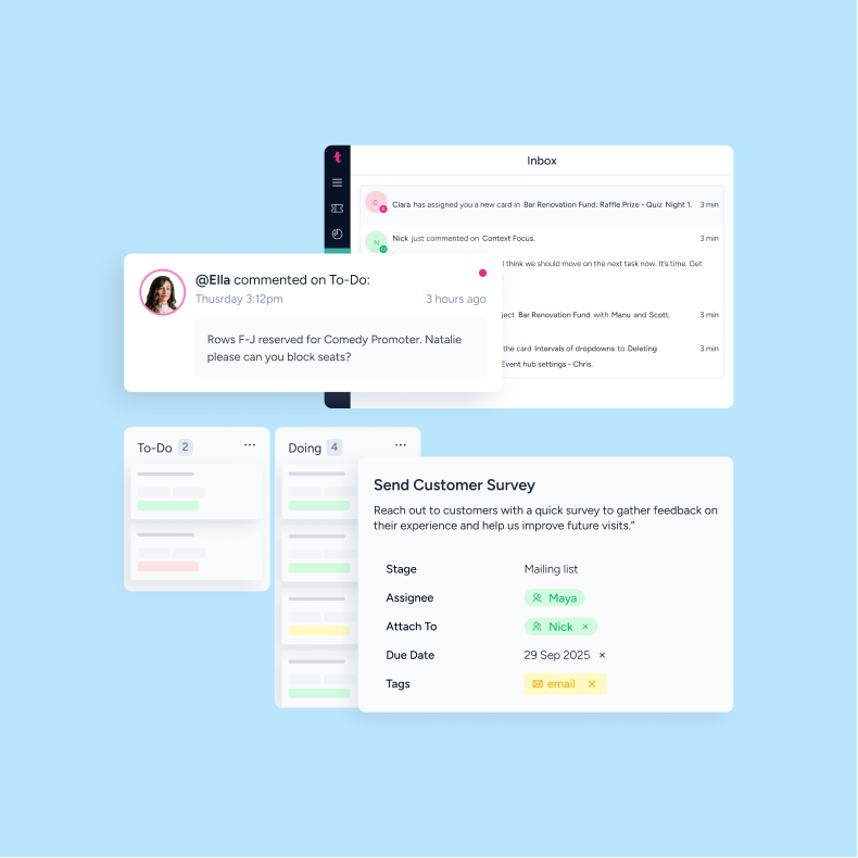
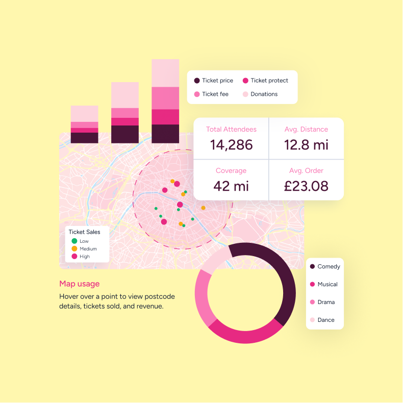
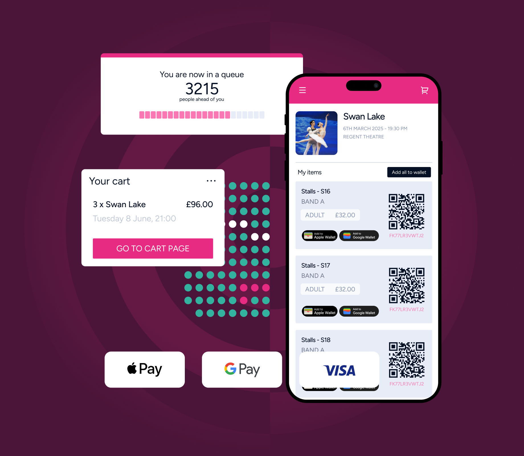
Ticketsolve’s brand relies on custom illustrations, especially on the website. Combining simplified UI elements, they showcase benefits and features of the platform. Custom icons, designed with fine lines and primarily rendered in the brand’s signature pink, support visual communication and usability. They help guide interaction, enhance the user experience, and clearly communicate Ticketsolve’s core features and benefits. Additionally, geometric brand elements create a flexible and coherent visual system. The patterns have their origin in the old brand and are now enhanced to fit the new identity.
Website
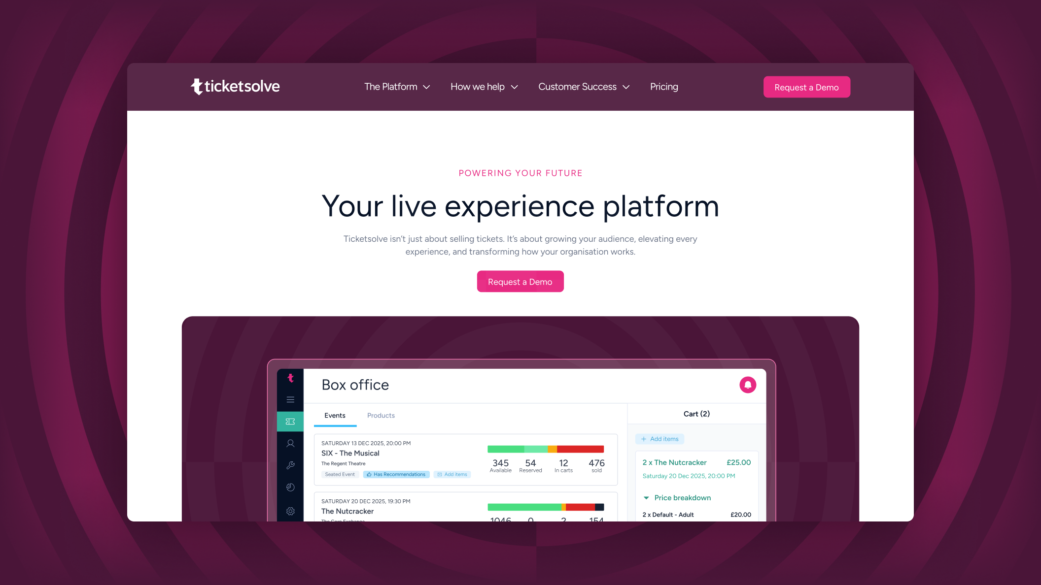
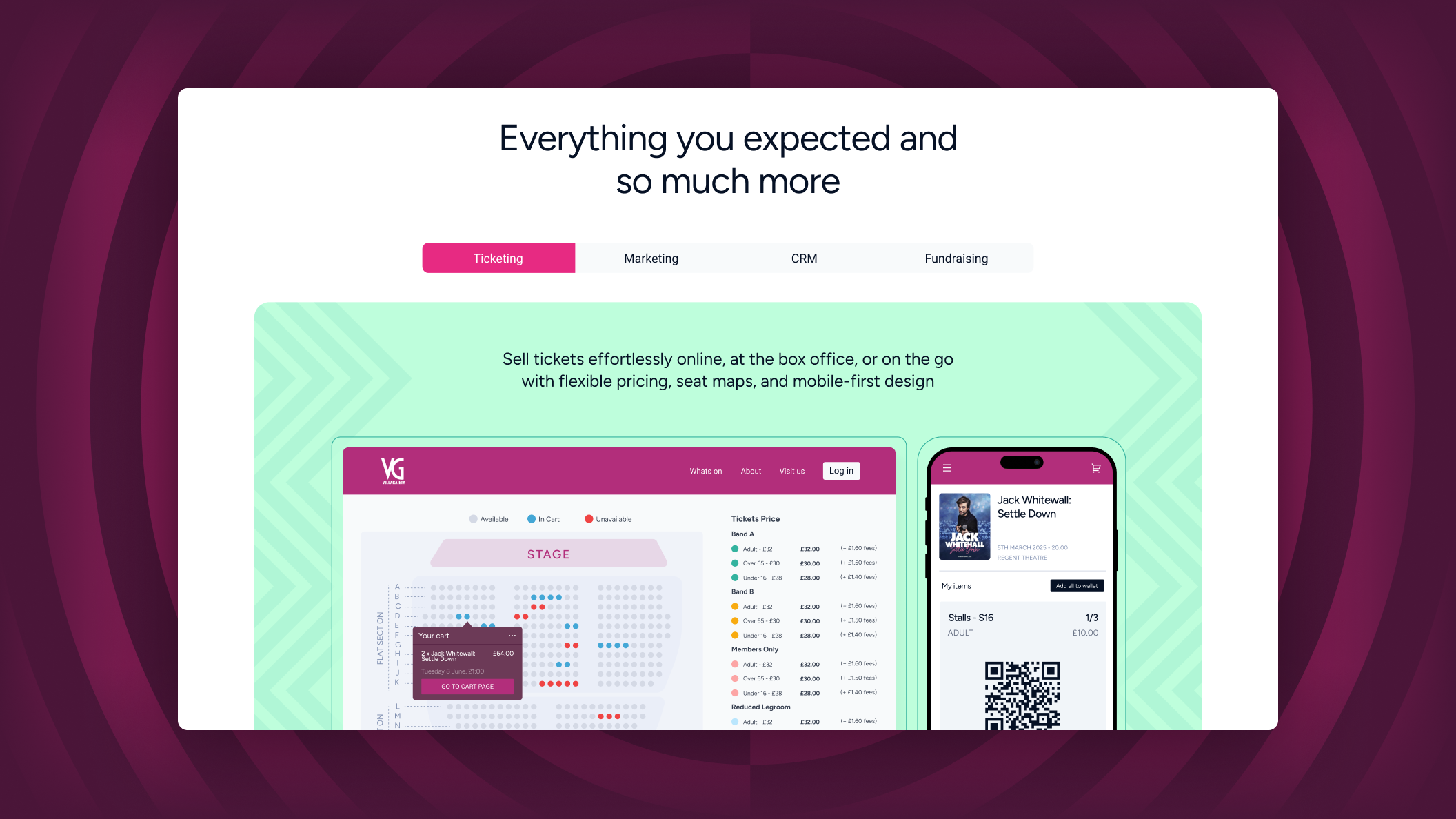
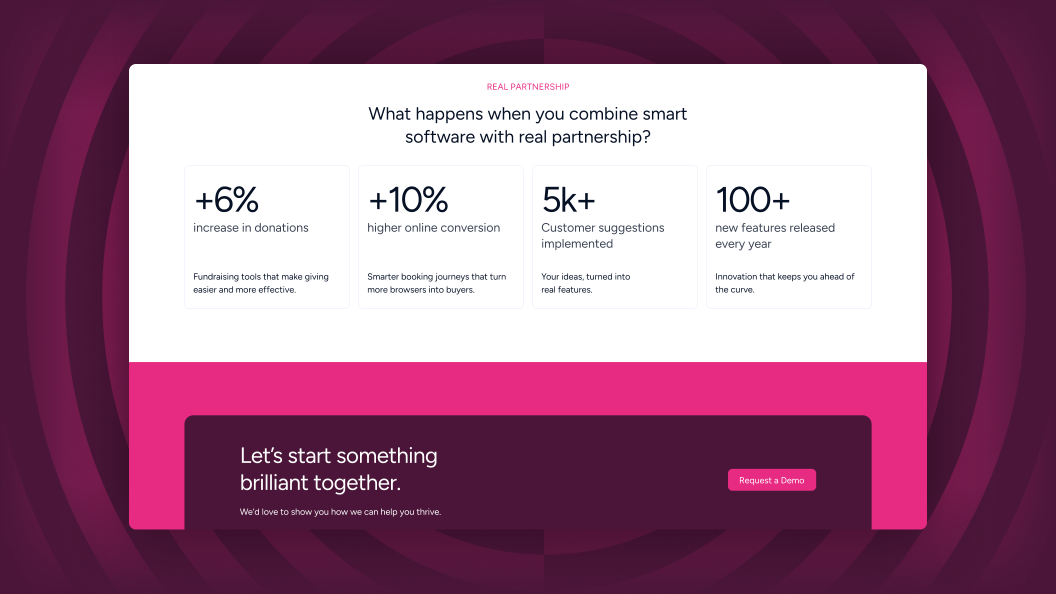
Ticketsolve’s website now fully reflects and supports its positioning. The extensive site structure, with dedicated pages for each feature and solution, presents the platform’s full scope in a clear and structured way. Custom illustrations for individual sub-features communicate benefits through a consistent, branded visual language, improving clarity and comprehension. Smooth transitions between sections and subtle hover interactions create a refined user experience that feels intuitive and engaging, guiding users efficiently to the information they need.
Brand Messaging
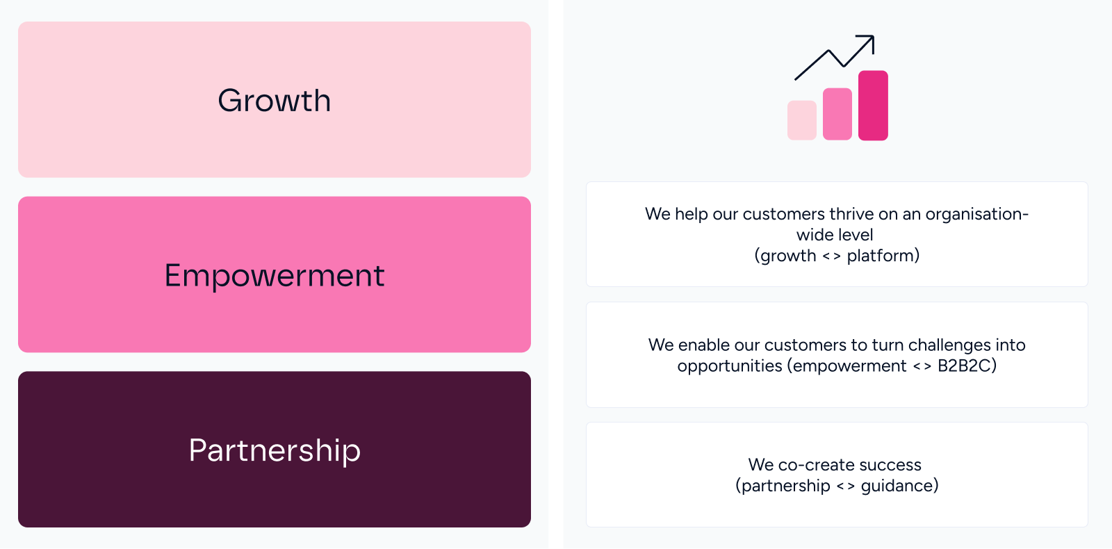
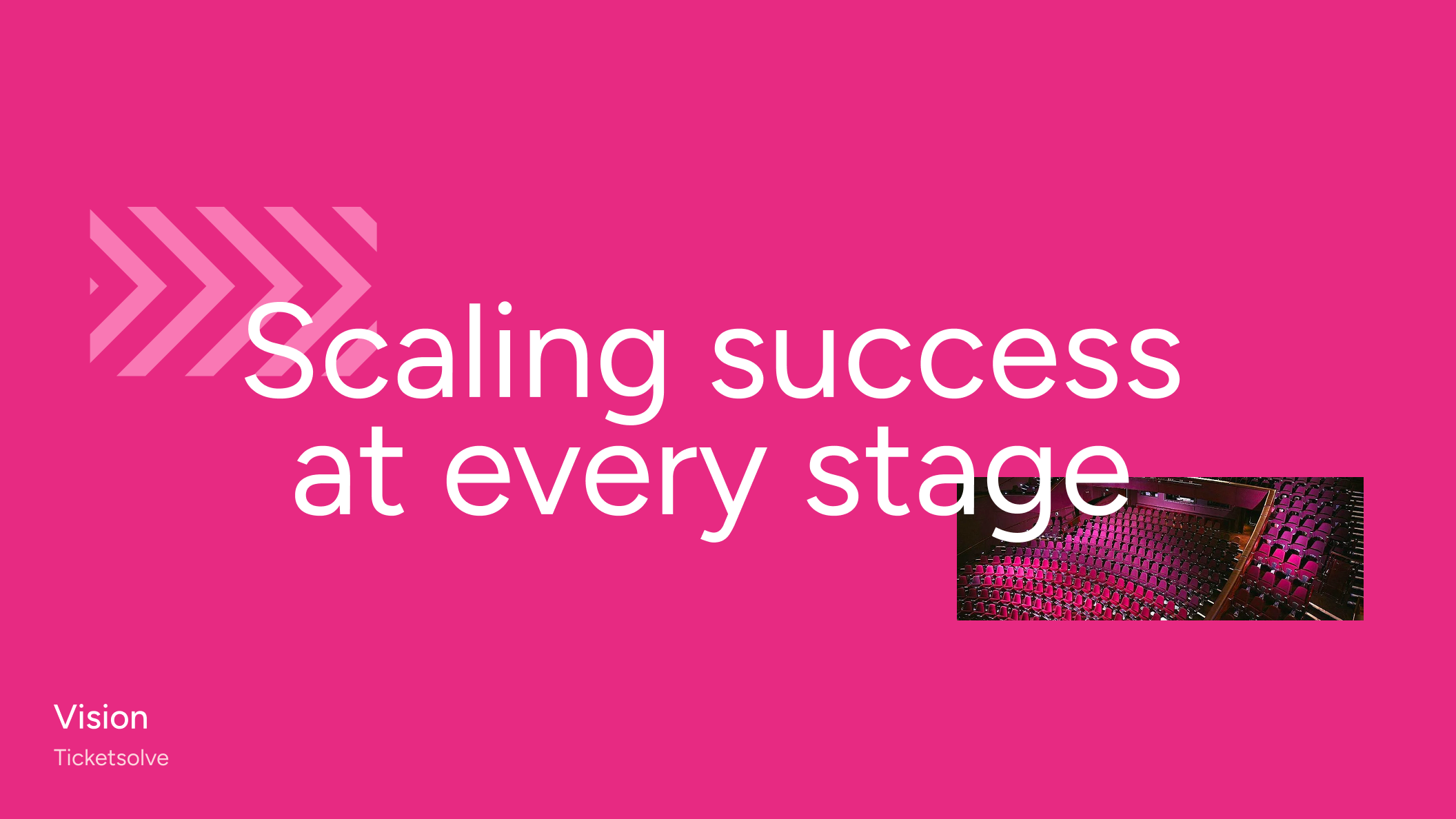
Ticketsolve’s verbal identity is also grounded in the three pillars of the brand strategy: growth, empowerment, and partnership. Closely aligned with the visual system, the messaging emphasizes collaboration and positions the solution as a long-term partner rather than a standalone tool. Taglines such as “Scaling success with every event”, “Scaling success at every stage”, and “Empowering performance behind the scenes” speak directly to the needs of the target audience. They reflect Ticketsolve’s role in supporting organizations as they grow, while reinforcing the adaptability and ongoing evolution of the platform.
Brand Communication
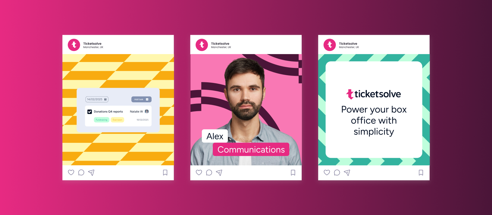
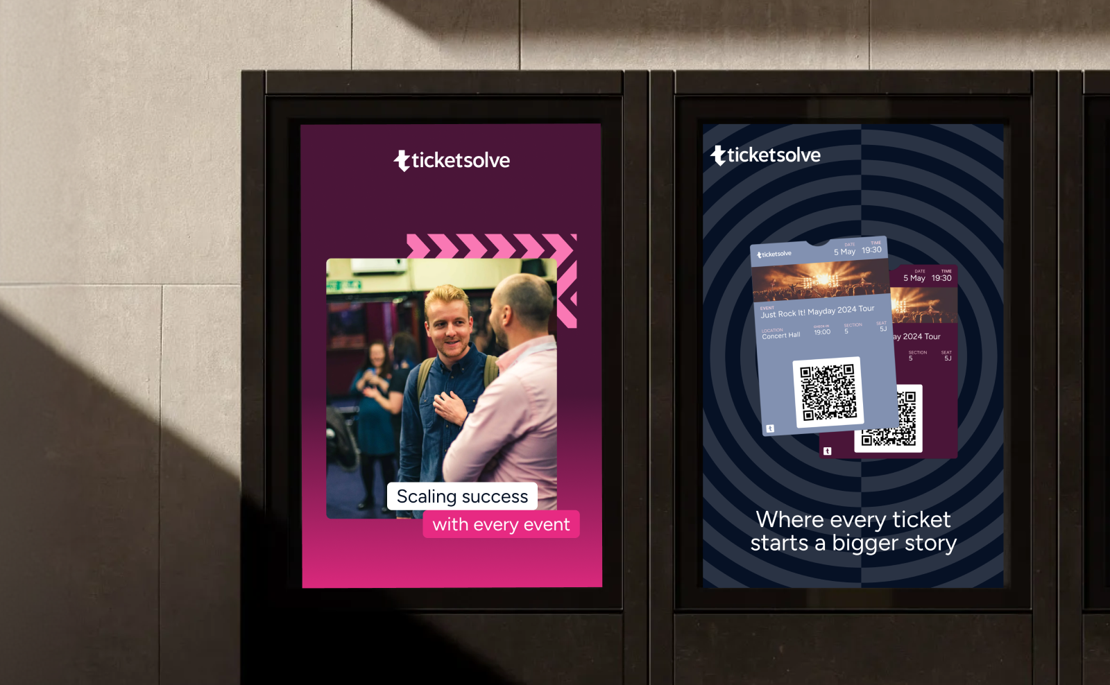
To support the launch of the new brand, we developed social media and out-of-home communication assets for Ticketsolve. These materials translate the brand identity into bold, high-impact visuals designed for visibility in fast-paced environments. The visual language is confident and empowering, using strong colors and clear contrasts to capture attention while staying consistent with Ticketsolve’s overall brand system.
"Our brand now reflects our product innovation and long-term vision."
They grasped where we’re heading as a company and translated that into a clear, compelling brand. Their project management was strong throughout. They were responsive to our needs, open to feedback and flexible when required. The process felt organised and collaborative from start to finish.
Related projects