Modulating the future piece by piece
The SaaS startup Zero-True provides a platform to streamline collaboration on projects involving complex data analysis, ML, and AI. They provide a smart and efficient way for data scientists to build and work together on data applications.

Zero-True was designed for collaboration. Their brand needs to convey a progressive, accessible, and simple solution to attract their target audience: data analysts and data scientists. However, as data is a delicate topic, the branding approach for the SaaS startup must not be too playful; it should establish trust among their users. The goal was to create Zero-True's visual identity, their UI design system, and brand communication materials.

Concept & Strategy


To convey the key brand messages of modularity, ease of use, and speed, we developed our ideas around the concept of “The simplicity of modularity”. A trapezoid serves as the basic element: it can be multiplied to form other shapes that evoke ideas of power, growth, and computing. Thus, it is the foundation of their visual identity and the user interface of their product.
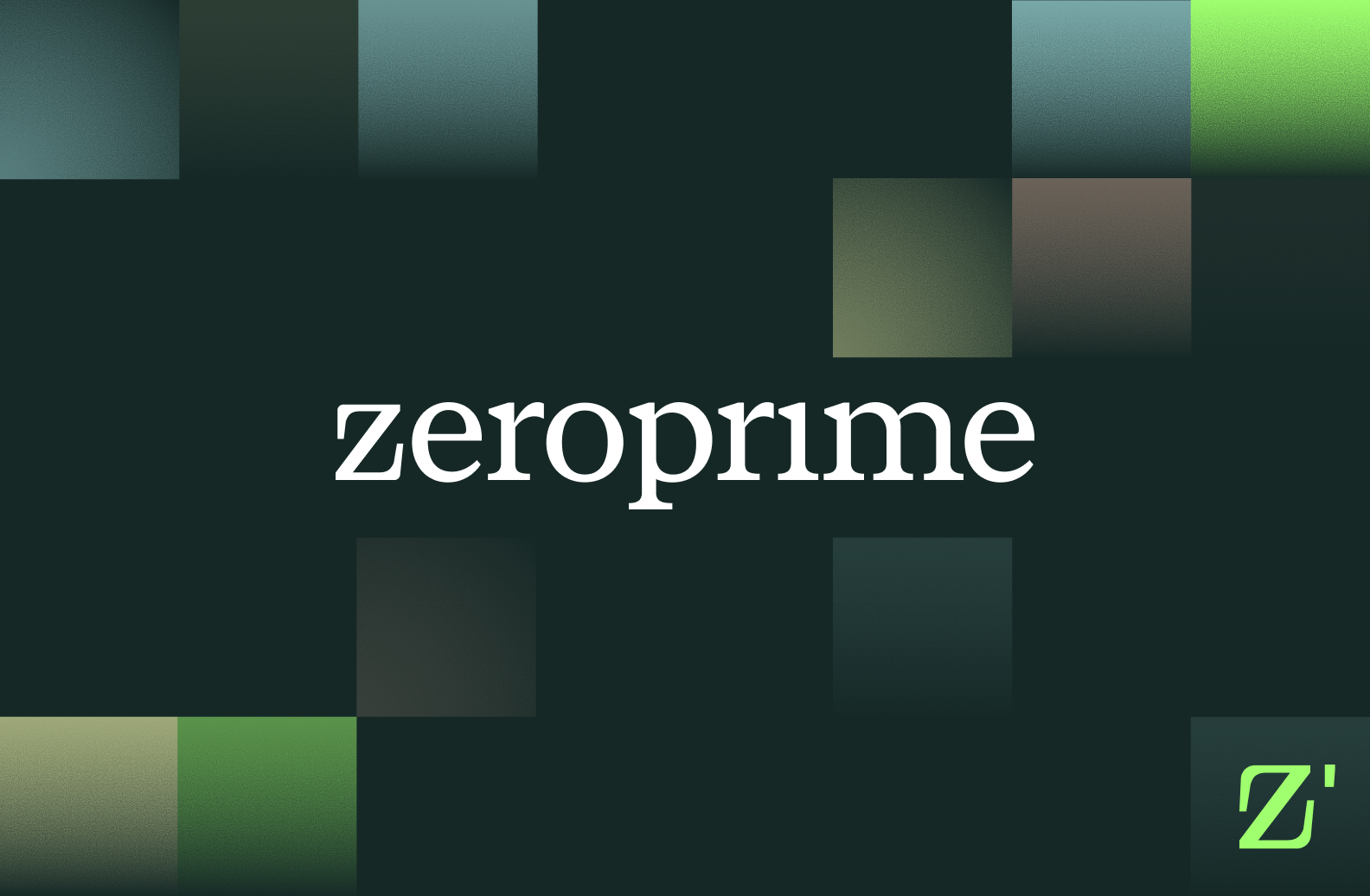
Logo
Perfectly matching the overall visual identity, the trapezoid shape serves as the starting point for the isotype: it is built around a “Zero” shape as negative space, adding uniqueness and recognizability to the brand. In combination with the clear-cut, tech-oriented yet elegant typeface, the logo is balanced and compact, with a friendly touch due to its lowercase letters.
Colors

The Zero-True color palette is a harmonious blend of dark-themed tones and softer yet vibrant tones. True Dark and True Light are the primary colors, communicating trust and simplicity. True Lilac and True Haze are used as secondary colors. Together with Golden True as the accent color, they give off a dynamic vibe. While the dark shades offer a bold, tech-oriented statement, the incorporation of soft pastel colors creates harmony and adds a human and sympathetic touch to the brand, representing the collaborative aspect.
Typography

The combination of two dynamic, straightforward fonts reminds one of computing, enhancing the tech aspect of the brand through text elements. Pathway Extreme is used across all body texts when we need the information to be clear and easy to digest. For display and code text, we use Azeret Mono.
Illustration


The visual language of Zero-True uses a system of abstract and simple shapes that can be used across different brand touchpoints. Powerful and unique at the same time, they help build the brand and add a bonus to the visual language, with their distinctive shapes enhancing recognizability. Just as in the logo, the concept of modularity is also represented in the simple, branded icons.
UX / UI

In line with their branding, we designed a component toolkit to be used across their website and their product and the dashboard for the SaaS platform, which is also characterized by its user-friendly and collaborative design. Simplicity and ease of use were at the core of developing the UI design elements of the data notebook, reflected in the strategic use of the brand colors and typography.
Communication
.webp)
In order to prepare Zero-True for the next funding rounds, we designed their deck presentation and document templates in line with their branding. Also, we created social media assets for the SaaS startup to enable a frictionless launch of their new powerful visual identity.
"The quality of the work and flexibility of the team were extremely impressive."
They went above and beyond with their branding and UI design work. The Branx led proactive and timely project management and provided quick responses.
Related projects