Making entrepreneurship easy
Easor takes care of the paperwork and makes invoicing easy, so that entrepreneurs can focus on running their business. Originating as a spin-off from a big accounting firm, Easor operates with a fresh, independent identity tailored specifically for SMEs and accounting professionals.

Launching a spin-off brand presents unique challenges. Easor’s goal was to establish a standalone brand identity completely distinct from its parent company. Targeting SMEs and accountants, the brand needed to embody simplicity, agility, and a dynamic personality with a tone that balances friendliness with boldness. However, as the startup ultimately handles sensitive business data, the brand had to communicate trustworthiness and a human-centric approach, instilling confidence in users.
Concept & Strategy


With the brand attributes in mind, we defined The Hero and The Everyman as the brand’s archetypes. This duality reflects the brand’s bravery in innovation and its commitment to being approachable and reliable. Centered on delivering a seamless, intuitive user experience, we crafted the brand concept of “A Flawless Solution”. This guiding principle is reflected consistently across all brand touchpoints, unified by a signature green color that symbolizes flow, growth, and efficiency.
Logo
Easor’s logo balances simple, bold forms with a subtle human touch. The smooth connection between the lowercase "e" and the "a" symbolizes flow, collaboration, and the union between entrepreneurs and accountants. The design is friendly and compact, emphasizing the ease of the solution. The font’s modern curves and sharp cuts reinforce a tech-forward yet accessible identity. The compact version made out of the “e” and the “a” works for profile pictures, app icons, and as a favicon while remaining recognizable and memorable.
Typography


Easor’s main typeface is the Google Font Albert Sans: clean yet friendly, with a geometric base and humanist touches. It’s highly legible, making it perfect for text-heavy layouts. Albert Sans strikes the right balance between professional and human, trustworthy yet modern. For illustrations and UI mockups, we use Nunito Sans. It’s the typeface embedded in the actual product, ensuring visual consistency and authenticity.
Imagery

With the brand’s imagery, we bring a warm, human element to the tech solution. The photography captures real moments with clarity and authenticity. It reflects an atmosphere where work, life, and comfort seamlessly combine. A natural lifestyle with spontaneous photography in everyday environments or on the streets is balanced with modern office environments. We also show individuals working from home or other comfortable spaces, showing that productivity and a relaxed atmosphere can go hand in hand.
Illustration


Easor uses simplified UI illustrations to give sneak peeks into the software. Combined with branded illustrations in the style of playful stickers, such as hands giving a high five, the brand communicates dynamism and a sense of approachability. Central to the SaaS brand identity are its “flawless curves”: soft, organic shapes in motion that visually represent the seamless and adaptive nature of the platform. These elements reinforce the startup’s branding by conveying innovation and ease of use.
Brand Communication


The Easor brand is designed for maximum digital impact, ensuring consistent application across all digital channels from social media to the website. The cohesive brand experience highlights more than just accounting services; it conveys reliability, professionalism, and a fresh, approachable fintech spirit. This comprehensive brand strategy establishes Easor as a memorable, trustworthy player in the competitive startup and fintech landscape.
Easor goes University
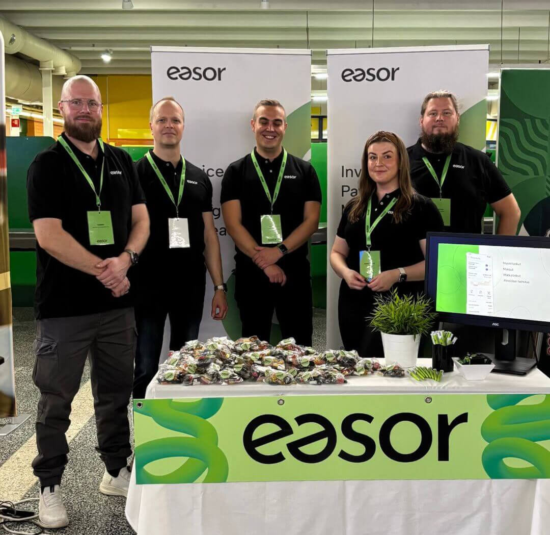
Easor proudly presented their brand at the Hurmos student event at the University of Oulu, introducing them as an employer. Their visual identity is appealing and friendly, attracting the attention of students and inviting them to learn more about the startup.
Related projects