Building and scaling CPG brands
Confido's mission is to improve the performance of CPG brands. They leverage AI to automate manual workflows, not only facilitating the creation and scaling of a CPG brand but also driving performance and efficiency.

Confido, a fintech startup backed by Y-Combinator, approached us when they had already gained some initial market traction and had a rudimentary marketing landing page in place. Their goal was to effectively communicate their product, attract more customers and secure additional investment and were, thus, looking for our expertise to overhaul their brand along all their digital touchpoints.
Concept & Strategy


For a fintech startup, it is essential to establish trust among their users. CFOs, controllers, accountants, and sales people have to be confident that their financials are accurate and that they can rely on the platform. Taking the startup name as the starting point, "confidence" was one of the cornerstones of this project. With the ultimate goal of making deduction management an integral and seamless part of running a successful CPG brand, our aim was to position Confido as a reliable, and accessible brand with an easy-to-use platform.
Colors

We limited the color palette to two primary and one accent color to communicate straightforwardness and reliability. The black tone of Charcoal establishes trust; the earthy Philippine enhances the approachability of Confido, making it softer and human; and the accent color Deep Sky Blue stands for confidence, while also relating the startup to the finance sector. Already with the UI design in mind, we further expanded the color scale with variations of the main colors. Complementing the visual identity, this broad color spectrum can be used across different brand touchpoints.
Typography

Two sans-serif typefaces enhance the sense of an approachable, easy-to-use tech product. Cabinet Grotesk is characterized by its versatility and clean, minimalist design with sharp angles and straight lines, giving it a modern and professional appearance. For body text and link buttons, we use Manrope. Modern, clean, and versatile, the font conveys professionalism and clarity.
Website


The homepage and the product pages of the web attract the users' attention immediately with their above-the-fold sections: simplified UI screens give insight into the platform at a glance. Across the website, mouse-over and drag effects give the otherwise clean and straightforward layout the sparkle that it needs to keep users engaged. Without compromising website speed, subtle animations contribute further to a seamless yet engaging user experience. The Calendly integration of the contact page makes it easy for interested users to schedule a demo with one of Confido's experts.
Communication

We helped Confido with their marketing efforts and created a deck template which will serve them as a starting point for various company presentations. In line with the visual identity, brand elements such as circles and simplified UI screens are integrated seamlessly in the presentation to reach brand consistency and raise brand awareness.
Scaling the brand
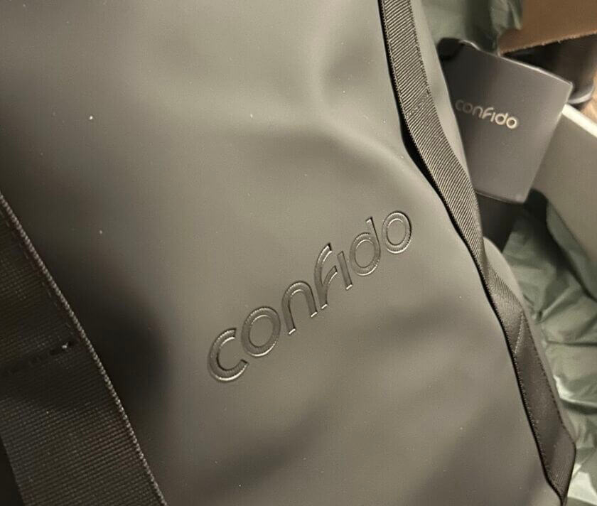
Confido is celebrating its 2026 milestones with beautiful merchandising material. Their elegant logo looks great on the backpack and the matching coffee mug.
Related projects