Cloud savings with AI-powered FinOps
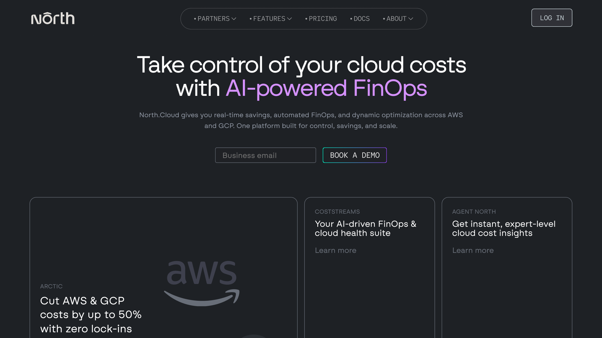
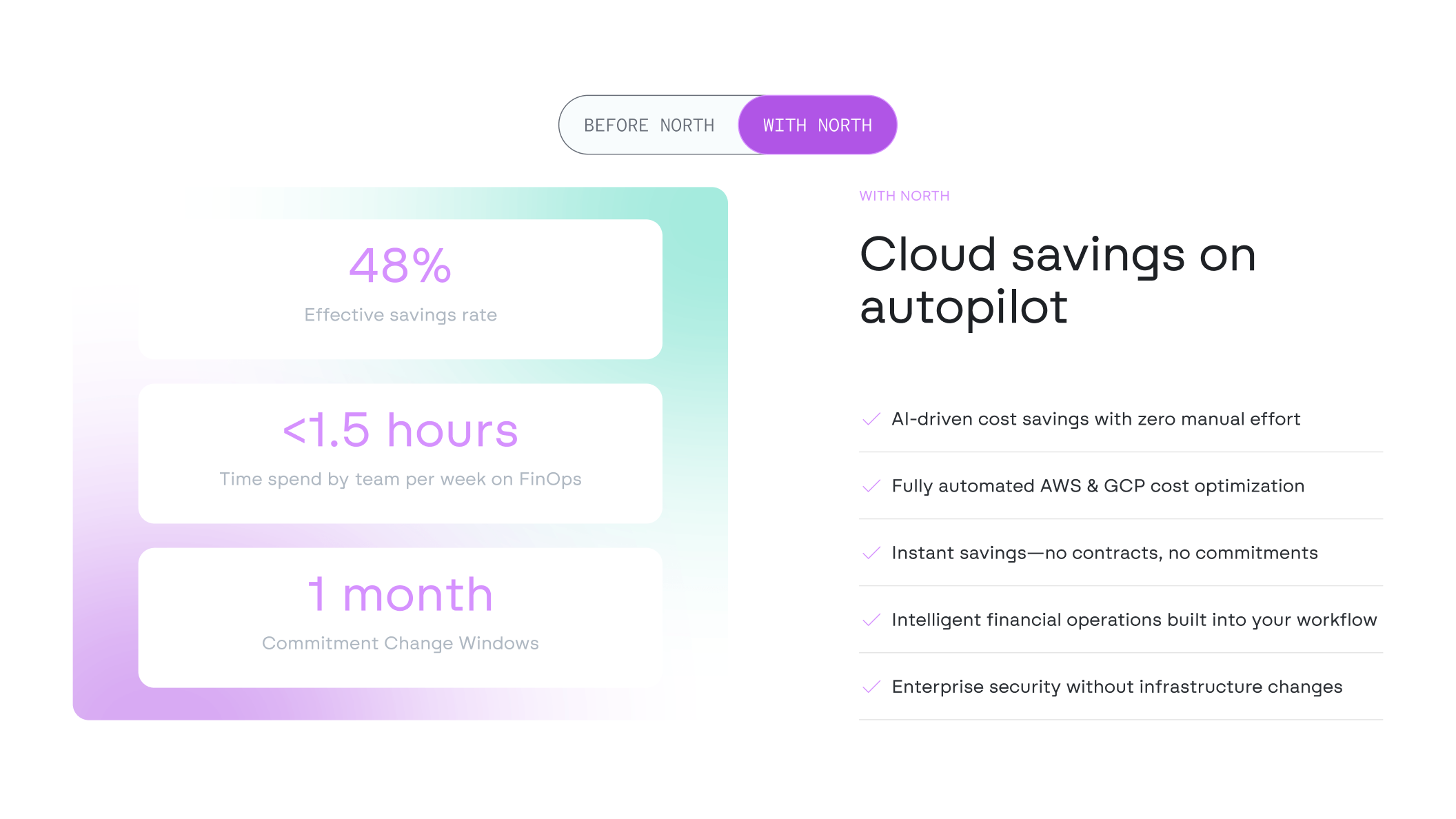
North helps businesses reduce their cloud computing bills by up to 50% through AI-driven optimization across AWS and GCP. One platform built for control, savings, and scale.
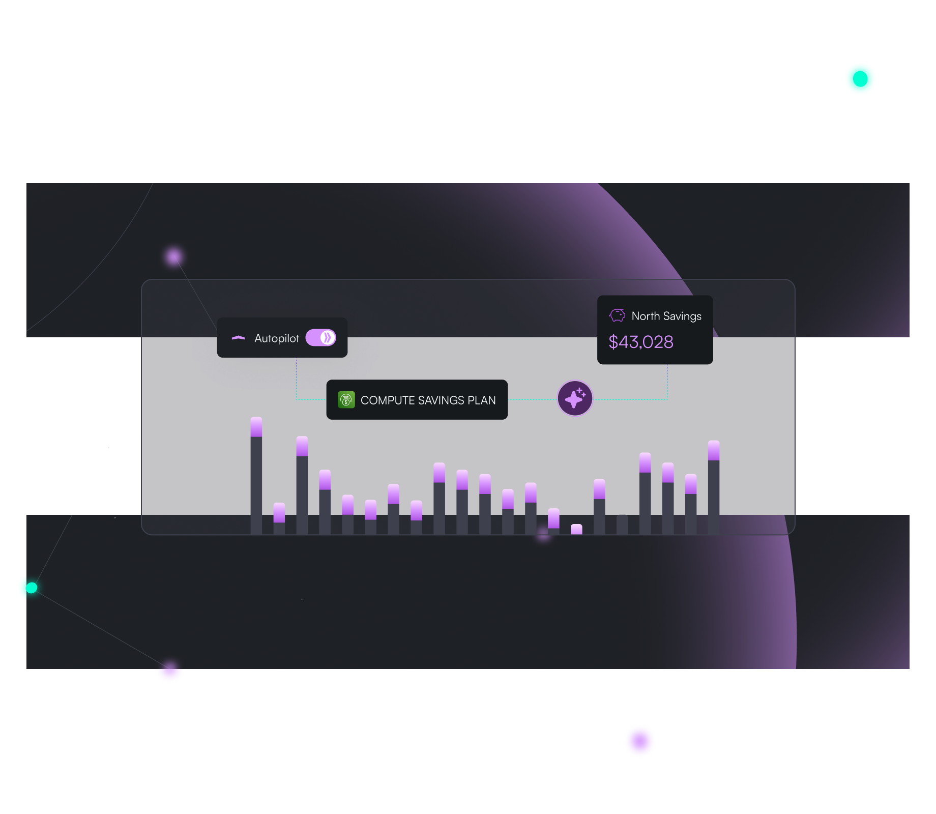
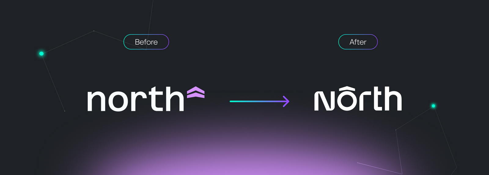
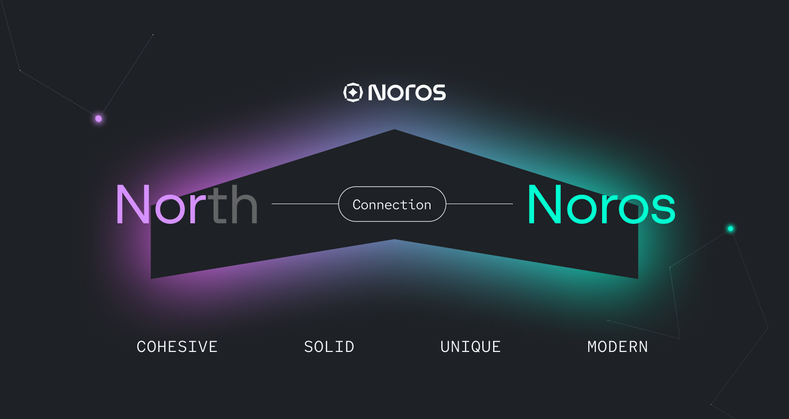
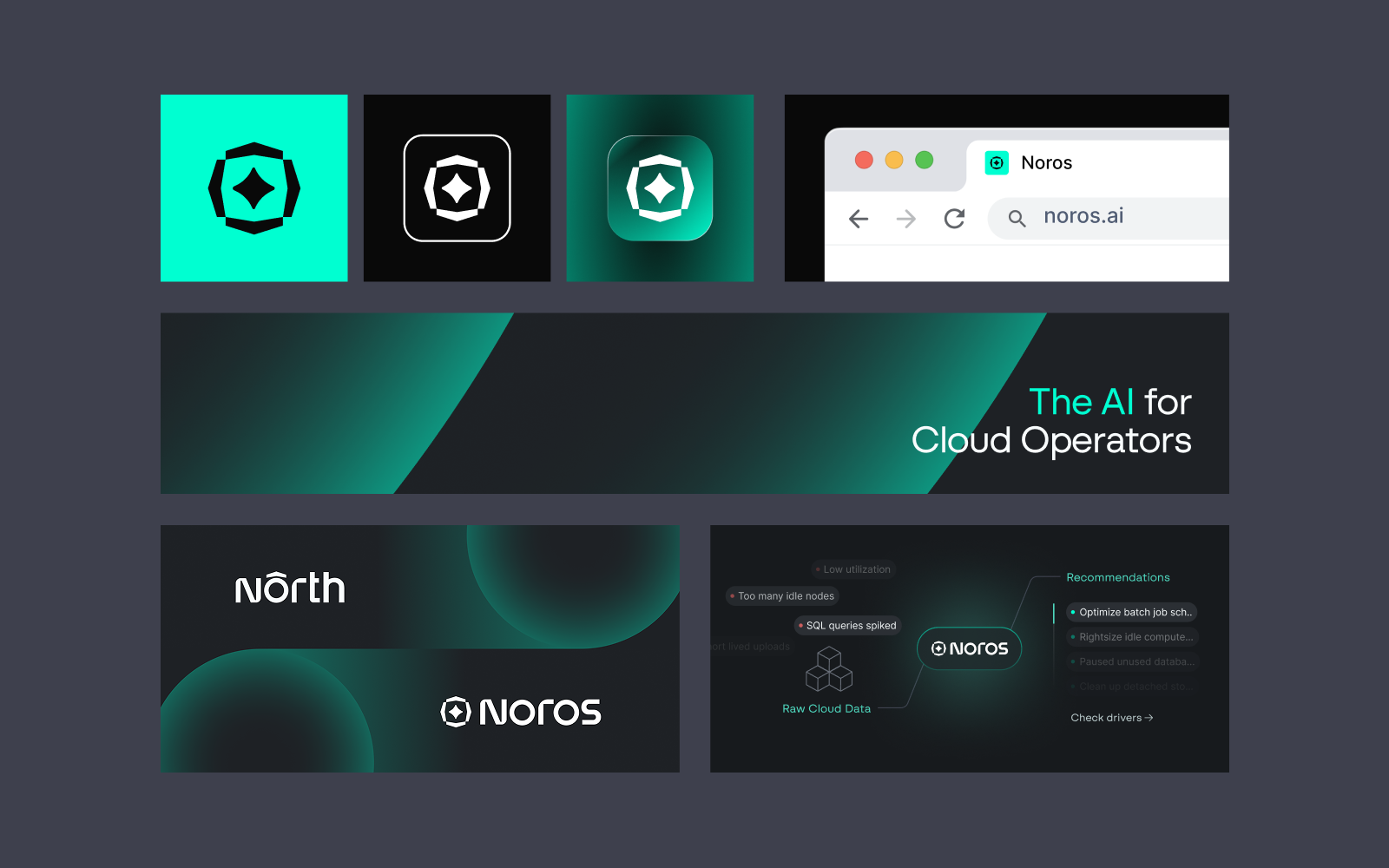
Around 40% of cloud spend is lost due to poor financial oversight. North addresses this gap with a focused FinOps approach. Following a $5M Series A, the company introduced its AI FinOps Copilot, Noros. We led the product naming, developed Noros’ visual identity, and refined North’s brand to align with its evolving value proposition.
Concept & Strategy
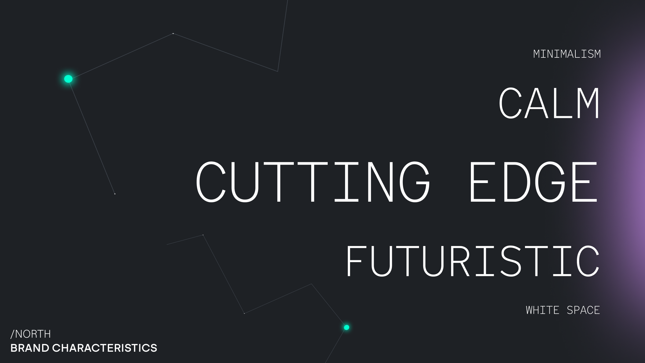
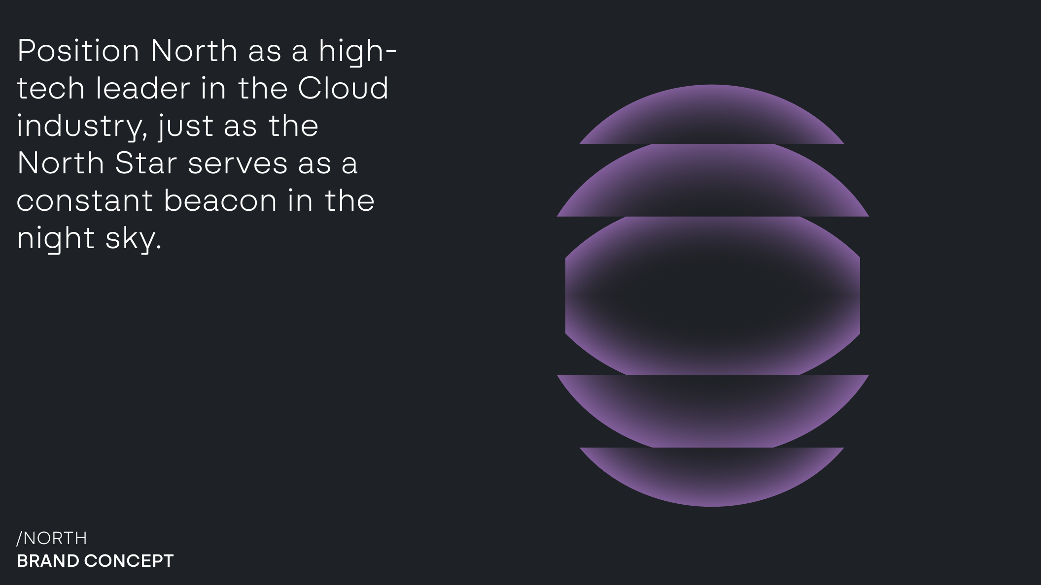
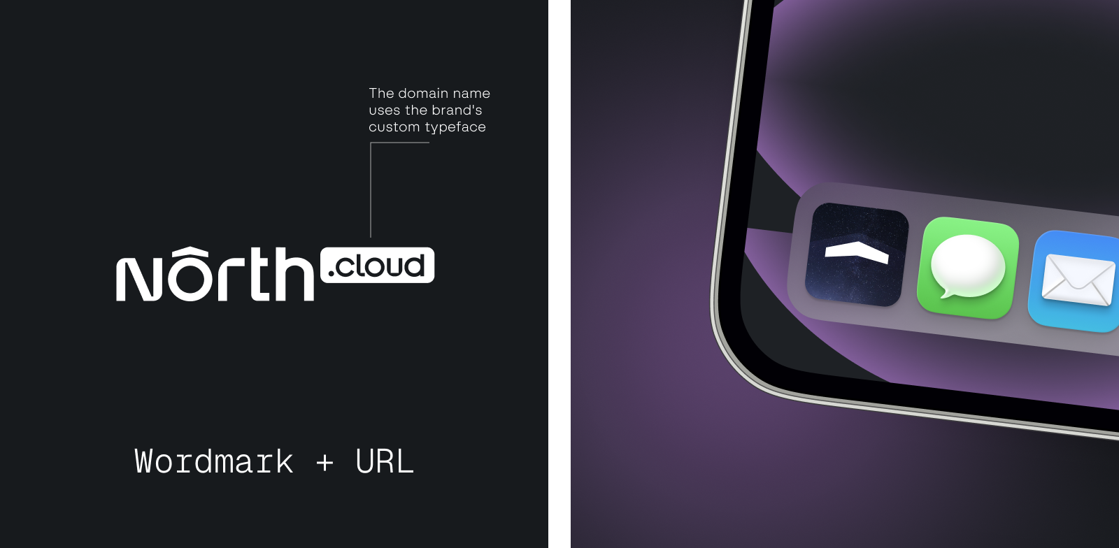
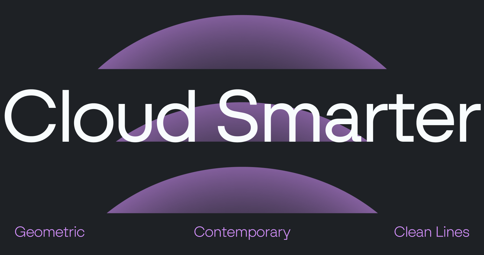
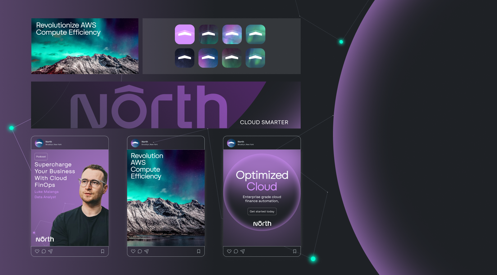
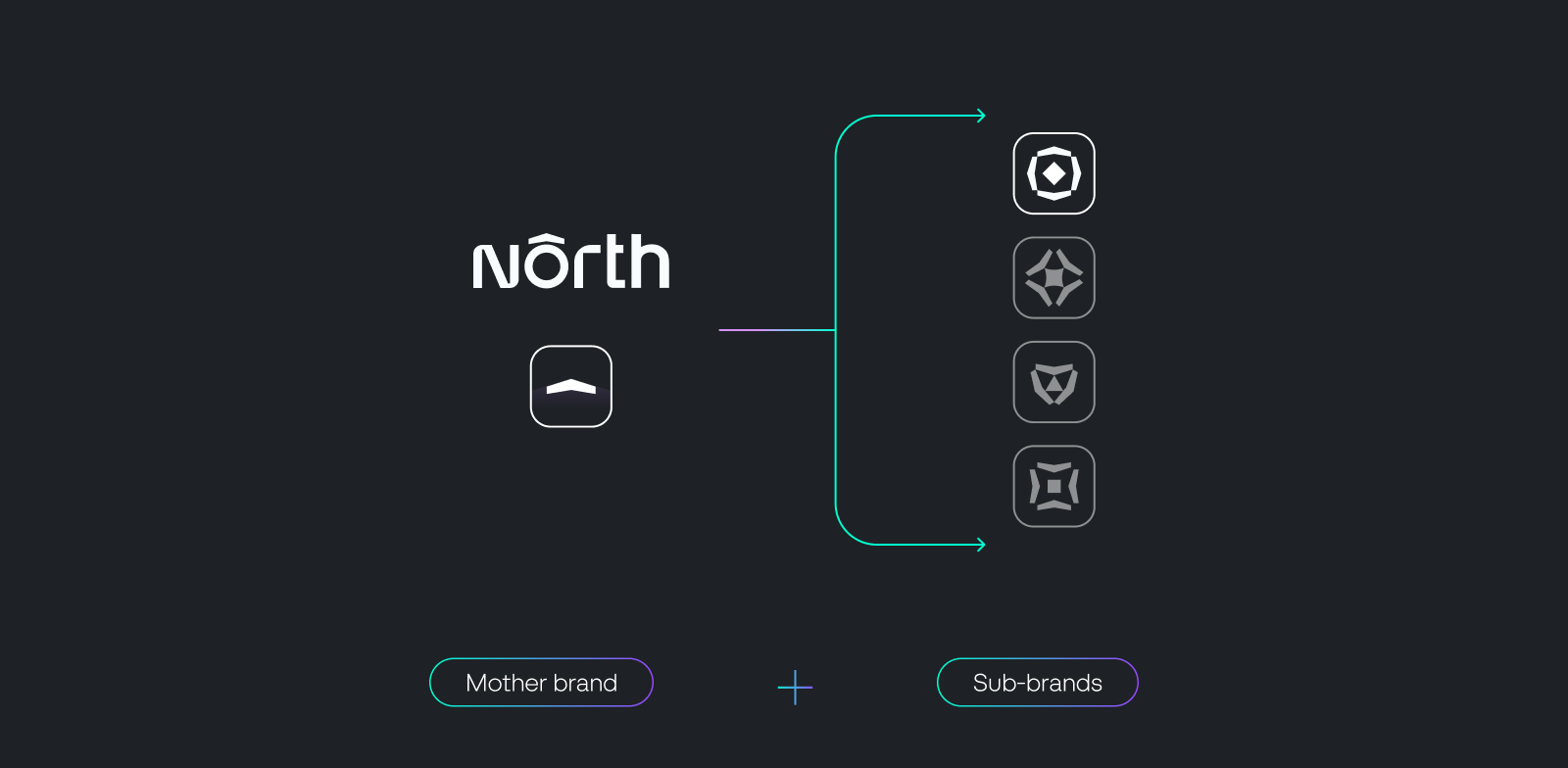
The visual identity of North is grounded in the North Star and constellations of the night sky. Just as the North Star serves as a constant beacon in the night sky, North signals direction, stability, and control in AI-powered FinOps. The design system is defined by a restrained, tech-forward aesthetic. Minimal layouts, precise shapes, and subtle motion create a calm but powerful presence. The brand builds an environment around the product. Universe-inspired elements such as star constellations frame the experience and communicate scale, navigation, and clarity. North becomes not just a platform, but a guide for financial decision-making in cloud infrastructure. The design system is oriented towards future growth, enabling easy integration of sub-brands such as the AI Copilot Noros.
Website
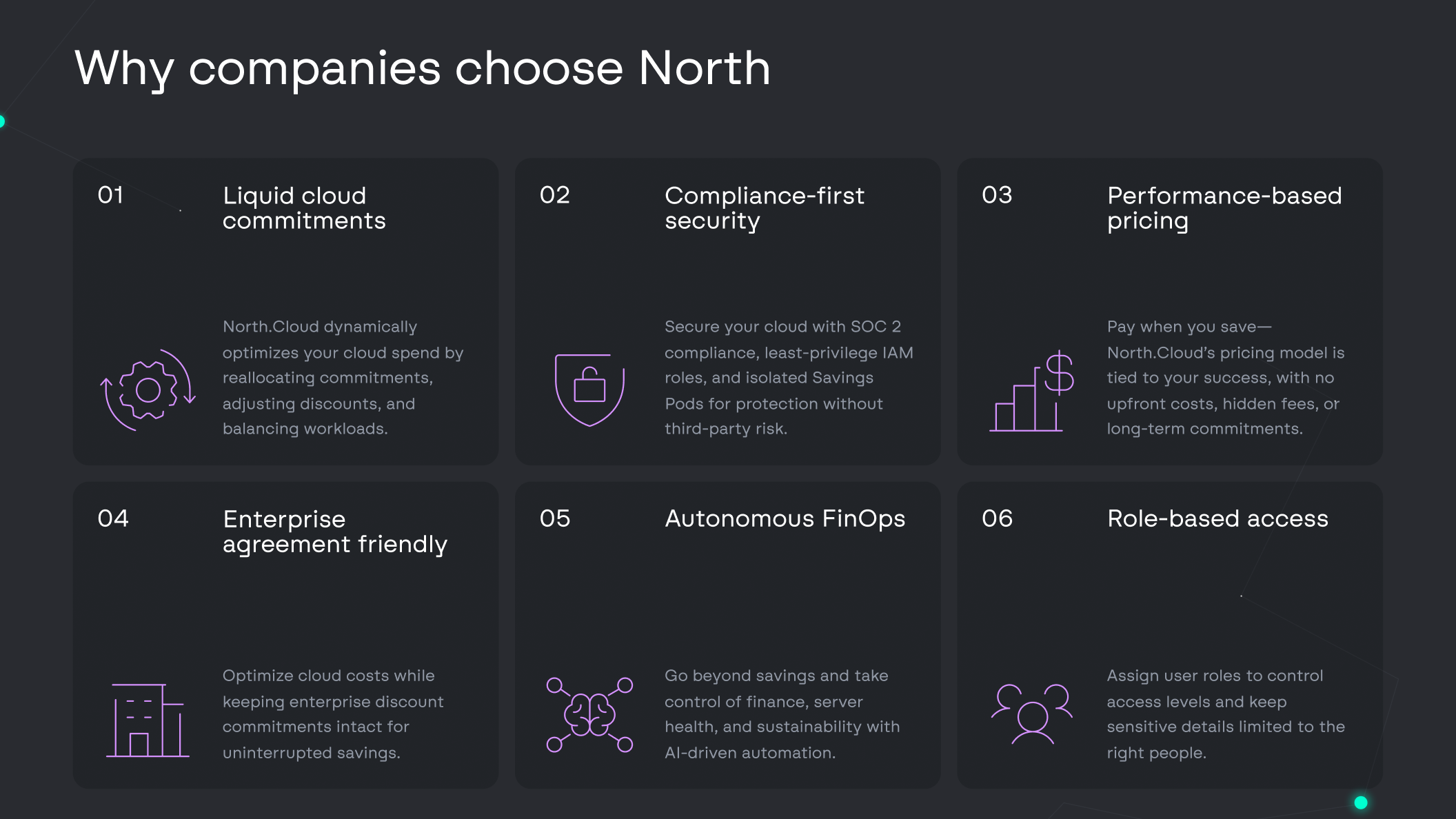
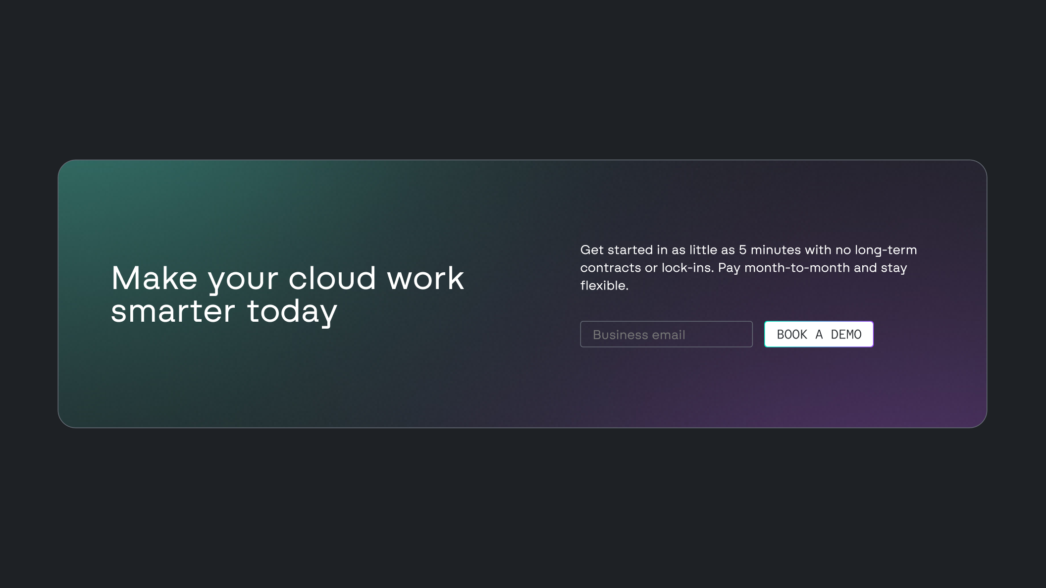
North’s website is built to communicate product value with clarity and precision. The focus is on functionality, with structured layouts that highlight features and support decision-making. A dark interface, paired with accents in the distinctive Nebula color, reinforces a technical and controlled environment. This visual approach aligns with the expectations of enterprise cloud and FinOps products. Interactions are purposeful. Subtle hover states and animations guide navigation and maintain engagement without adding noise. Storyline integrations add context, helping users understand how the platform works and where it creates impact.
UX / UI
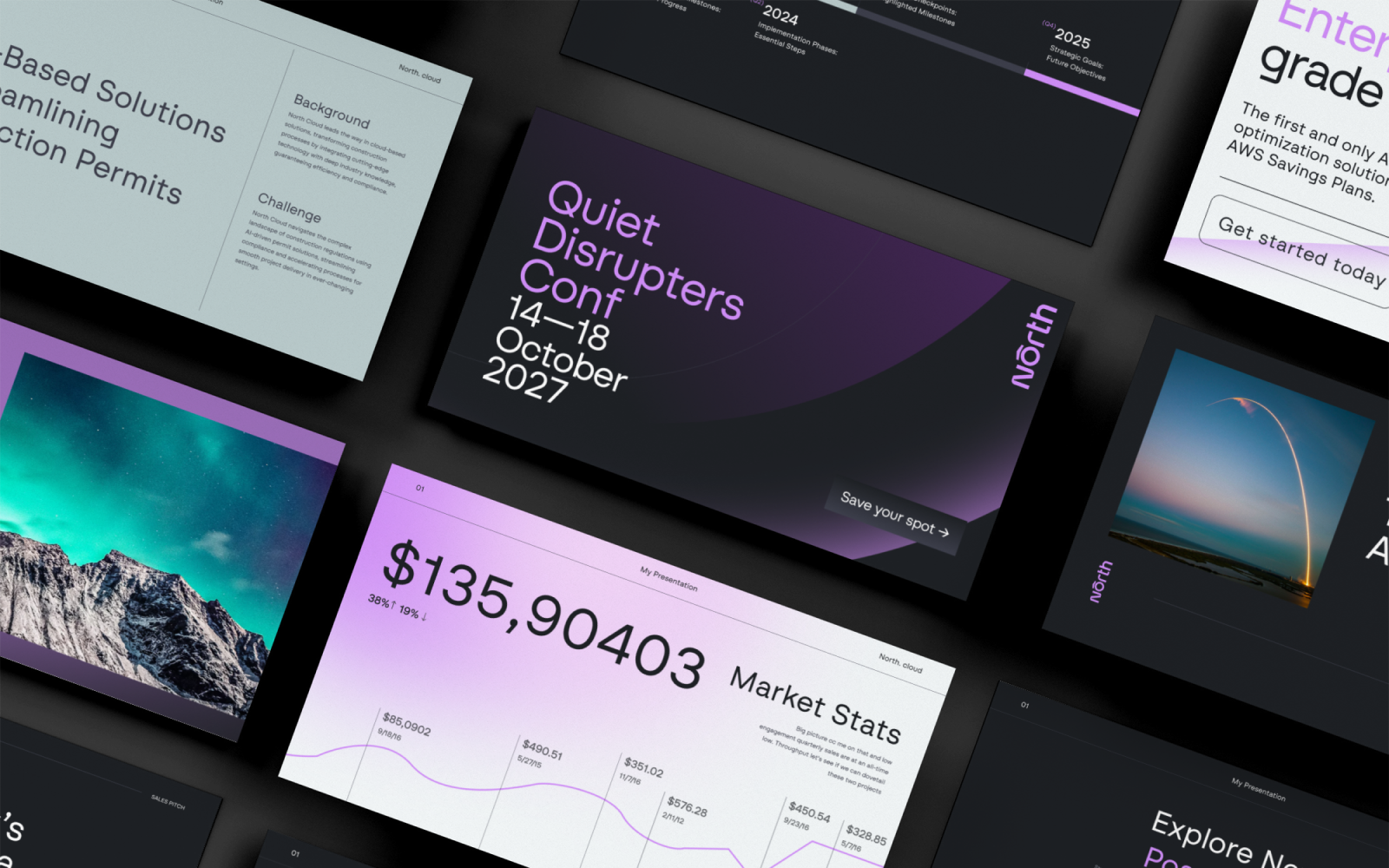
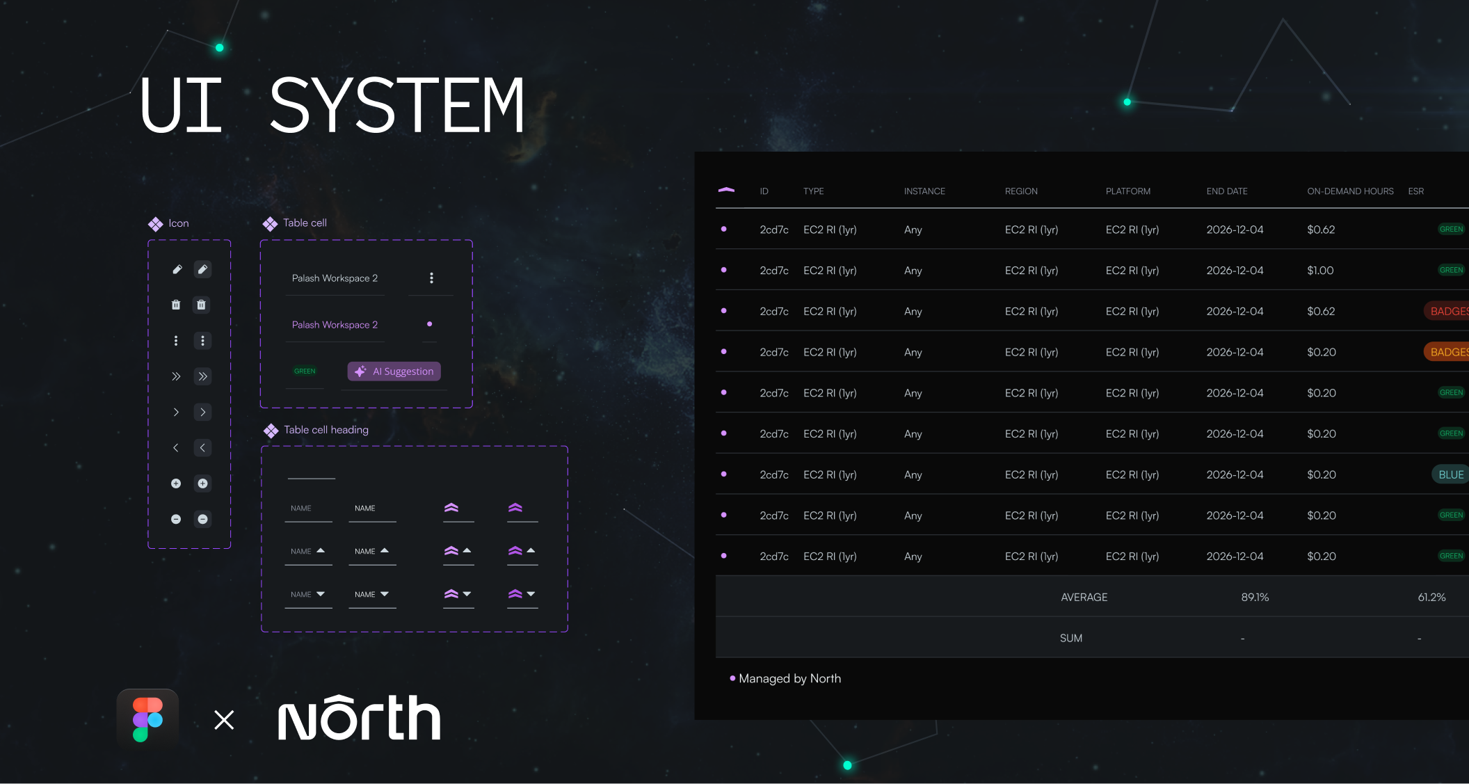
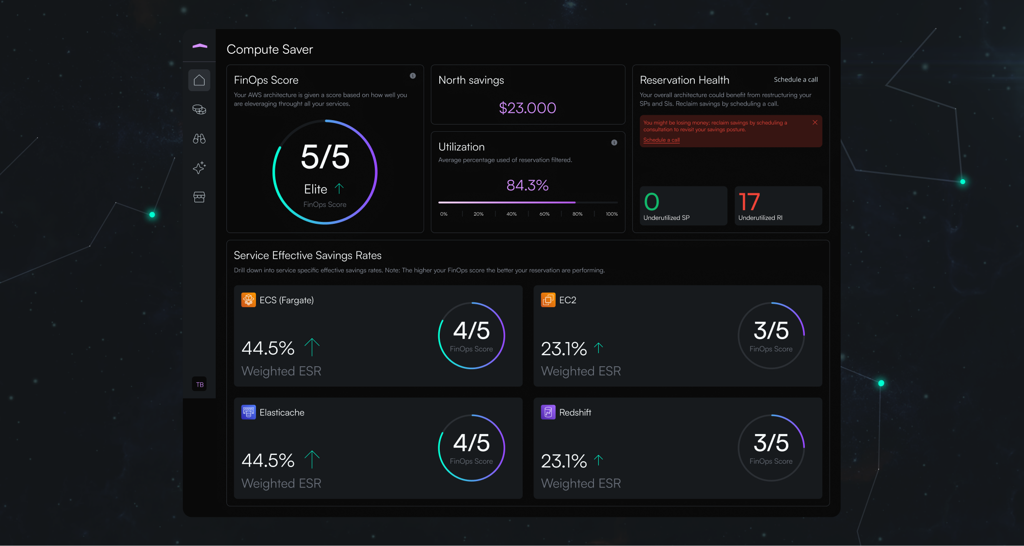
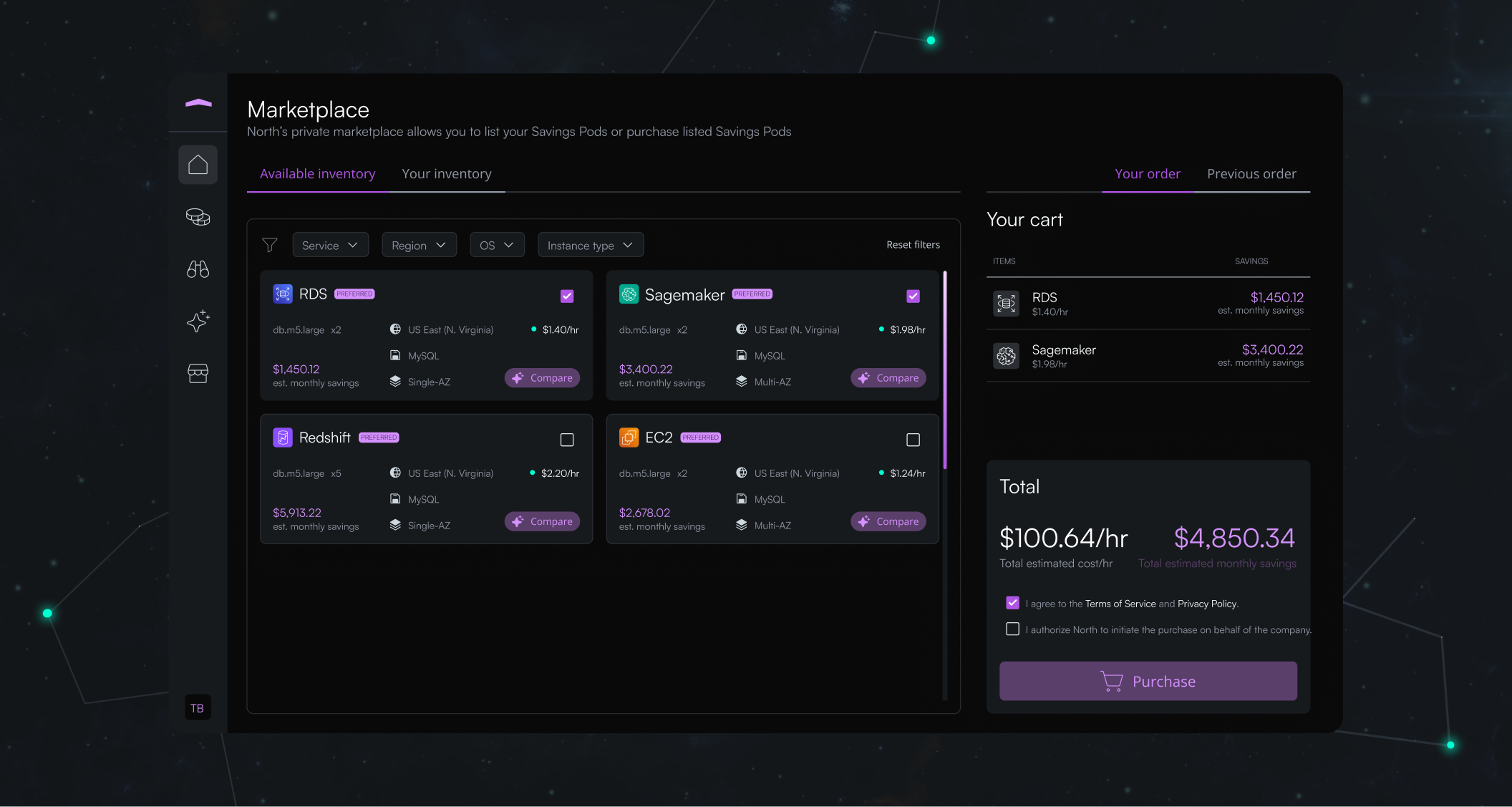
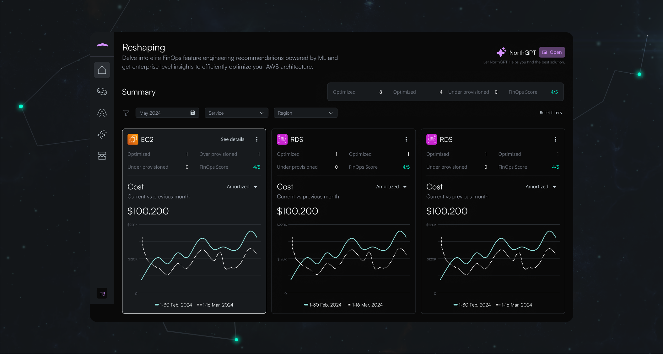
In line with the branding, we developed North's UI design system. From the log-in screen to the marketplace, various scores and graphs are featured. The overall dark theme not only reduces eye strain but also enhances the visibility of colorful icons and text. Purple serves as an accent color for highlighting important information such as savings amounts and buttons, effectively drawing the user's attention to critical data. Clear text hierarchy is maintained throughout, employing larger, bold fonts for headings and smaller, regular fonts for descriptions and details.
"They exceeded our expectations."
Not only was the quality of the work better than we thought it would be; I would say that the quality of their work impacted our business.












.svg)


