Driving Web3 infrastructure
Moonlet builds the technology that keeps blockchains running safely and efficiently. It helps both regular users and financial institutions stake their crypto and manage blockchain data through secure, easy-to-use, and compliant tools.
Moonlet needed to translate its technical maturity into a powerful brand. We redefined Moonlet’s digital presence through a swift rebranding exercise, a clear, scalable website redesign, and refined messaging: supporting future marketing efforts and strengthening its position in institutional blockchain infrastructure.
Concept & Strategy

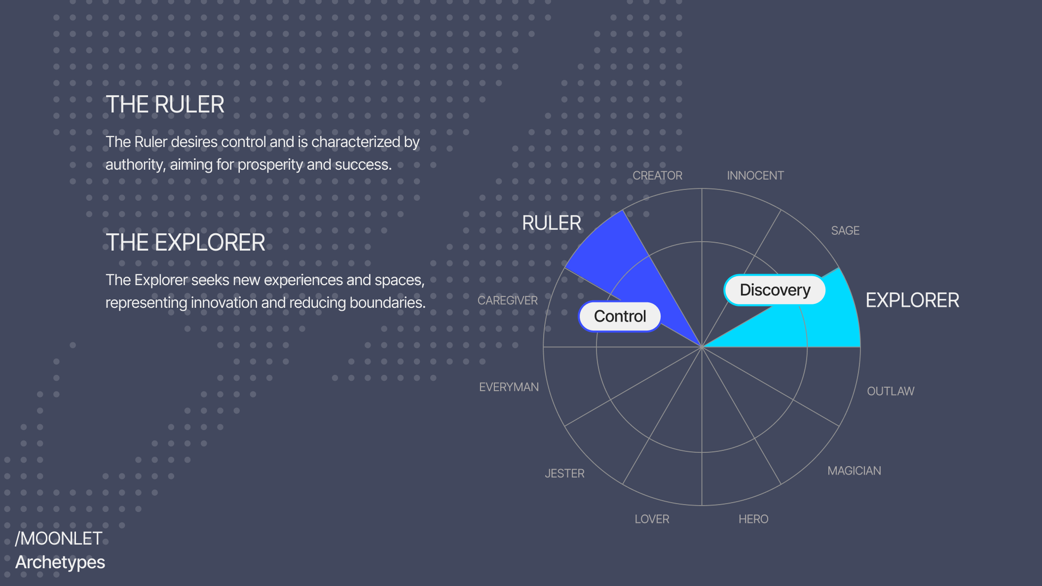

A “moonlet” is a small natural satellite orbiting within a planet’s rings, visible only when zoomed in. This inspired the brand concept: the future of blockchain is a matter of scale. Moonlet needed to speak to a diverse audience, appearing corporate and reliable for B2B users while staying dynamic and tech-forward for individuals. The Ruler archetype fits mature mainnets focused on trust and compliance, while the Explorer archetype reflects the agility and curiosity of devnets and testnets. We built a brand that balances knowledge, stability, and innovation.
Logo


Due to blockchain dependencies, the logo could not be fully redesigned. Instead, we extended its use by introducing new color applications and graphical variations for marketing and digital assets, enhancing flexibility without losing recognition.
Typography


The tech brand uses Inter Tight, a refined version of Inter optimized for digital interfaces and large-scale design. With its tall x-height and tight spacing, it ensures clarity and rhythm across UI, signage, and marketing contexts, reinforcing a professional yet approachable visual tone.
Imagery


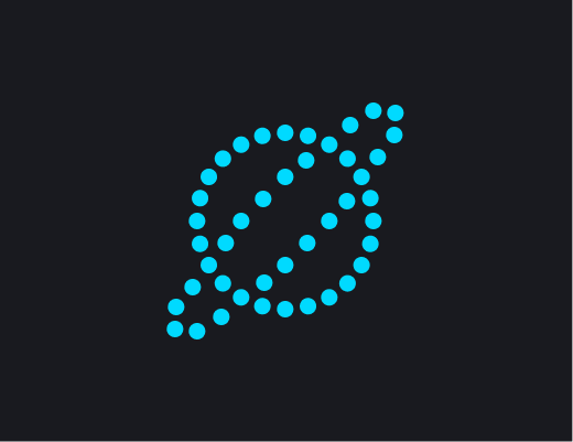
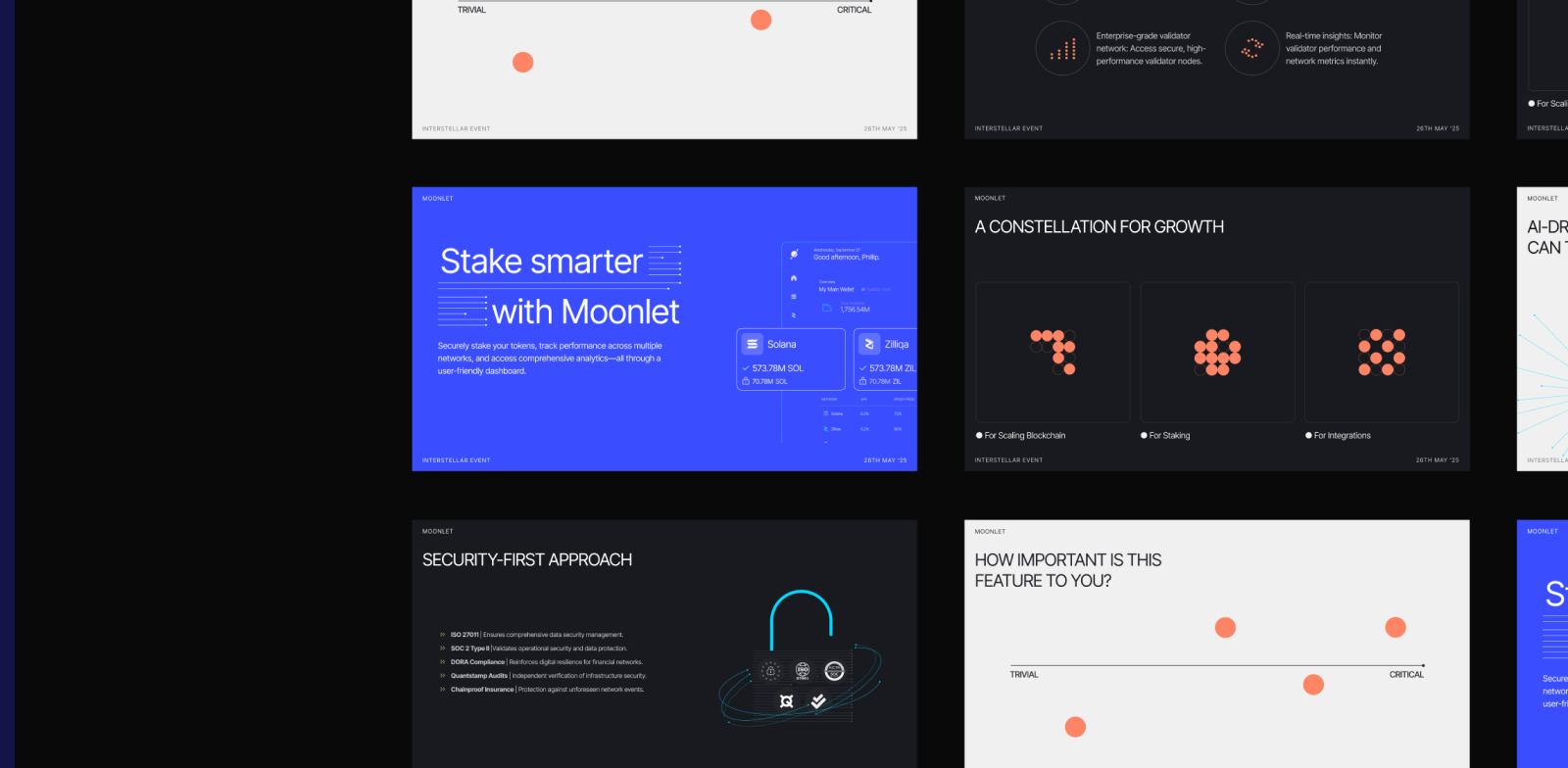
Moonlet’s visual identity is anchored in its naming roots. The design elements are derived from the concept of planetary rings: they feature linear forms that converge into a small circle, representing the dynamic motion of moonlets in orbit around the planet. For the website of the startup, we introduced an interactive element that brings the isotype to life: when a user hovers their cursor over the area, individual dots respond to the interaction by increasing in size. This scaling effect is smooth and progressive, creating a ripple-like animation as the cursor moves across the surface. This interaction reinforces the tech startup’s commitment to dynamism, precision, and user-centric design.
Illustration


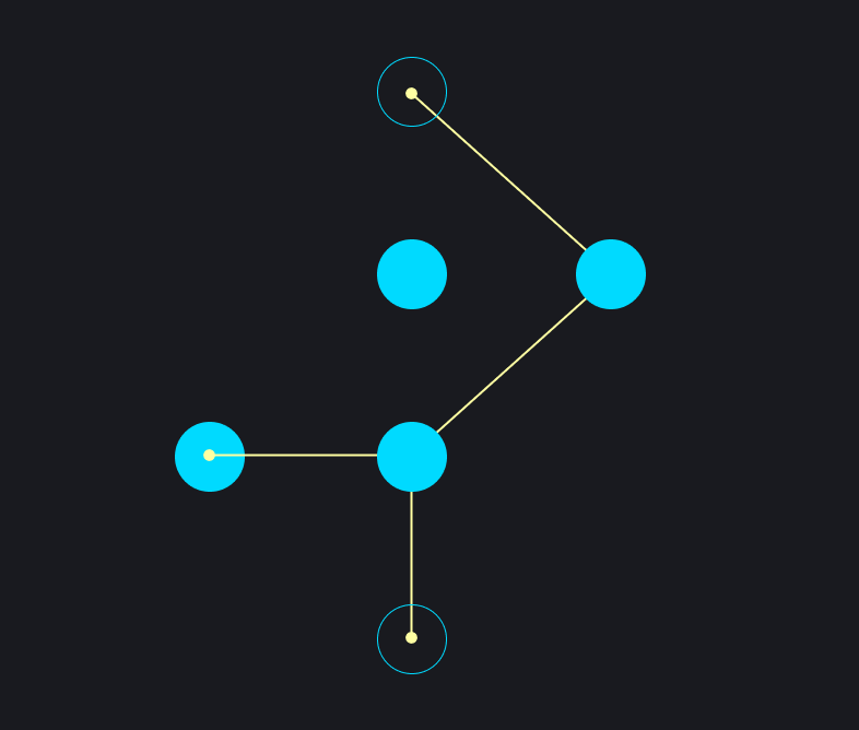

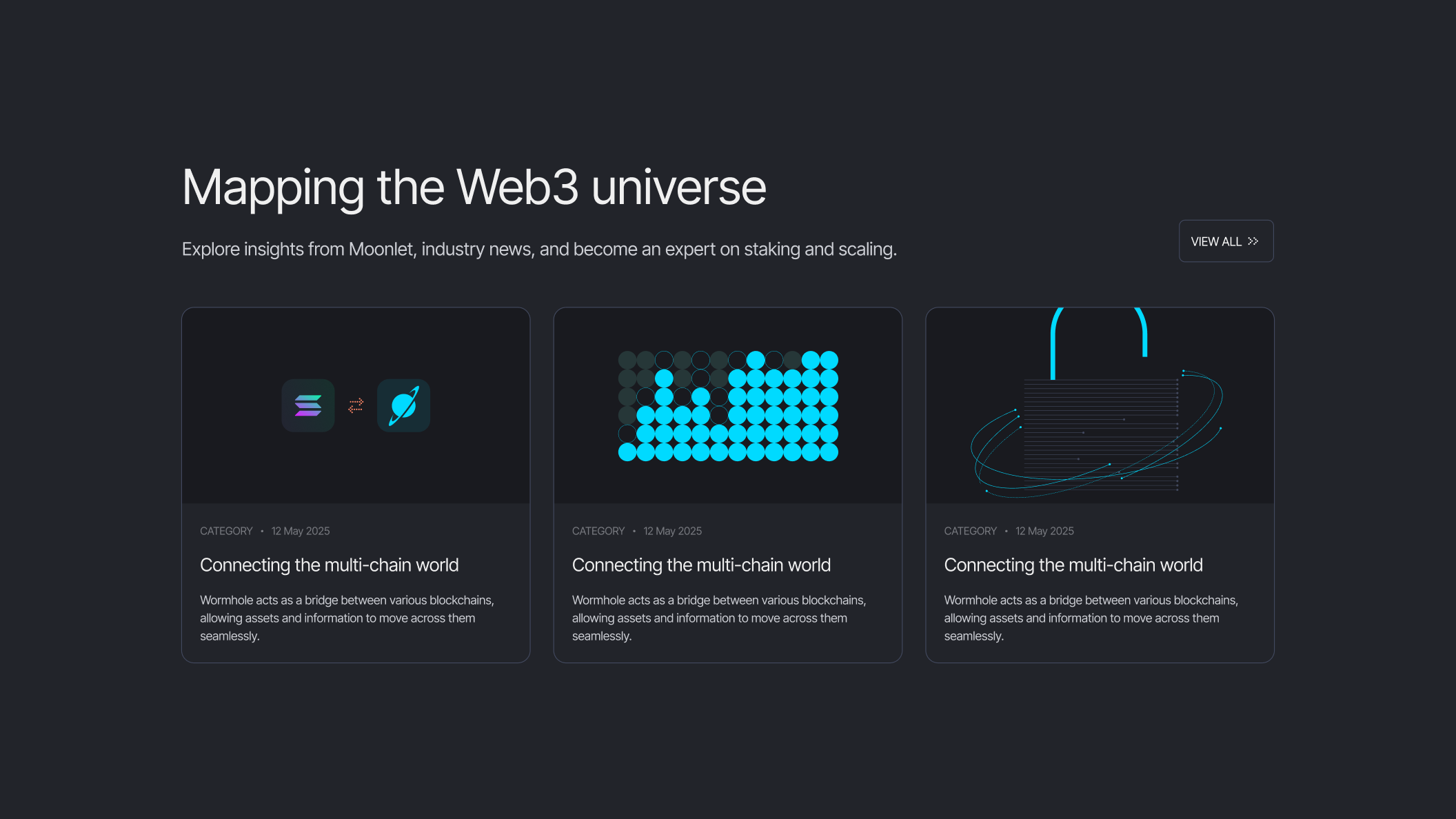
Moonlet’s illustration system is built around a set of handcrafted styles that support the tech brand’s identity. Each style serves a distinct purpose: from abstract representations of data connections, to informative diagrams, to product-focused UI highlights. Despite their functional differences, all illustration styles share common visual elements: fine lines, circular forms, and a consistent approach to color, contrast, and spatial composition. These illustrations provide flexible tools for storytelling across platforms and contexts.
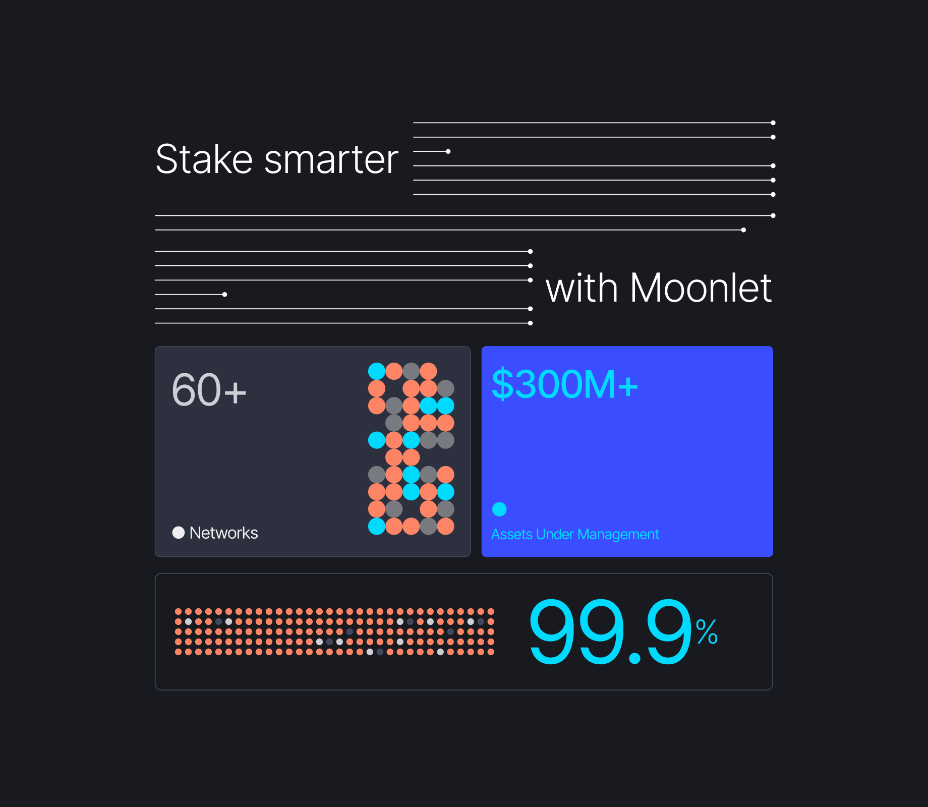
Website


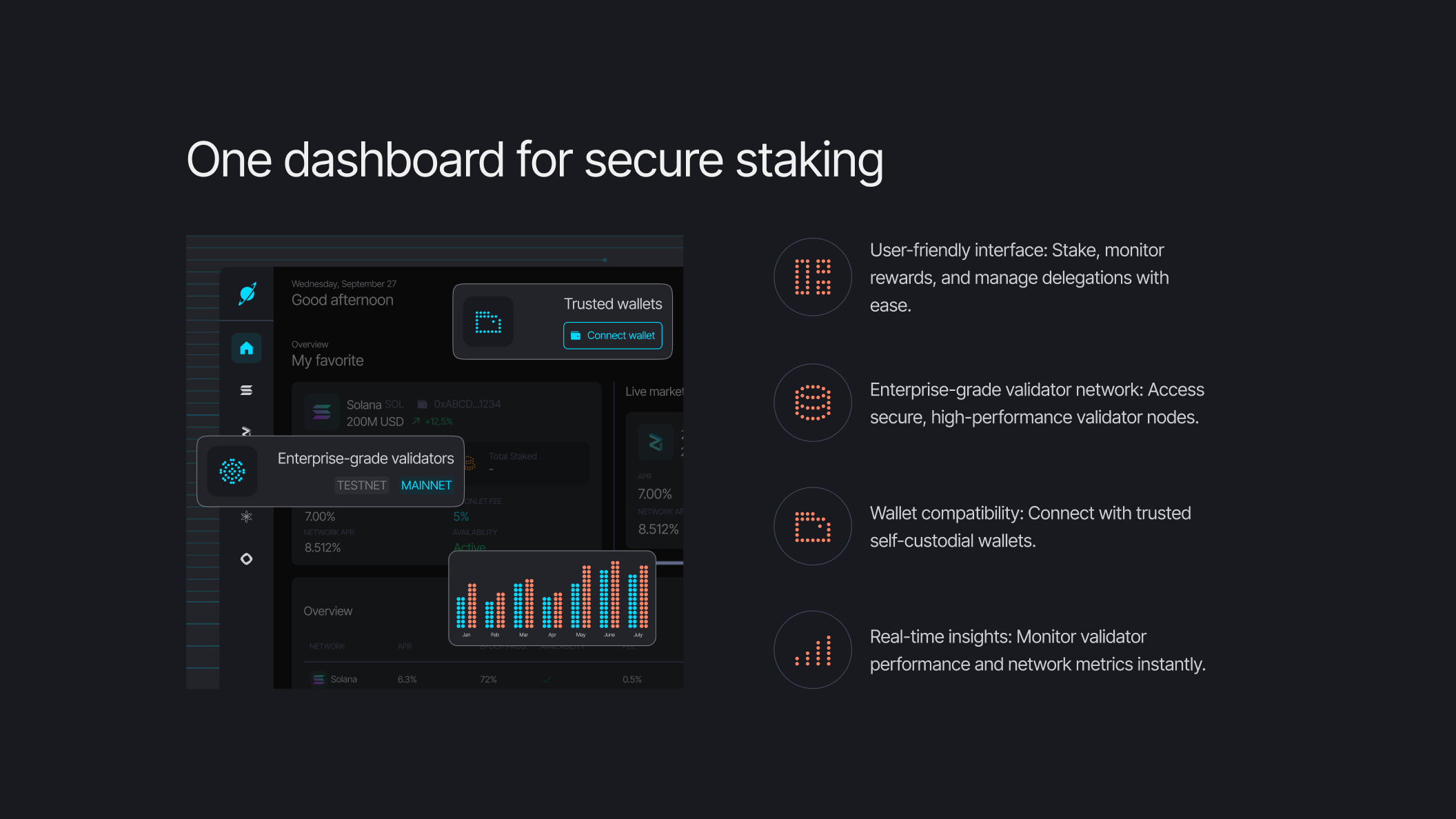
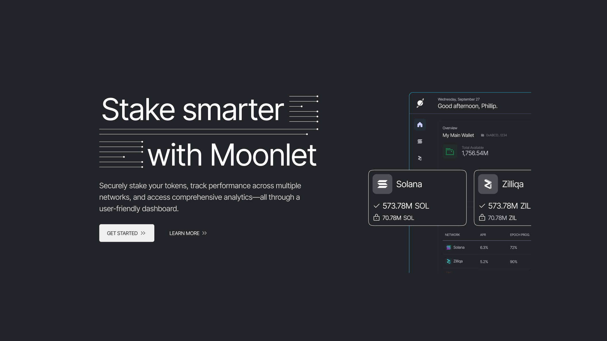
One of the startup branding project’s milestones was to clearly communicate Moonlet’s three core value propositions: scaling, staking, and integrations. This is immediately visible above the fold, where interactive cards guide users toward their specific area of interest. Moonlet’s website now has a clear structure, guiding the target audiences effectively. A dark theme communicates maturity, while cyan and coral accents bring vibrancy. Subtle motion effects and simplified dashboard visuals emphasize a clear, branded, and responsive experience.
UX / UI
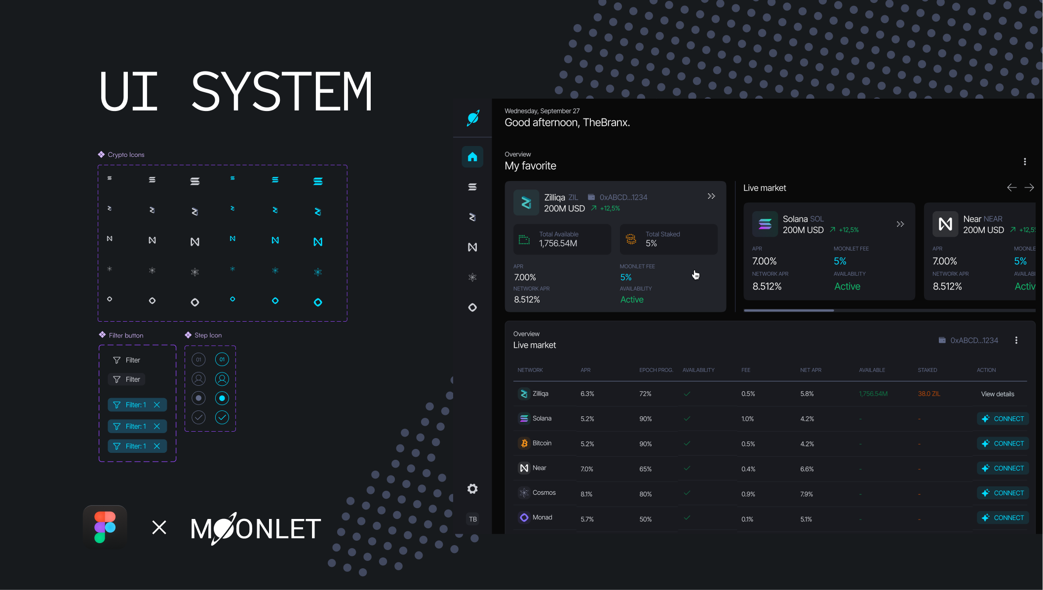
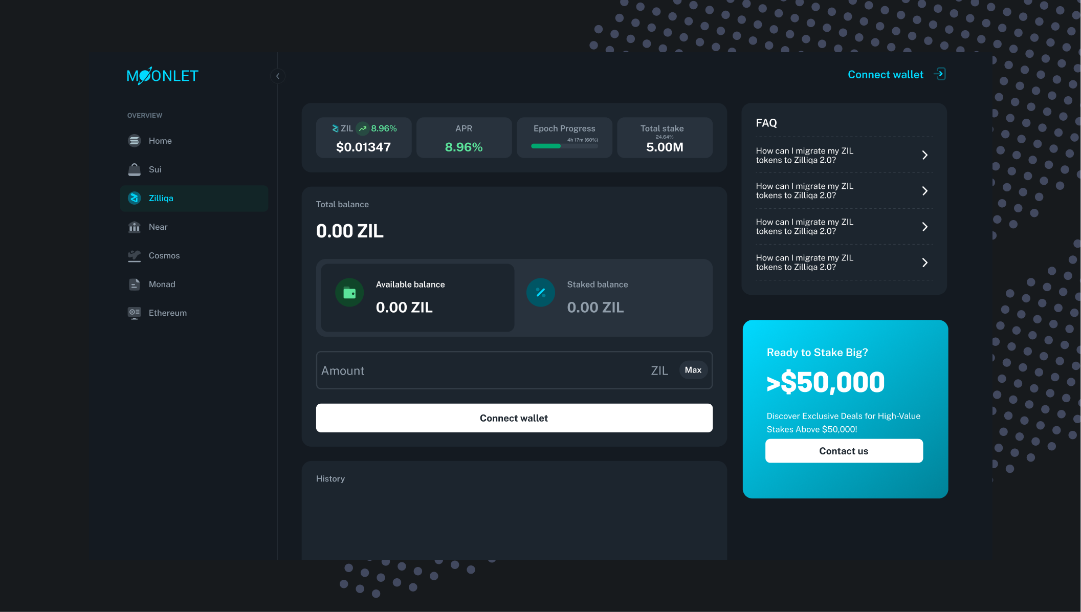

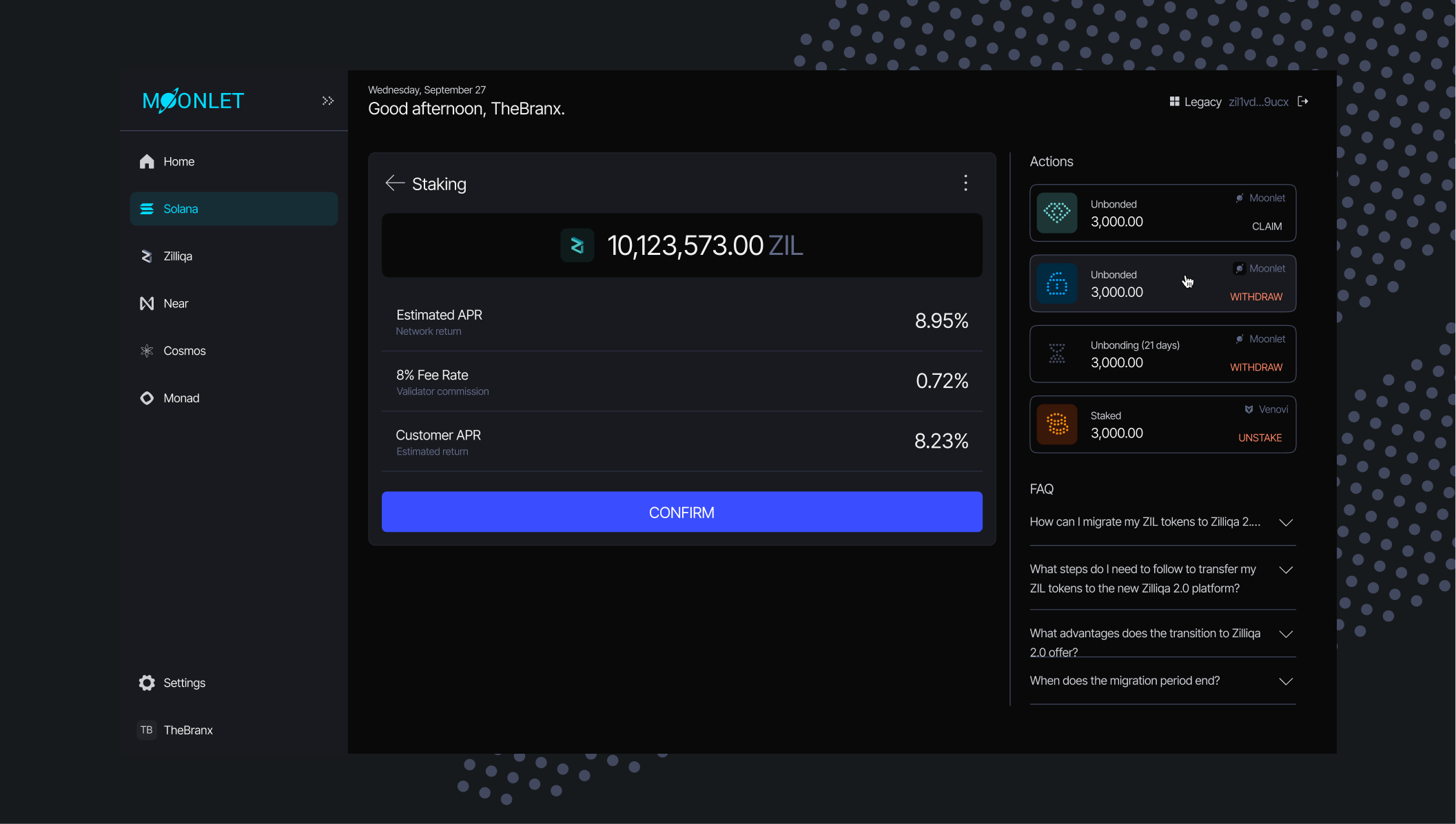

The redesigned self-custodial staking dashboard now aligns fully with the new visual identity. Intuitive and consistent, it enhances usability and strengthens trust in the Blockchain brand.
Brand Communication


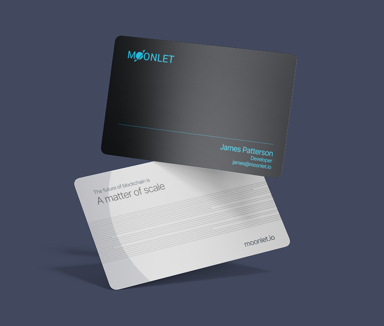
To support the website launch and initial traction, we developed the tech brand’s verbal identity and set up a framework for the blog strategy. The messaging relates back to the brand archetypes: professional and avant-garde without being dry, approachable and customer-centric without being casual, and innovative and optimistic without over-promising. This makes sure Moonlet conveys both authority and openness in a consistent, trustworthy voice. We also created branded merchandising and OOH material.
Related projects