Share-economy goes travel
The startup JoinMyTrip is a travel platform to find like-minded travel buddies to experience unique trips and share unforgettable memories. It enables travelers to join the trips of others or to make money by becoming a trip leader, democratizing the travel industry.


Concept & Strategy


Traveling is a fun topic, hence, the branding of the Traveltech startup should also be entertaining on the one hand, but also communicate sophistication and trust in order to attract users and convert them into brand ambassadors. The goal was to reach this by elaborating strategic branding and a strong visual identity across all relevant brand touchpoints, including website, OOH as well as digital communication.
Logo

As each trip is different, we created a dynamic logo with a changing logo shape, which represents the different trip itineraries. It is also a five-sided figure representing the distinct five senses you experience on a trip. Together with the JMT team, we held a workshop where the team had to dye their fingers and place their hands over the logo. The marks from the fingertips were connected with lines, so every team member also created their unique JMT logo.
Colors
.png)
We used vibrant colors with gradients representing the sunset, sunrise, and moonrise, which are always present in the landscapes during your trips. These colors go in line with the brand values and trigger excitement as well as joy. Illustrative elements with clean lines and clear visual messages provide a pleasant contrast to the lively color scheme and represent JMT's streamlined approach to travel.
Typography

As rumor has it, the creator of the Montserrat typeface was inspired by old posters and signs inside the traditional Montserrat neighborhood of Buenos Aires. With the use of Montserrat as the principal typeface, we invite the reader to join our trip online and offline: Due to its high legibility range and its variety of different fonts, Montserrat is a suitable typeface for both web and physical media.
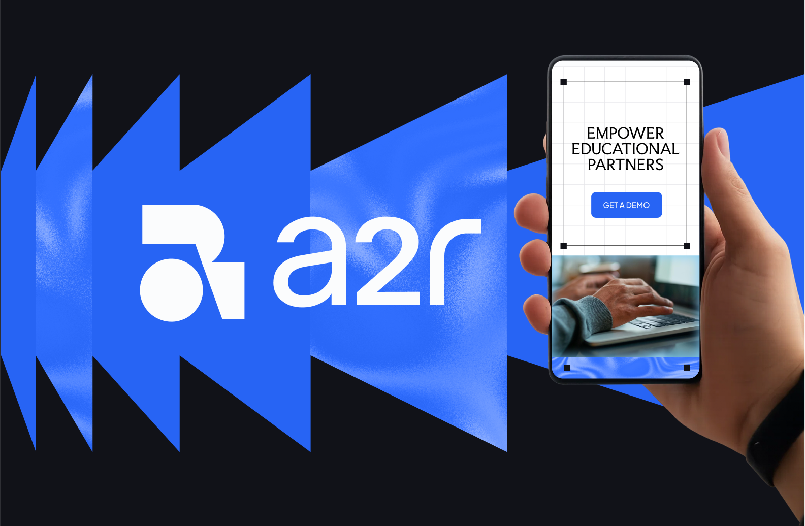
Website


Our aim was to transform the JoinMyTrip travel platform into an aesthetic, easy-to-use, and user-centric website. Before we started with the actual web and UX design, we performed a user journey analysis and put into practice our learnings to minimize bounce rate in crucial process stages. In order to increase brand awareness, we created branded and personalized call-to-action buttons.
Communication
.png)
.png)


Together with the JMT marketing team, an integrated full-blast brand communication strategy was carried out on different channels and with different formats, along with the different stages of the user journey. Also, appealing Instagram stickers are used to pimp stories that should grab their users' attention. Through the branded Instagram feed we achieved not only maximum branding but also a clear differentiation from competitors. The full image grid with bright and dynamic colors impresses every user.
"Amazing combination of talent and personality of the team!"
I believe great results would not be possible without the amazing combination of talent and personality of the team.
Related projects