
Almost everyone outside the graphic design bubble uses “logo” to refer to the graphic mark representing a company.
From a linguistic point of view, this is quite correct, as the word “logo” originates from Latin, meaning “word”. However, technically speaking, there are different types of logos, and not each of them might be the perfect fit for your tech startup.
So, let us explore the different types, their pros and cons, and how you can use them to differentiate your company and create recognizability and trust in your sector.
Wordmark
A wordmark or logotype is a grouping of letters or words, using only the brand name. For this kind of logo, length, and readability are crucial. Wordmark logos work best when the brand name is short and distinctive, as long names could become too complicated and result in an unprofessional appearance. Also, if the name is too long, it might lack usability for different brand assets. As for the typography, you need to go for something simple, yet unique, as it needs to be easy to read and recognize. Some well-known wordmarks of unicorn startups are Stripe, Canva, and Uber.

Pros: Using a logotype for a tech startup can help reinforce your brand name, as people are more likely to remember it when they see it clearly in your logo, always on the basis that your name is clear and short. Especially for early-stage startups, an easily memorizable name is key. Also, wordmarks are easily scalable and can be used across multiple platforms.
Cons: If you are going for a logotype with your brand name solely, you have to ensure that it is powerful, communicating your values in an effective way. It can be hard to tell what your company does if the brand name doesn’t relate to your business.
Isotype
“Isos” originally is Greek and means “equal or identical”. Hence, an isotype is the graphic representation of a company. It is an icon that visually represents the values and personality of your tech startup. Therefore, it needs to relate to your company, product, or service. Have a look at the isotypes of Apple, Twitter, and Whatsapp: the pictographs refer, more or less, directly to the company name.

Pros: If you are looking to become a major, international player, isotypes might be the way to go for your tech startup logo design, as they are great for closing the language gap between cultures. Also, isotypes enable you to connect more easily with your audience, as a picture expresses emotions stronger than a word.
Cons: Isotypes are great for established brands, but as it is hard for users to associate a picture with a brand unless they already know what that brand does, it might be difficult to create brand awareness amongst your target audience. Also, remember that abstract isotypes might mean different things to different people and the last thing you want to do is confuse your audience.
Imagotype
An imagotype is the combination of a symbol or image, hence an isotype, and the lettering, with the two elements being able to be separated clearly. What matters most is creating harmony between icon and word; they need to work together and stand on their own. In the startup universe, you can find a bunch of successful startups that use this kind of logo: OpenAI, Databricks, Mailchimp, and Airbnb. Whereas the isotype of OpenAI, Databricks, and Airbnb can be directly related to the business—Airbnb's timeless icon represents the clever combination of people, places, love, and the initial A of the company name—, Mailchimp relies on its “Freddie” monkey, which doesn't relate at all to the e-mail marketing platform.

Pros: Imagotypes are an excellent solution for brands that need to implement their logo on various phygital touchpoints. Also, an imagotype can be great for growing tech startups that are making their mark in the sector: You can start using the icon and the company name and then, once you gain reputation, proceed to rely on your isotype.
Cons: Crafting an imagotype might be one of the most challenging tasks in brand design. All elements need to be in perfect alignment, as they have to combine perfectly and also work alone. However, you can always rely on a branding agency for startups if you need help.
Isologo
Last but not least, isologos are another type of logo that some companies choose to go for. An isologo blends the image or icon with the text to create a single element. In contrast to an imagotype, these elements do not work separately. World-class examples include Intel and HP Inc.
Pros: As you have the name and the mark, an isologo is great for brand recognition. It is easy to convey emotions and associations and to create a relationship with your audience.
Cons: Usually, an isologo contains a bunch of important information that has to be able to be identified by users. Therefore, it's hard to make this kind of logo smaller, which limits its implementation. Hence, this might not be the ideal fit for your tech brand.
How to create a tech startup logo: Strategic design process
In order to create your successful tech startup logo, our brand design team takes into consideration various factors: your company name, your brand strategy, your target audience, your positioning, etc. After finding out more about your preferences through a moodboard, we begin with the design of your logo, always relating it to all other possible brand elements such as colors, icons, and typography. Depending on the project scope, we also consider what it will look like on your website and other brand applications.
At this stage, the decision on which kind of logo it will be is made:
For early-stage tech startups, we recommend either a wordmark or an imagotype, as they are best-practice in this sector. They are versatile and straightforward and communicate a professional brand.
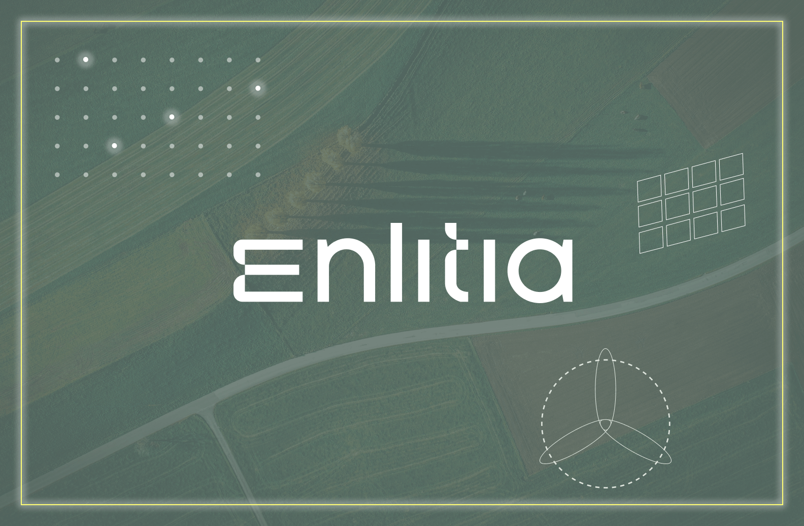
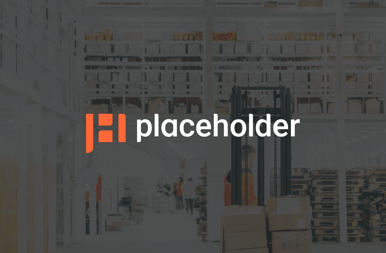
If we go for a wordmark logo, we make sure to make your customized typography outstanding, aligning it with your brand personality and adding distinctive elements to it—check out our logos for Enlitia, Sikoia, and Instruqt. Sometimes, an imagotype is the perfect solution, especially if you are looking for an outstanding isotype. This was the case for Placeholder, Aviator, and Moby Analytics, amongst others.
Then it is up to you: We come up with two different logo designs that you can choose from. After you collected consolidated feedback from your team and stakeholders, we apply the changes you are looking for so that your tech startup logo fulfills your expectations. Together with the brand colors, typography, and other brand elements as defined in the scope, we provide you with a brand guide with logo application guidelines. Now your company is ready to disrupt the tech startup scene.
Have you now got a feeling for which logo could work for your company? Drop us a line if you need help with your tech startup logo design.
As the #1 tech branding agency for startups, we ensure that your logo (whether it be a wordmark or imagotype) will be the right fit for your industry and enable you to build a visual identity around it that fosters growth.

.webp)