Creativity has been thought to be restricted to humans—however, we are experiencing an AI revolution in a broad range of sectors, affecting creatives as well as techies. New tools are launched on a daily basis. As we know, this revolution is the subject of heated discussions and AI tech startups need to lower society's concerns about their products. So, how do you effectively brand an AI startup? In this article, our Brand Designers Damian Bello and Dani Pedreño analyze the branding strategies of two leading US companies.
OpenAI's branding
OpenAI is on everyone's lips. Founded eight years ago in the US, the AGI (artificial general intelligence) research and deployment company has released three major products up until now: GPT, DALL·E, and Whisper, having raised a total of $11.3B in funding over 7 rounds. What stands out is their focus on artificial general intelligence, as outlined in their company mission: “Our mission is to ensure that artificial general intelligence—AI systems that are generally smarter than humans—benefits all of humanity.” Thus, it is likely that their branding strategy will focus on trust and safety as key messages in order to gain users instead of daunting them.
Naming
From a linguistic point of view, OpenAI is a strong startup name: short, concise, and made up of everyday words. In terms of connotations, “open” communicates values of openness as for transparency and accessibility on the one hand, and collaboration and partnership on the other—implying that everyone can collaboratively work together in AI development. “AI” explicitly indicates that the tech startup is involved in the field of artificial intelligence. However, it doesn't communicate its particular focus on AGI.
Logo
The isotype is the key element of the imagotype of OpenAI. It features the letter "O" enclosed in a stylized circular shape, which can be interpreted in different ways: On the one hand, it reminds of an eye, a symbol often used for making metaphorical reference to AI. On the other hand, the circular shape alludes to potential boundless possibilities and capabilities of AI, as it not only resembles the mathematical symbol for infinity but also the Armenian eternity sign.

Colors
Whereas black and white serve as primary colors on the homepage and the Developer page, the colors change on most of the other pages for the above-the-fold section and the footer. The black background and white typeface of the home suggest trust and seriousness at first sight, whereas the technological colors like deep blue and neon green on the Product page give a dynamic notion to the site, communicating innovation. The highly saturated colors embrace the technology used to create a digital world. Also, the color palette is open enough to make complementary pastel colors of other pages the perfect match, using earthier colors for the About and Careers pages.
"The way they use colors gives users orientation and helps them focus on the feature that they need from Open AI. When developers get to the black and white Developer page, they know instantly: this is my place." (Damian Bello, Brand Designer at The Branx)
Layout and design
With its editorial style applied to every page, the website transmits structure and organization. As the heading always goes on the left and the accompanying text on the right side, a feeling of calmness, structure, and safety is communicated, reassuring the user of the trustworthiness and confidentiality of the AI company. Also, straightforward and clean CTAs with rectangle shapes establish a clear, journal-like look and feel. This is in line with the serif typeface for headings and quotes, which evokes a sense of authority and trustworthiness.
As for the branding, our Brand Designer Dani suggests that the website design of Open AI holds a “retrofuturistic* notion” with its varied color palette, gradients with lines, and branded imagery, containing geometric, simple shapes with thin to thicker lines.
*Retrofuturism: In general terms, Retrofuturism means to look into the future through the lens of the past, hence, how we imagined the future in the past. With regard to design, a retrofuturistic style combines elements of both past and future visions, being curvy, pointy, clean, and minimal in appearance. (Source: artincontext.org)
Imagery
In line with the retrofuturistic design, the photography in warm colors also combines a touch of retro with the notion of an open-minded, dynamic, modern, and trustworthy company. Except for the video in the above-the-fold section of the homepage, not a single line of code is shown. The images portray people in a location that is supposed to be their office, all of them are smiling and seem to be relaxed and happy at their workplace. Every detail of the photographs seems to be carefully planned: the matching outfits, the retro furniture, the way of posing, the brand collateral like cups, etc. High-tech products like laptops, expensive watches, and smartphones contrast with pieces of furniture that seem to be recycled. Elements like a crumpled sweater on a sofa evoke a sense of spontaneity and add a human, approachable touch to the AI startup.
However, the main goal of the imagery seems to be to communicate safety, trustworthiness, and control, as Damian notes:
"The people photography of Open AI suggests that artificial intelligence won't get out of control and communicates safety and trustworthiness." (Damian Bello, Brand Designer at The Branx)
By focusing on people in their visual language, Open AI effectively shows the strong relationship between technology and humans: the people represent the developers, on the one hand, and the end-users of the tools on the other. Thus, an inspirational notion is conveyed, demonstrating implicitly the beneficial impact AI can have, while at the same time evoking calmness and confidence.
Tone of voice
“Creating safe AGI that benefits all of humanity”—the tagline of the AI startup offers a strong statement, reflecting its overall tone of voice on their website. From a linguistic point of view, verbs like create, transform, or develop imply bringing something new into existence, gradual growth, and advancement; they generally have positive connotations around innovation. Adjectives and adverbs like safe, beneficial, and responsibly evoke a sense of security and calmness: “Our work to create safe and beneficial AI requires a deep understanding of the potential risks and benefits, as well as careful consideration of the impact.” The wording of this sentence also creates some kind of social proof, as it makes reference to their knowledge and know-how. Phrases like “people from a wide range of disciplines and backgrounds” are indicative of taking many perspectives into consideration in order to make grounded decisions.
A certain degree of realism runs through their whole communication, presenting a realistic approach to AI and recognizing that it will change our lives. However, they focus on its benefits: “This technology will profoundly transform how we live. There is still time to guide its trajectory, limit abuse, and secure the most broadly beneficial outcomes.”
Also, they strategically use quotes from their team members, like from their Chief Technology Officer, to communicate their vision and establish trust: “AI systems are becoming a part of everyday life. The key is to ensure that these machines are aligned with human intentions and values.” Such statements imply that the startup is aware of the boundaries and possibilities of AI, always relating them to humans and considering its global impact.
Content strategy
Whilst communicating trust, safety, and responsibility via their visual and verbal identity, the overall content on their website also serves to communicate their approach. On their research page, they directly link to scientific papers published in the open-access archive of Cornell University (New York). Also, on their Blog, they take up topics like the relationship between journalism and AI—controversial issues that are tweaked to focus on the beneficial impact AI might have: “Partnership with American Journalism Project to support local news”. However, in some blog articles, they communicate a more critical approach to AGI, debating its risks.
Brand strategy: Trust, safety, and calmness
OpenAI positions itself as a trustworthy provider of AGI technology, presenting it as an additional source of knowledge and creativity, facilitating the life of its users. By the strategic use of people photography, they unify humanity and technology, and transmit a hint of safety, like being in good hands.
Dani sums up the main message that OpenAI seems to communicate with its branding as on its website:
"They are creating the future with calmness and consciousness." (Dani Pedreño, Brand Designer at The Branx)
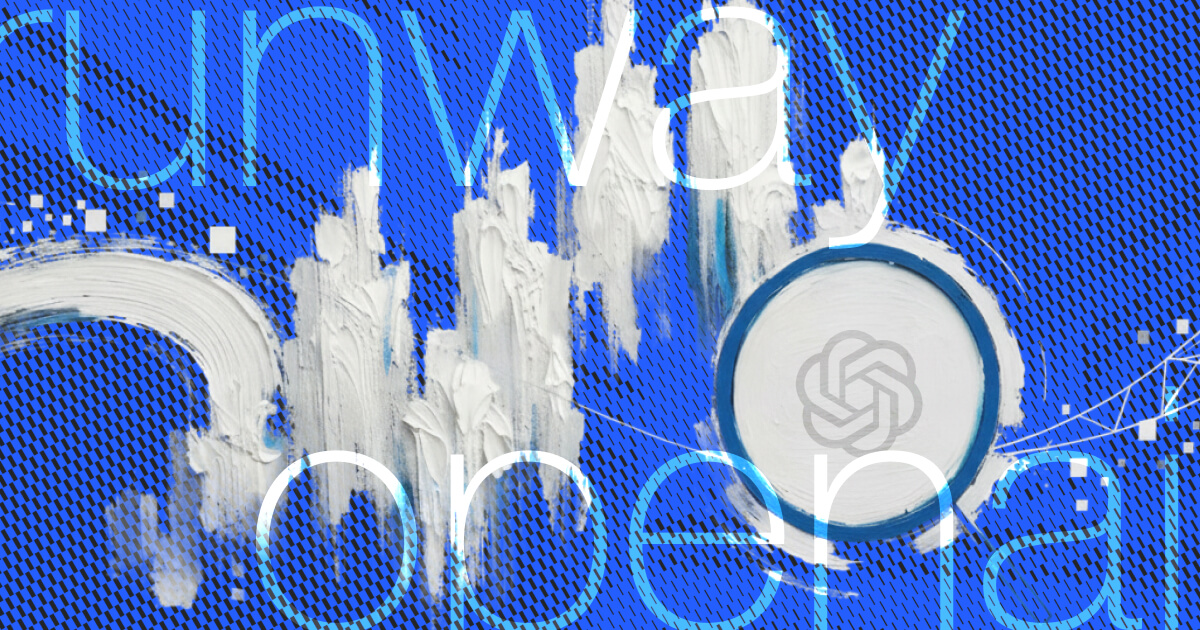
Runway's branding
The AI startup Runway was founded in 2018 and is currently in Series C round. They are building the next generation of creative tools, focusing on video automation and synthetic media with generative video, image, 3D, and audio tools. They have a mission to “make content creation accessible to all” and to “push the boundaries of creativity and in turn, lower the barriers of content creation; unfasting a new wave of storytelling”. Consequently, most likely their branding strategy will revolve around showcasing the potential of their AI tools and the benefits for content creation.
Naming
As “Runway” is a familiar word only made of two syllables, it is a strong startup name. However, it does not directly relate to the AI sector. The word itself has got connotations of movement and presentation, as it means a flight strip on the one hand, and the platform used during fashion shows on the other. In the context of the AI tech startup, the first definition establishes a relation to its value proposition in a broader sense: as a runway in aviation serves to indicate the direction that a plane should take to gain speed and lift off, its use for the company evokes a notion of guidance, speed, and unlimited possibilities. It implies that the company's tools and technologies are propelling users forward in their creative endeavors, just as a runway helps aircraft lift off. As for the second definition, the runway as a platform to present ideas, it implies that the tools of the AI startup serve for launching innovative ideas, transforming them into visual realities.
Logo
The imagotype of Runway, dominantly used in white or black, consists of an isotype accompanied by the company name in lowercase. The icon is reminiscent of an arrow but also reminds of an R for the company name. Hence, it can be related directly to the aircraft concept behind “runway”, although the arrow is directed 45 degrees to the left upper side, a direction that normally “indicates regression, taking a step back”, according to Dani. However, most likely it has been placed like this as it needs to represent the initial of the company name.

Colors
Black and white serve as the primary colors for Runway, establishing trust and sophistication. On their homepage, various shades of grey are employed to expand the color palette, creating a balanced visual experience. For CTAs and for the footer, a bold and powerful blue is chosen, symbolizing the tech startup vibe. On their research page, the background features bright, vibrant gradients in lively tones, adding energy and excitement to the website design and creating a technological and futuristic look and feel.
Imagery
Regarding imagery, Runway strategically employs mainly people photography and images created with their tools, showcasing the outcomes. This clever approach places a strong emphasis on their products and features, making their website design more product-centric. Images created with their AI products are accompanied by simplified UI Design elements, mainly featuring the prompt and the “Generate” button. Through these sneak peeks of the product interface, they communicate the simplicity and user-friendliness of their offering.
It seems like the photos were taken in the office of the startup: they depict people working in groups, in reunions, or having a coffee with their colleagues. Due to the angles of the photos, their lighting, and the scenes, the photography creates a notion of spontaneity and approachability, as though the team simply decided to snap pictures during an ordinary working day. This portrayal adds a human touch to the otherwise product-centric web.
"It looks as if your colleague just grabbed his smartphone and: flash, here you go, we got pictures for the website." (Dani Pedreño, Brand Designer at The Branx)
Unlike OpenAI's location, the office furniture at Runway doesn't precisely align with their overall branding; however, this contrast might serve a purpose. The office space exudes a relatable and "normal" ambiance, effectively communicating approachability and a sense of proximity. The choice of these photos contributes to the simple and easy-going look and feel they convey throughout their whole website.
Simplicity and proximity to clients and users are further emphasized by the use of emojis as bullet points on their About page. As nowadays everyone can access emojis on their smartphone, this is visual element reinforces Runway's approach, communicating that their tools are designed for everyone and anything.
Content strategy
Their Research page boasts a proper domain, enabling users to get more information on their approach to AI research. They published papers in the archive of Cornell University, just as OpenAI. However, their research approach to AI is different, as they seem to focus on exploring further ways of deploying AI for content creation and not debate about uprising controversies. It is a more dynamic, technology-focused approach, which is intended to unleash all possibilities that AI can provide, making it accessible to everyone. This is also reflected in the mission statement on their Research page, which is different from the one on their homepage and suggests a very idealistic approach: “Runway Research is enabling the impossible. Our mission is to build multimodal AI systems to enable new types of creativity tools.”
Tone of voice
“Everything you need to make anything you want”—this tagline is representative of the overall brand personality of Runway, indicative of a very idealistic vision of AI. The repetitive use of the words everything, anything, and free is indeed one of the most distinctive features of the tech startup's tone of voice. Also, their CTA “Sign up—it's free” indicates that everyone can leverage the tools, without any limitations. Thus, they apply an idealistic approach to AI tools, further emphasizing this by referring to their products as “AI Magic Tools”. Describing their products as “magic”, however, does not only convey a mysterious connotation but also a feeling of uncertainty and ignorance about the functionality process.
Despite its product-centered nature, the website's wording adds an inspirational and holistic touch to the brand. Phrases like “A new era of storytelling” and “unleashing a new wave of creativity” shift the focus on the process of designing and creating content, implying that their tools break down boundaries and open up limitless possibilities. By addressing the user directly with phrases like “Remove any background” and “Make the impossible & move creativity forward”, they establish a sense of closeness and approachability. Short phrases suggest simplicity and easy-to-use tools.
Branding strategy: Simplicity, accessibility, and approachability
With its idealistic approach and product-centric focus, Runway evokes the impression of a younger, dynamic, and modern company, directly addressing the users. Presenting sneak peeks of simplified UI Design, they put the simplicity and accessibility of their products in the spotlight, suggesting approachability as one of their values. They position themselves as an innovative player in the market, Damian points out:
"Runway presents itself at the artistic forefront of AI tools." (Damian Bello, Brand Designer at The Branx)
Summing up: How do you brand an AI startup?

This visual effectively sums up how the brand personality of OpenAI and Runway differ from each other. The main differentiation points are exclusiveness versus accessibility, seriousness versus playfulness, simplicity versus complexity, and the degree of realism versus idealism.
What are the key messages OpenAI and Runway communicate through their visual and verbal identity on their website?
OpenAI communicates safety and trust in AGI tools in every element of the website: from the editorial style to the tranquil layout, the warm and approachable people photography, and the tone of voice centered around words like beneficial and responsible. Thus, they seem to intend to lower any concerns related to the use of their products. Their communication approach takes on a holistic and thought-provoking nature, focusing more on a holistic vision of AGI tools rather than showcasing specific product features. Social proof is seamlessly integrated, being found solely in quotes of their team, emphasizing their skills and trustworthiness. Apart from that, blog posts are used to talk about partnerships.

Runway, on the other hand, positions their AI tools as magic, making anything possible for everyone. Putting more emphasis on the unlimited possibilities of their products, the repetitive use of anything or everyone paired with the imagery with the results of the tools suggests creative freedom, enabled by AI. Their brand communication is more product-focused, with simplified UI Design demonstrating the ease of use of their products. Regarding the photographs, images of people working in the office convey an approachable company. However, their spontaneous and slightly chaotic impression may not entirely convey trust. To establish credibility and foster trust, Runway employs customer logos and dedicates a Customer page, following best practices among startup companies.
So, this is what branding for AI startups looks and feels like. Keep in mind that OpenAI and Runway are already unicorns and that the ideal brand strategy always depends on the stage of a startup. Some of the AI startups we worked with include: North, BlueCloud, Permio, and Meridian.
Curious to learn more about branding for tech startups? Check out our blog for the latest news and trends in the startup scene. Also, feel free to drop us a line to join forces.
All of the company-related information about OpenAI und Runway stems from their respective websites (openai.com, runwayml.com) and from the Crunchbase database (crunchbase.com).


.webp)