
Congrats! If you're reading this, you likely have your branding settled. If a branding agency developed your visual and verbal identity, you might also have received a brand book with guidelines to follow. In this article, you'll learn how to understand your brand and apply it with confidence.
What you need to know about your startup logo
When should I use the logotype or the isotype?
Especially if your startup or product name consists of more than one word with an additional isotype, you need different logo versions to create an aesthetically pleasing brand image across all brand touchpoints. So, apart from your main logo version and the isotype, you might also get different logo lockups from your brand designers.
Main logo version
Your main logo version is the most important and commonly used. Whenever possible, use this version of the logo. In most cases, it is a rectangular shape, so it is perfect for space that is wider than it is tall, such as in the navbar and footer of your website, for communication material such as e-mail signatures and letterheads, business cards, and banners. This is also suitable and effective for outdoor advertising such as billboards where viewers may be seeing the logo from a distance. Using the combination of isotype and logotype also adds to brand recognition.
Isotype or brand icon
Your isotype or brand icon can be either part of your logotype or a separately designed icon. It should be distinctive, simple, and representative of your brand's identity and perfectly harmonize with the logotype or wordmark. Your isotype serves to add brand recognition where space is limited and should be recognizable at smaller sizes: profile pictures, social media icons, favicons of website browser tabs, app icons, or buttons and badges in digital interfaces.
Different lockups
Logo lockups can be vertical, horizontal, or in a square format and are useful when space is limited to a certain frame and you need to show your isotype with the name. However, it should not be used as a replacement for the primary logo and is generally not recommended for very small use cases.
What is the exclusion zone and how do I apply it?
To ensure that your logo is always readable and recognizable, you need to apply a clear space, or exclusion zone, around it. This area must remain free of any other visual elements.
Using tools like Figma, you can easily determine the exclusion zone for different use cases.
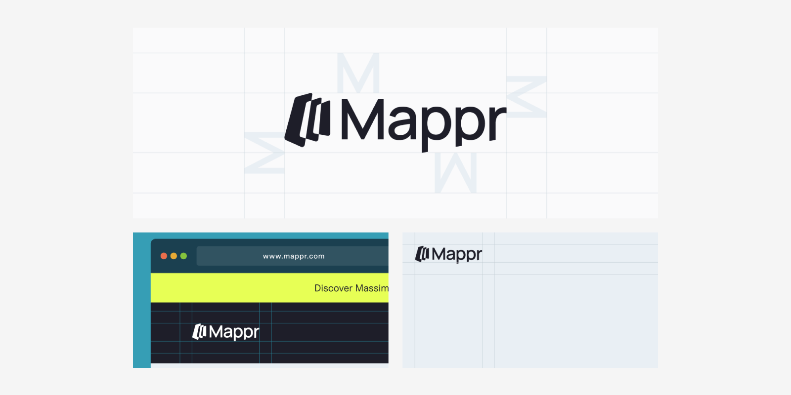
We usually define the exclusion zone by the size of the letter with the largest height. Have a look at the example below: taking the letter “M” as a reference, we start creating the exclusion zone for the logotype of the B2C Travel startup Mappr.
Keep in mind that the exclusion zone is only a visual orientation that helps create clean visuals and layouts, such as letterheads, profile pictures, presentations, etc. The space between the logo and other elements can also be bigger, but it rarely is smaller—except when you get more creative with the design.
If you need to create a profile picture for social media, place your isotype in the center of the frame and keep enough clear space, enabling the symbol to breathe.
How do I use the logo on different backgrounds?
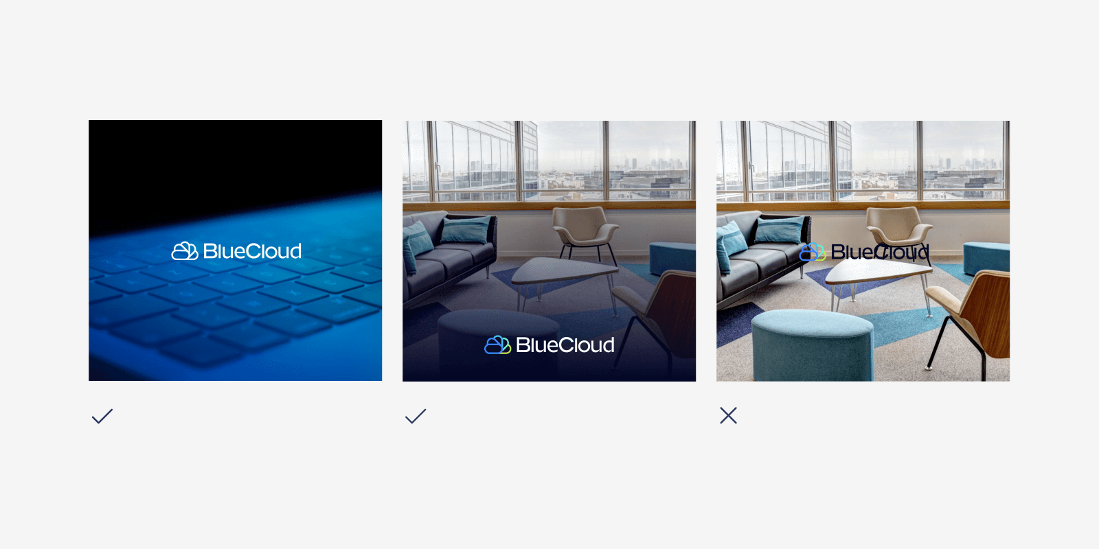
For partnerships or other use cases, your logotype might be used on backgrounds that are not on-brand. You need to make sure that it will still be perfectly legible. We recommend maintaining a high contrast between the logo and background colors If necessary and possible, darken the image with an overlay. Check out the examples below for the B2B company BlueCloud.
In which format should I use the logo of my tech company?
For your logo and any other brand icons, transparency and easy scalability without quality loss are crucial. This is why you will barely use your logo in JPG format as it is neither transparent nor easily scalable.
The most commonly used formats for logos are PNG and SVG, both supporting transparency and different sizes. So, where do you need to use PNG and where SVG?
Website
SVGs are ideal for web use because they are lightweight and can be easily styled and manipulated with CSS and JavaScript. It can be adapted easily for different sizes and resolutions.
Animations
If you want to create animations for your website based on your logo, also animate the SVG version. The weight of the animation will be lower, which is beneficial for web performance.
E-mail signatures
Here, you can use your logo in PNG or JPG. For the whole e-mail signature, HTML is the preferred format because it allows for rich text formatting, images such as logos, links, social media icons, and a consistent layout with the customization of fonts, colors, and layouts.
Social Media profile picture
PNG is generally the best format for a profile image due to its versatility and quality. Ensure the image meets the recommended size and resolution for each specific platform to maintain clarity and brand consistency. 400x400px is one of the most commonly used sizes.
What you need to know about your brand colors
When should I use CMYK, RGB, HEX, or Pantone color codes?
Print Media
If you've ever needed to change the ink in your printer, you'll know that CMYK is used for offline materials, such as printing. CMYK stands for Cyan, Magenta, Yellow, and Key (Black)—the inks you need to refill. For printed materials like brochures, business cards, posters, and packaging, CMYK is the standard color model. When sending files to professional printers, be sure to provide the CMYK codes to ensure accurate color reproduction.
Additionally, you might need to use Pantone colors, which are standardized colors used in printing and manufacturing that typically aren't included in brand books. You can use online "Hex to Pantone converter" tools or manually convert HEX colors in Adobe Illustrator or Photoshop. To ensure the final output meets your expectations, always request print proofs when converting to Pantone for printed materials.
Digital Media
When choosing between RGB and HEX color codes for digital media, such as websites or graphics displayed on screens, many of us can get confused. However, HEX colors are often preferred to ensure precise and consistent color representation.
This is why:
- HEX codes are commonly used in web development and CSS for specifying colors in HTML and style sheets, facilitating the implementation of branding on websites and applications.
- HEX codes allow for specifying colors with high precision, ensuring that the color appears exactly the same across all digital media.
- HEX codes allow for easy manipulation to create color variations, such as lighter or darker shades, without losing the consistency of the main color.
Miqui Troncoso, brand designer at The Branx, points out:
“We work with tech startups, whose priority is to create an engaging website. HEX colors offer us unlimited possibilities and brilliant colors for startup websites. As we are conscious that they will need to apply their brand to other touchpoints, it is important to include the RGB and CMYK colors also in the brand guidelines.”
In general, you can easily convert color codes online. However, consult with a brand designer if exact color matching is critical for your project.
How do I create gradients for my startup brand?
Gradients are a hot trend in design for 2024. They create a sense of depth and 3D, making elements pop on the screen. With a contemporary feel, gradients add dynamism and energy that flat colors can't match, often suggesting next-gen technology or AI.
If gradients are part of your visual identity, consider applying them across different use cases. However, be careful not to overuse them to avoid overwhelming your visuals. See how the AI startup Permio uses gradients across the brand for impactful statements.
This step-by-step guide will help you create a gradient for your startup brand in Figma and how to use it for branded presentation slides.
What you need to know about brand typography
How do I use typography correctly?
Though often underestimated, typography is an essential part of your brand.
Ideally, your brand book provides guidelines on its use and hierarchy, especially for digital touchpoints such as web and other user interfaces. Within a user dashboard or an application, sometimes a font distinct from your primary font is used, mostly a sans-serif—the reason for this is that for such use cases, legibility and easy readability even on small screens are primordial.
Here are some general guidelines to keep in mind:
- Number of fonts: Across all channels, use a maximum of 2 fonts to maintain coherence.
- White space: For all digital and print touchpoints, presentations or flyers, avoid overcrowding with texts. Leave white space and use consistent alignments. The text should only be a visual aid, not the entire content.
- Readability and legibility: Ensure good contrast between text and background, using colors that complement the design. Apply dark text on a light background or vice versa for easy reading.
- Text size: The sweet spot for body text for digital application points is 12-16pt for mobile devices, 15-19pt for tablets, and 16-20pt for larger screens. For presentations, use a minimum text size of 24 points, and headings of 36 points or more.
- Typographic hierarchy: Generally speaking, the H1 header should be 300% of the font size in the body text, and the H2 200%. For example, if you use an 18pt font for your body text, the optimal sizes for your headings are 54pt for H1 and 36pt for H2.
- Line height and tracking: Consider the tracking (the space between letters) and the line height (the vertical distance between lines) when applying your typography, as they can vary depending on whether the font is used for overlines, titles, body text, or CTAs. As a rule of thumb, the ideal line height should be 150% of your body text and 120% of your title. This can be easily adjusted in Figma. While Google Docs and Slides also allow you to adjust line height (150% translates to 1.5), you can't adjust tracking.
In the visual below, you see an example of how a typography hierarchy is defined in a brand book and its application on a flyer, which we created for the Cleantech startup Andluca. You might realize that the font sizes and their usage do not translate 100% - let us explain.
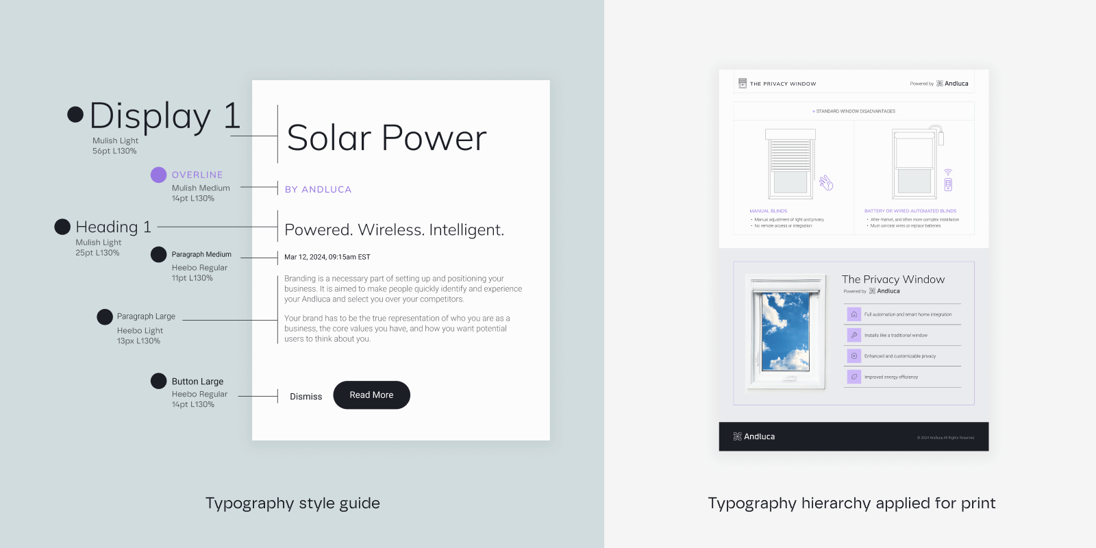
The font size changes due to the size of the flyer, but the relation between the fonts remains the same. However, the font styles are flexible in their usage: the overline is used for the small headings, for instance. As you can see, typography use is not set in stone, but a hierarchy helps you to establish consistency across different brand touchpoints.
What is a fall-back font and when should I use it?
In case your branding agency chooses a licensed or custom font for your tech company, you need a fall-back font too. A fall-back font is a secondary font with similar characteristics to your main font, being used when the primary font cannot be displayed. This ensures that the text remains readable and consistent across all brand touchpoints. Fall-back fonts are typically free, publicly available typographies downloadable from libraries such as Google Fonts.
All our brand books are equipped with fall-back fonts for the following reasons:
- Website performance: Next to different browsers and operating systems that may not support all web fonts, a slow internet connection can also cause trouble when loading a font. Therefore, web developers need to specify fall-back fonts to ensure that the text is displayed and remains readable.
- Mobile applications: Using fall-back fonts can help improve performance and reduce loading times in mobile applications too. Also, different mobile operating systems (iOS, Android) and versions might not support the same custom fonts. Fall-back fonts maintain consistency.
- Print material: Professional printers or other designers might not have your custom font installed. Fall-back fonts can prevent layout issues.
Be careful: Google and Microsoft Office fonts are often not compatible.
This means that while using a free Google font in your Google Slides presentation, you might encounter layout and formatting issues when converting it to PowerPoint, and vice-versa. To avoid these issues, check if there are matching pre-installed fonts on both platforms. If a font is not compatible, look for a similar font with shared characteristics (e.g., sans-serif vs. serif) that works on both systems.
What you need to know about your brand imagery
How do I edit the images to fit the brand imagery style?
To align with your brand imagery, follow the photography guidelines ideally provided by your branding agency. These guidelines typically include specific rules for the subjects portrayed, the scenery, the use of negative space, and adhering to the rule of thirds. Ensure the image style, tone, color palette, composition, and overall aesthetic are consistent with your brand.
When editing images, adjust the colors to match your brand’s color palette. This may involve tweaking the hues, saturation, and brightness. To ensure a consistent look across all images, apply color grading using presets that align with your brand’s look and feel.
In this video, you learn how to easily edit your visual by adjusting the image settings.
What do I need to keep in mind for social media postings?
One of the most common requests from our clients is the creation of social media templates for their startup brand. We typically design those in Canva or Figma. Independent of the design tool, there are certain rules to stick to, especially regarding colors, layout, and imagery style.
The style of the postings varies according to your brand personality, however, you need to keep in mind the following:
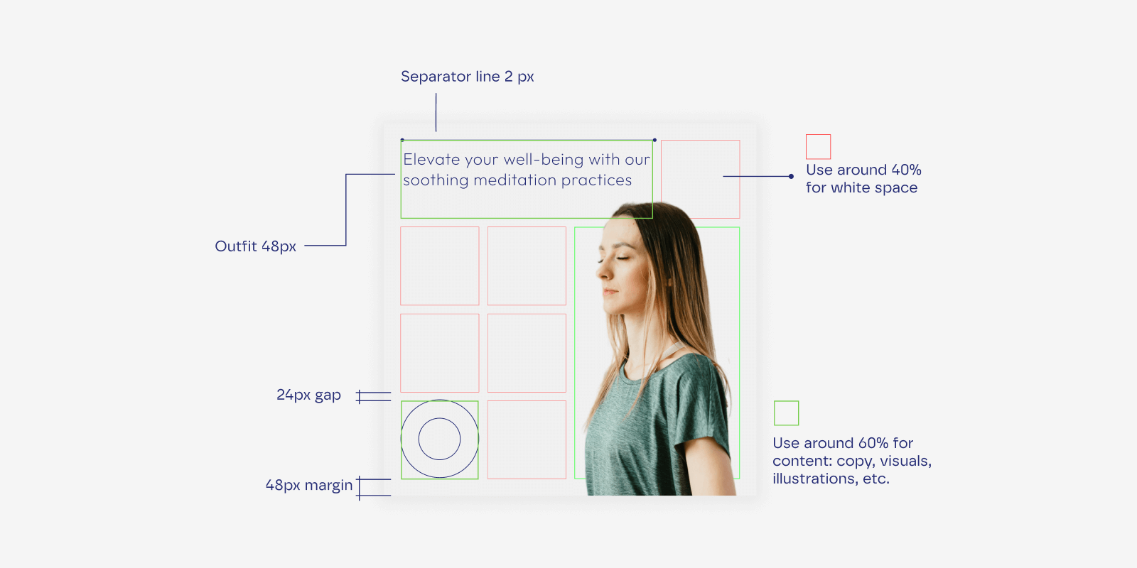
- Keep the copy within the visuals neat, within a maximum of 3 lines.
- Don't overload the visuals, use around 40% of white space.
- Use the same weight for illustrations and separator lines.
- Use a grid of 8x8 to make compositions.
By the way, did you know that Facebook formerly had a rule that stated that no more than 20% of an ad’s image could be occupied by text? It’s no longer enforced or a reason that ads get outright rejected. It is still a guideline, though, and rumor has it that Meta does limit the reach of ads with more than 20% text in their visuals.
What is the 8x8 grid and how do I apply it?
The 8x8 grid maintains even spacing between elements and creates a balanced and organized layout, ensuring consistency and visual harmony. It divides your design canvas into 64 equal squares, with 8 rows and 8 columns. Each square is an equal part of the whole, providing a structured layout. For example, on an 800x800 pixel canvas, each grid cell would be 100x100 pixels.
These grid guidelines help you to organize your content on social media visuals:
- Position key elements like headings or main images at intersections or along grid lines. This draws users' attention and establishes a clear visual hierarchy.
- Align text blocks with the grid to ensure even margins and spacing.
- Place images, icons, and other graphic elements within the grid cells, ensuring they are evenly spaced. This maintains consistent sizing and alignment.
We hope this guide is useful to you. If you have any questions about your visual identity or are considering rebranding, feel free to reach out to us.


.svg)
.webp)