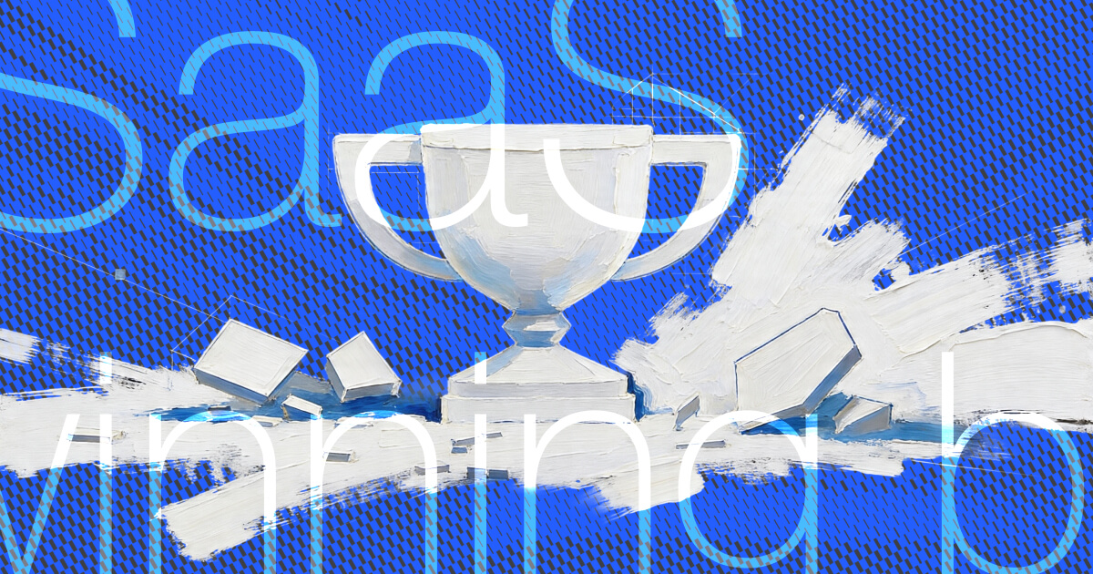
The global SaaS market is projected to reach $1.23 trillion by 2032. What seems already like a long time ago, SaaS was considered a novel way to increase efficiency and save money. Then, companies integrating AI in their SaaS technology became the trendsetters. Now, AI is the norm, the market is crowded, and the pressure to differentiate has never been higher.
Churn rates are rising and chances are that there is already another player out there offering the same value proposition. As a startup founder, you might wonder:
How can I build a standout brand for my SaaS company to gain a competitive edge?
And, perhaps equally important: How abstract can/does my branding need to be? Do I need to scream “AI” to fit in or to stand out?
In this article, we’ll explore best industry practices and what it takes to create a standout SaaS brand. Spoiler: There is no universal answer to the level of abstractness. Both, abstract/tech-heavy and non-abstract/human work—if done right.
Notion branding analysis
Tines branding analysis
Diamo branding analysis
GitHub branding analysis
FAQs about SaaS branding
SaaS branding: What does it take to stand out in the industry?
We’ve gathered 4 standout SaaS branding examples, ranked based on a scale from human-centric to abstract. Let’s start with a very relatable SaaS brand.
Notion
- SaaS sector: B2C, AI
- Location: San Francisco, US
- Target audience: very broad; from product, engineering, design, marketing teams to students, teachers, creators, and personal use
You’re probably using Notion or at least thought about it. Aiming to be as useful and flexible as paper, the workspace platform was one of the biggest tech startups that rebranded in 2024. Notion allows users to create customizable workspaces for various purposes, including personal organization, project management, and collaborative work. With the launch of their AI assistant, powered by ChatGPT and Claude, they’ve rebranded to showcase the new positioning.
Playful yet efficient
The updated visual identity centers on thoughtfulness, play, and experimentation—highlighting the creative freedom that comes with AI-enhanced productivity. Instead of emphasizing AI or tech, Notion emphasizes human qualities, evoking a time when AI still felt like a science fiction concept.
Although the startup has introduced new colors and elements to their visual identity, the branding still communicates simplicity and efficiency.

While Notion still refrains from using bright colors in their app, they’ve introduced yellows, blues, and reds into their color palette to create more impactful and bold OOH advertising campaigns and to be able to express more creativity and play.
Illustrations & AI assistant
They evolved their long-time illustrator Roman Muradov’s distinctive drawings, taking inspiration from artists like Picasso and Rube Goldberg. Before, the illustrated characters were shown from far away, feeling a bit impersonal. To give them more personality and to increase engagement, they zoomed in, moving closer to the characters. These close-ups allow to peek inside their characters’ thought processes and how they bring ideas to life. They led to the concept of the rebranding: “If you can think up an idea, you can make almost anything happen.”
This was to starting point for their visual and also their verbal identity. Their new brand tagline is:
“Think it. Make it.”
The tagline itself uses the rhetorical device of parallelism to create a short, memorizable tagline. Parallelism is characterized by sentences having the same sentence structure. The tagline fits into the experimental approach and highlights the processes behind outcomes. The similarities with Apple’s “Think different.” and Nike’s “Just do it.” are no coincidence: According to the startup, they wanted to evoke the ideas of innovation (Apple) and pushing limits (Nike) with its tagline, encouraging “people to turn ideas into action”.
For their AI assistant, they also stick to their illustrative style. The character is the complete opposite to the sparkling assistants we find out there. Mark Wilson from Fast Company described it like this:
“It looks like if Microsoft’s Clippy grew up drinking dirty martinis and reading New Yorker cartoons.”
Check out their presentation video and see yourself if you agree...
TL; DR?
Notion's branding strengths:
- Artistic approach to communicate creativity
- Human qualities over tech buzzwords
- Modernized brand without losing its essence
Tines
- SaaS sector: AI, cybersecurity
- Location: Dublin, Ireland
- Target audience: security, IT and infrastructure, engineering and product teams
We discovered Tines while researching for a B2B SaaS client—and instantly added them to our "best in class" list. Here's why.

Tines is a no-code automation platform built for security teams. Founded in 2018, it raised Series C funding in 2025 and is on a rapid growth trajectory.
The visual identity of the SaaS unicorn revolves around the narrative “A tool for every story”. This idea celebrates limitless potential—represented by a dotted grid design that appears throughout the brand, symbolizing an empty page full of possibilities.
A balanced look and feel
Tines strikes a beautiful balance between technical sophistication and human-centered design. The grid layout with simplified UI screens evokes a techie look and feel, whereas abstract functionalities are visualized by hand-drawn illustrations of objects like pencils, rubber gums, and elements that remind of children’s games. These visuals balance the tech-functionality of the platform, making abstract concepts feel tangible and approachable.
A palette dominated by purple—with accents of pink, green, and orange—further humanizes the brand. The use of the elegant serif font Reckless for headings adds to its personality.
What stands out on the website of the SaaS company is its navbar: Lightweight and very organized, it allows users to navigate without friction. Although the level of information changes according to the tab, the layout still remains intuitive and functional. Illustrations within the drop-down make the user experience more engaging and draw attention to the most important pages.
TL; DR?
Tines' branding strengths:
- Recognizability due to illustrations and purple tones
- Human-friendly visuals for a technical audience
- Structured, playful web experience
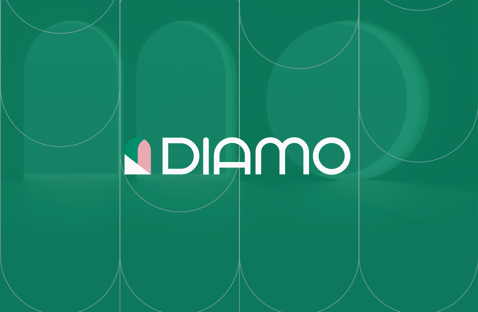
Diamo
- SaaS sector: Travel tech, Marketing tech
- Location: New York, US
- Target audience: independent hoteliers
We've partnered with Diamo, who just got their $4M seed funding, to create their branding and website. The result is a SaaS brand that feels quite charming.
In a space dominated by big hotel chains, Diamo gives smaller players the tools they need to level up. Their AI-powered revenue management platform helps boost bookings and improve financial performance, all while delivering a delightful user experience.
Diamo’s storytelling is focused on a clear theme: Open the door to growth. It positions Diamo as a partner helping hoteliers unlock new opportunities. From the arch-inspired logo to brand shapes and messaging, this narrative runs like a guiding thread through the entire identity, building a progressive, dynamic, and approachable brand with a Mediterranean holiday flair.
Like a soft breeze whispering through the leaves of an olive tree feel Diamo’s color palette: Emerald green brings stability and growth, while pink adds a human touch. Together, they balance tech credibility with hospitality, creating an identity that feels smart and welcoming.

Inspired by Andiamo (“Let’s go” in Italian), the brand visuals capture Mediterranean charm through AI-generated shapes resembling windows and doors. The door-like letters define brand shapes in a realistic photographic style and backgrounds with arch-like patterns.
TL;DR?
Diamo's branding strengths:
- Colors that balance tech credibility with hospitality
- A visual identity that brings laid-back elegance to the SaaS space without losing focus on performance
- Strong narrative: opening the door to growth
GitHub
- SaaS sector: Deep tech, AI, B2C
- Location: San Francisco, US
- Target audience: individuals and enterprise teams around DevOps, DevSecOps, and CI/CD.
GitHub's iconic Octocat has been around since 2008. As the go-to platform for developers, the SaaS company’s brand leans fully into its tech-savvy audience.

The visual identity of the startup is centered around productivity, collaboration, AI, and security. A predominant dark theme with white text evokes a techie look and feel while the neonish gradients in purple-blue or green-turquoise add depth and hint at the use of AI.
Mascots adding playfulness
Product screens and simplified UI elements dominate the content, but now and then, friendly mascots relax the tech-heavy atmosphere.
Beyond the Octocat Mona, GitHub introduced new characters in line with new features:
- The Rubber Duck stems from the world of developers, where “Rubber Duck Debugging” is the act of explaining your code to an inanimate object, like a rubber duck. This method helps in clarifying thinking and identifying bugs.
- The newest addition is the Copilot, representing the latest AI advancements. It supports messaging about the GitHub Copilot product and AI in general.
- The least famous one, Hubot, can perform any task but is not made with the latest AI. While Copilot may be the brain, Hubot is the muscle. In general, Hubot shows up when the surrounding content is regarding automation and productivity.
By the way, here you can have a look at all the (original, retro) Octocat versions the community has been creating.
GitHub is characterized by the following brand attributes: nerdy, confident, smart, imaginative, and optimistic; materialized through verbal and visual language. Depending on the topic, audience, and medium, these attributes flex up and down: quirky for developers, more serious for enterprises. Mona is an icon to the developer community. However, for enterprise material, security, or geopolitical themes, a more toned-down visual language including brand shapes is used.
TL;DR?
GitHub's branding strengths:
- Friendly mascots that balance playfulness with technical depth
- Gradient and dark themes signal AI and innovation
- Visual system adapts to audience and context
Summing up: How to create a standout SaaS brand
How can my SaaS startup stand out without losing clarity?
Start by embracing what makes you different, but express it through a clear, relatable lens. A brand perception map can help find your place.

Notion, for example, leans into human creativity and creates a relatable brand via visuals user can identify with, while still communicating their innovative value proposition. Tines mixes playful visuals with technical credibility. Diamo embraces a holiday charm to deliver a delightful tech experience. GitHub leans into developer culture with a tech-heavy visual language surrounded by abstract mascots.
You don’t need to shout or be weird for the sake of it. Instead, find a position that’s authentic, focused, and emotionally resonant—then express it consistently across every touchpoint.
Don’t know where to start with your brand strategy? Download our brand strategy toolkit and create a winning strategy.
Should my branding focus on technology or on storytelling?
Both—but storytelling wins hearts. Technology wins trust. Brands like Diamo and GitHub show that you can highlight your tech through story-driven metaphors (like narratives such as the door-concept or mascot narratives).
How important is my startup’s name?
It’s important—but not everything. Names like “Notion” or "Diamo" are broad and conceptual, while “Tines” is more abstract, and “GitHub” is literal. The key is that your brand gives the name meaning, not the other way around. So pick a name with room to grow and layer in meaning through your visuals, tone, and UX.
What do I need to keep in mind for a successful SaaS startup brand?
Start with a clear positioning: What do you solve? For whom? And how are you different? Then build a visual and verbal identity that embodies your brand’s personality—from tone to typography. Make sure every element (site nav, illustrations, mascots, colors, tagline) works together to reinforce that identity. And finally: Be consistent. Recognition is a result of repetition.
If you need help creating your startup brand, reach out to us. As a startup branding agency, we're helping SaaS companies like yours stand out in the industry.
Sources and image credits:
Notion: https://www.notion.com/blog/the-thinking-behind-our-latest-brand-campaign, https://buck.co/work/notion-think-it-make-it
Tines: https://www.tines.com/blog/a-new-look-for-tines/, https://dokument.studio/work/tines
Diamo: https://thebranx.com/work/diamo
GitHub: https://brand.github.com/, https://buck.co/work/github-what-is-github, https://buck.co/work/github-universe-2023


.webp)