The future of animal-free protein
Vivici is a biotech startup with a mission to meet the world's growing demand for sustainable and nutritious protein. They employ precision fermentation, a process that enables them to produce sustainable protein for a wide range of food and recipes.


As feeding the world with animal-derived protein is not feasible in the long run, Vivici joined the animal-free protein revolution and is now looking to make their mark in the industry. As a spin-off of DSM and Fonterra, Vivici leverages decades of experience in developing and scaling bioprocesses and holds world-leading knowledge in the isolation and application of dairy proteins. The biotech startup approached us seeking a branding and website that would set them apart from other competitors in the animal-free dairy protein market, while effectively communicating the company's sophistication and scientific background.
Concept & Strategy


“Small changes, big impact” serves as the guiding principle behind the branding of the startup, inspired by the butterfly effect. We developed this concept during the logo design process and continued using it as a motto throughout the creation of the visual identity. After analyzing the competitive landscape, we felt that Vivici would need to reflect an organic, straightforward approach and communicate in a clear, realistic way to its audience, making the science behind its process easy to understand. From the imagotype with its approachable isotype to the refined combination of custom-made illustrations with food photography on their website, Vivici's visual identity makes the science behind the technology more accessible to the target audience and clearly communicates their value proposition. What added further complexity to the project was their request to subtly reference DSM and Fonterra: this was reached by some brand elements bearing a resemblance to the parent companies. As a result, Vivici is portrayed as a progressive, disruptive, yet friendly company that is poised to lead the animal-free protein industry.
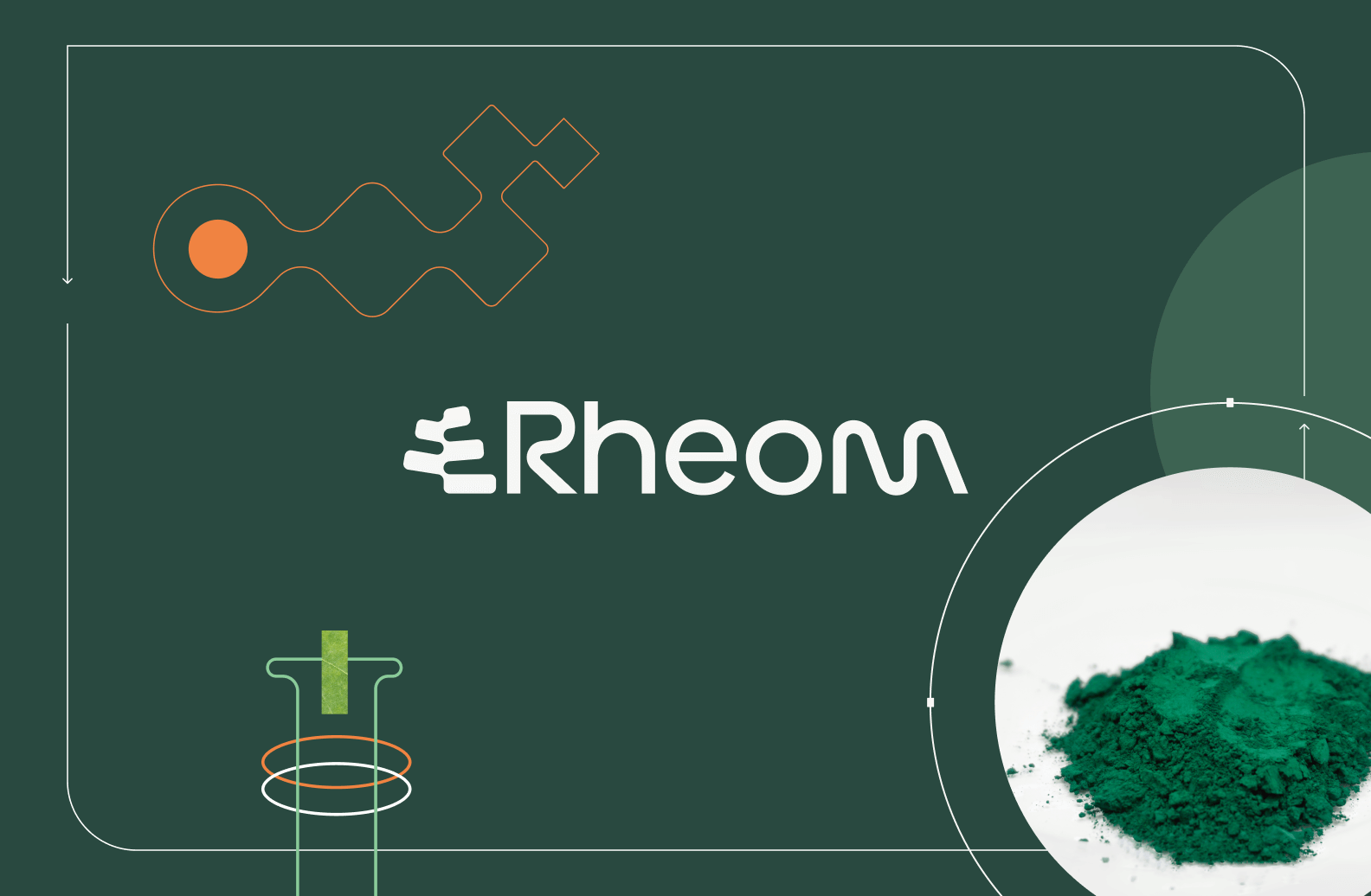
Logo


The combination of science, health, and nature is represented in the imagotype: the bold lettering establishes a connection to the tech sector and evokes trust through its use of capital letters. The counterform of the “C” matches the isotype, which features a soft shape to create balance, making the brand approachable and human. The overlapping elements symbolize both a "V" and a butterfly, representing the combination of nature (depicted by a leaf) and precision fermentation —the protein production process employed by Vivici. This design also reminds of the butterfly effect. The lettering of the logo seamlessly complements the isotype, maintaining a harmonious visual rhythm.
Colors

To strike a balance between a straightforward, modern, and scientific aspect and a calm, friendly, and nature-related brand, we created a color palette that communicates both facets. After various reiterations, we drew inspiration from legumes, cereals, and nuts, resulting in a pastel color palette with greenish and earthy tones. Black was added to convey modernity and establish trust in the company. In combination, these colors harmonize perfectly and are ready to be applied to all brand assets.
Typography

In order to create harmony within the overall visual identity, we went for a clever combination of two typefaces: Plus Jakarta Sans and Beslye. Plus Jakarta Sans is a modern sans-serif font with a clean, minimalist design. Its uniform stroke widths and rounded edges create a friendly and approachable feel. On the other hand, Besley is a classic serif font with a traditional and elegant look, featuring sharp serifs and subtle contrast between thick and thin strokes, ensuring high legibility. While Plus Jakarta Sans primarily serves for body text, both typefaces are combined in headings for eye-catching elements. The contrast between the two fonts results in a unique and dynamic typography, ensuring versatility and readability.
Illustration


The illustrational style encompasses a combination of custom-made illustrations and photography of food items. The fine lines of the illustrations have traces of being hand-drawn with a pencil, which gives them a human feel while maintaining the necessary precision to communicate the scientific content effectively. Thus, the illustrations clarify concepts that would not be apparent through photography alone. To enhance visual appeal, we added touches of color using the predefined palette, aiming to create "an encyclopedia full of life."
Website


The ultimate goal of Vivici's website was to captivate the target audience, stakeholders, and investors by communicating clearly and explaining the scientific process. By leveraging the branded illustrations, we effectively conveyed the startup's deep industry expertise in a compelling and human way. The homepage features a short, ingeniously integrated video sequence in the above-the-fold section, creating intrigue and enticing users to scroll and learn more about the company. Throughout all pages, the illustrations guide the user through the sections, offering a lightweight and understandable presentation of Vivici's scientific approach. The highlight is the technology page featuring a step-by-step illustration of the precision fermentation process. The website efficiently communicates Vivici's value proposition, enhancing the explainability of the startup's technology and establishing the company as an approachable, knowledgeable, and dynamic partner.
Brand Communication and Collaterals
.png)
In July 2024, Vivici assisted the IFT First (Food Improved by Research, Science, and Technology) in Chicago. Alongside researchers, scientists, engineers, and entrepreneurs from across the globe, the Sustainability startup presented its Beta-Lactoglobulin, the new standard in protein. For this occasion, we assisted them in designing their booth, flyers, and product detail sheets.
Women in science 2025

In February 2025, Vivici celebrated the accomplishments of women in Science; and in particular of their Science team who push the boundaries of food innovation every day. Their work isn’t just about creating better products; it’s about shaping a more sustainable food system for the future.
Related projects