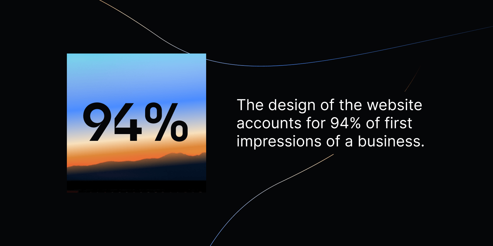
The design of a website accounts for 94% of first impressions of a business. The flipside is: 88% of users are less likely to return to a website after a bad experience. Slow load times, non-responsive pages, poor navigation, and outdated design are the top reasons for users to leave a website.
Just as fashion evolves, so do websites. But in tech, it’s not (only) about chasing trends; the challenge is to create websites that work for the target audience. Startups need to focus on clarity, credibility, and conversion.
When a company is targeting multiple markets (think B2B and B2C), the challenge to create a web that appeals to the each audience is even bigger.
In this blog post, we unveil which tech websites have absolutely nailed it in 2025 and which trends will continue to work in 2026.
Example #1: Vercel
Example #2: Lovable
Example #3: Jeton
Example #4: Diamo
Example #5: Formless
More top startup websites 2025
Web design trends 2026
TL;DR: Key takeaways
2025’s best tech websites
Discover the top 5 tech startup websites that stand out in 2025 with design and functionality.
We've analyzed hundreds of tech startup websites to bring you the ones that truly stand out. Also, we’ve added those who were among our favorites but haven´t made it into the ranking as a goodie. Each one teaches us something valuable about web design, user experience, and brand communication.
#1 Vercel
Vercel.com is a leading deployment platform for modern frontend development.
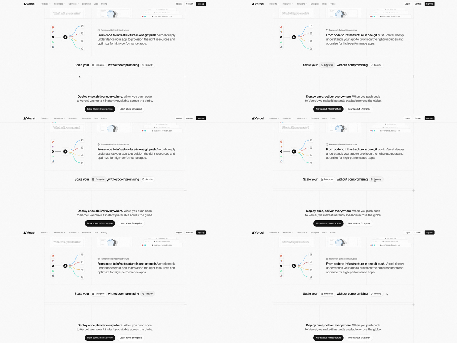
Everything about the SaaS site seems to be designed with developers in mind. Simple, easy to navigate, and without decor or ornaments, the web exists in dark and light modes, according to the user’s system settings. Clear contrasts, grids, and minimalist illustrations form part of the straightforward approach.
Key features:
- Minimalist colors: A restrained palette conveys authority and technical confidence.
- Bento grids: highlight key aspects of the product, each in its own interactive tile. Each tile (or “bento block”) contains an illustration and the link to the detail page.
- Functional clarity: The design isn’t ornamental; it organizes information by function.
What we especially liked: The simplicity. It’s a deeply functional, smooth, high-performing web. Also, the clever integration of buttons like “Enterprise” and “Security” in headlines and statements. They add to a smooth user experience and make simple text more engaging.
What could be improved: Brand distinction and recognizability. Though this is more of a strategic branding question, adding some elements for brand recognition to the branding could be worth a try.
Design lesson
Less is more.
Vercel’s website shows that simplicity and elegance often win over being loud and extravagant, especially in the B2B SaaS sphere. When communicating clearly with smooth user flows and on-point illustrations, brands don’t need immersive design ideas to convince.
#2: Lovable
Lovable.dev brings the open-source spirit to life through an interface that feels both friendly and efficient. The platform positions itself as a collaborative hub where developers can share tools, insights, and projects, bridging the gap between creativity and code.
Visually, Lovable’s website is a standout example of modern tech website design. A fluid gradient background shifting from blue to pink and orange instantly captures attention, creating a sense of movement without overwhelming the content. It’s a visual metaphor for what the platform represents: progress, accessibility, and collaboration.
Key features:
- Gradient design: adds depth and dynamism while maintaining clarity. A high-contrast warm and cold color palette with blue to orange hues captures a feeling of an array of possibilities and brings personality into tech, relating to the startup’s name.
- Clean navigation: focused on helping users start building quickly, with part of the interface as CTA right in the above-the-fold.
- Community showcase right on the homepage: highlights real user projects, reinforcing authenticity and trust.
What we especially liked: the fact that a tender name and isotype can work for a tech-heavy development platform. Also, the B2C and B2B pages have the same look and feel, which adds to brand recognition.
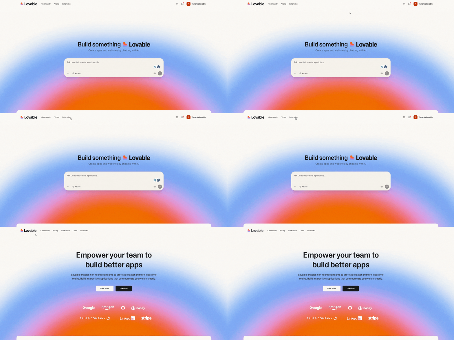
What could be improved: If we had to find something to criticize, … The grey boxes on the enterprise page feel a bit unfinished, as if there was some color missing. But honestly, well done, Lovable.
Design lesson
Beauty and simplicity can coexist.
... even in the development sphere. A well-crafted visual design doesn’t distract from functionality; it strengthens it.
#3 Jeton
Jeton.com has positioned itself as a Fintech platform built with visual daring and clarity of purpose.
Its website stands out in a category dominated by conservative blues and muted palettes by embracing a bold pink-to-orange/red gradient that signals energy and innovation. Talking about blue and a more conservative tone: jetonbank.com is for businesses and does have the traditional Fintech blue tones and business imagery.
Key features:
- The vibrant pink-to-orange gradient: not only visually differentiates Jeton but also gives the brand a youthful, high-energy feel in a traditionally conservative financial space. The gradients are not just decorative; they build brand memorability and visual momentum.
- Elegant 3D illustrations: Coin-shaped metaphors, layered visuals, and abstract 3D elements reinforce the idea of money moving and value flowing, making the product feel dynamic and modern.
- Step-by-step transaction flows: The website clearly presents user flows (Add, Send, Exchange) with visual feedback and minimal friction, demonstrating usability and transparency.
- Balance of playfulness and credibility: is found in engaging visuals backed with trust signals (security badges, regulatory licensing, real-user testimonials) to maintain financial credibility.
What we especially liked: The interactive currency conversion rates section. By clicking on the currency ball, users can play with it like on a playground.
What could be improved: Navigation on the homepage. The homepage is quite long, with big sections that occupy the full screen, forcing users to keep scrolling until they find what they’re looking for. The home could benefit from a side navigation bar to improve user experience.
Design lesson
Dare to be different.
In conservative industries such as finance, design that stands out can become your competitive advantage. Jeton shows how a fintech brand can adopt a vibrant visual identity without compromising trust.
#4: Diamo
Diamo.ai is a TravelTech startup that empowers independent hoteliers with AI-powered revenue management tools. Its digital presence combines technical sophistication with hospitality: a perfect, yet uncommon blend in the travel tech space.
Every part of the web design reinforces Diamo’s mission: to help hoteliers “open the door to growth”. This concept defines the entire user experience: from logo structure to layout composition, a consistent and memorable brand story is created. Rounded shapes and arch motifs recall hotel doors and windows, instantly connecting the product’s purpose to its audience.
Key features:
- Strong storytelling: The “door to growth” metaphor appears in visual elements, turning a functional website into a narrative experience.
- Balanced color palettes: made of muted greens and pinks express harmony and optimism, enhanced by neutral backgrounds that project professionalism.
- Scroll-triggered animations and floating key metrics: maintain engagement while guiding the visitor naturally. Statistics (such as 9% revenue increase and 3x ROI) are displayed prominently to establish instant credibility.
- UI screens: allow users to explore real dashboard interfaces without leaving the page.
What we especially liked: the consistent storytelling around “opening the door to growth” that expands from the logotype to visuals. It’s a strong narrative and sets the direction for creativity in company videos and other communication material.
What could be improved: Real-time Storylane demos of the platform could be integrated to make it even more engaging, just like on north.cloud.
Design lesson
Storytelling is what makes a brand memorable, even (and especially!) in tech.
The TravelTech website balances intelligence with emotion and proves that visual identity is not just decoration, it’s differentiation.
#5 Formless
Formless.xyz redefines how digital products express innovation through design. The site blends generative aesthetics* with spatial interaction*: Visuals dynamically evolve and respond in a 3D-like digital space. The web experience feels dynamic, alive, and intelligent.
Formless builds its story through movement, light, and clarity. The homepage feels less like a landing page and more like an environment: fluid, responsive, and conceptually bold.
Key features:
- 3D scroll and hover interactions: Subtle layers of motion create spatial depth, making users feel as if they’re navigating inside a living interface.
- Minimal text, maximum clarity: found in short and impactful copy, with clear hierarchy and generous whitespace guiding focus.
- Mission-first approach: leading the storytelling concept. "The future of the internet" is proposed before introducing product features or services.
- Angular forms (as in the isotype) and clean typography: reinforce the sense of structure and intelligence associated with blockchain and AI—contrary to the company name.
What we especially liked: the explosion of color that comes with fast mouse movement in the background. However, it’s a clear desktop-first design approach (!).
What could be improved: We did a quick pagespeed.web.dev analysis and were not surprised by the outcome, as hover interactions and animations in the background use to come with a decrease in page speed. In fact, the website failed the “Core Web Vitals Assessment” with only a 35% score in performance, e.g., Largest Contentful Paint: 7.6s.
Design lesson
Technology can be transformed into an immersive experience.
By combining a strong narrative with spatial design and subtle generative motion, the site transforms abstract technology into a tangible experience. It’s an example of how tech website design in 2025 merges storytelling and interactivity.
*Generative aesthetics means visuals that evolve and react, rather than being static. In practice, this can look like shapes or gradients that shift based on data, cursor movement, or time. It reflects how AI or generative systems produce design dynamically.
*Spatial interaction refers to depth and movement in digital interfaces: layers, parallax effects, or 3D motion that make a flat screen feel like an environment you can move through. It’s about creating a sense of space and immersion instead of a two-dimensional layout.
More successful tech websites of 2025:
- Ory: huge website with clear information and page hierarchy, neat and without distracting the user. Simplicity wins. Every element serves a purpose, and the technical complexity is hidden behind an intuitive interface.
- North.Cloud: futuristic-looking website for the FinOps/Cloud startup with consistent storytelling centered on the universe theme. Against the dark background, the signature violet color guides the user’s attention. Storylane integrations work perfectly to explain the product. Explore the North brand further in our case study.
- Base44: similar value proposition and design approach as Lovable. The tech website also uses gradients, but its look and feel is less techy but more human: pastel colors remind of a sunrise or a sunset, which is also visible in the isotype and in the CTA (our design highlight).
By the way, did you know that Base44 was only launched in January 2025 and it already got acquired by Wix 5 months later? Also, it was a one-person bootstrapped project, built, developed, and marketed by Maor Shlomo.
Tech web design trends 2026: A preview
Purposeful motion
Animations and motion elements remain effective in communicating complex tech products and to provide an immersive experience. However, in 2026, motion is guided by intention and needs to fulfil a practical need. If users feel overwhelmed, they most likely drop off.
So, never use motion without a clear purpose.
- Micro-interactions, scroll-based transitions, and UI previews can highlight how a SaaS platform or AI tool works. They become a tool for clarity, demonstrating functionality, data flow, or process automation.
- Motion guided by user interaction, such as interactive backgrounds (see Formless), adds to an engaging experience without overwhelming users.
Remember: the dose makes the poison.
Bento grids
Bento grids (see Vercel) are part of a broader design trend ongoing since 2024. Those layouts are an excellent choice to present information in an organized way, providing enough design flexibility to add illustrations and even subtle interactive elements in each box.
Merging branding and UI
We’ve seen this in Lovable, Base44, and in North. The design system carries through from branding (logo, color palette) into UI and website interaction, with the web often reminding of the proper platform interface. This enhances brand recognition and provides a smooth user experience from the first brand touchpoint to the final product.
Less is more
“Less is more” in web design is the shift toward reducing visual noise so the product can speak for itself. Instead of layering animations, decorative graphics, or oversized storytelling, especially big established tech brands focus on precision: fewer elements, clearer hierarchy, and interfaces that load fast and feel intentional.
Vercel is a strong example of this principle: a clean, high-performance experience where the design frames the technology instead of competing with it.
Key web design takeaways
TL;DR? Here are your main takeaways:
- Clarity over complexity: Each site communicates its value proposition immediately and clearly. This means stripping away anything that does not support comprehension, credibility, or conversion.
- Performance matters: Fast load times and smooth interactions are non-negotiable.
- Brand consistency: The website should feel like an extension of the product.
- User-focused design: Every element serves the user's needs, not just aesthetic preferences.
- Technical excellence: For tech companies, the website itself is a demonstration of capability.
Whether you're building your first startup website or redesigning an existing one (on your own or with the help of a startup branding and web design agency), the above examples provide a roadmap for creating something truly exceptional. The best tech startup websites don't just look good; they work seamlessly, communicate clearly, and leave lasting impressions.
Sources:
https://vwo.com/blog/web-design-statistics
https://dev.to/watzon/25-web-design-trends-to-watch-in-2025-e83
https://en.wikipedia.org/wiki/Base44
.svg)