A tech startup’s website serves as its digital identity. This is where you need to make an excellent first impression, capture customer interest, and establish trust. Your startup’s website design often has a say in future growth (next to branding).
In this blog post, we give you tips on how to create a website for your tech startup that stands out in 2025. These advanced insights from our expert team take web design one step further, assuming you've already covered the web design basics (see further down).
1. Start with optimizing your website’s navbar
A well-designed navbar is key to helping visitors quickly find information and take action. Especially websites with many pages benefit from a clearly structured navbar (and footer!).
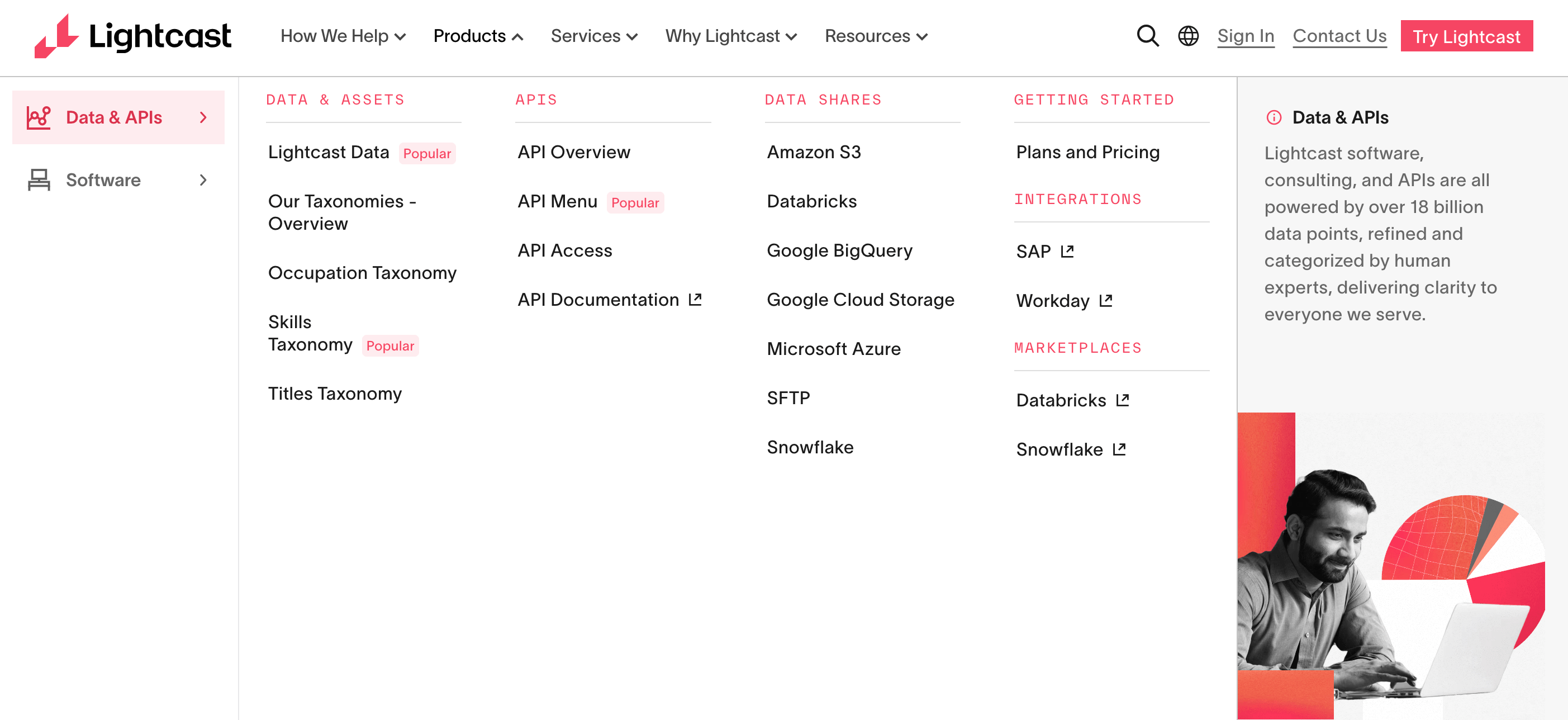
Check out this example from Lightcast.

The HR company’s website is huge and the navbar reflects this; however, it’s easy to capture, read, and navigate. This example is the dropdown of the tab “Product”: With six columns in total, it’s still accessible and the user gets a good overview of the offering. The very right column breaks the layout; the visual at the bottom adds a human touch to the otherwise very neutral and classic design.
How can I optimize the navbar?
- Limit menu items: Keep primary navbar tabs to five to seven clear, descriptive links. Avoid overwhelming users with too many choices.
- Order by importance: Place the most important sections, like “Pricing” or “Get Started”, on the far right or use high-contrast buttons. Typically, “Features” or “Product” are placed left.
- Use concise language: Stick to simple, familiar terms (“Home,” “Features,” “Contact”), and don’t get overly creative. Avoid long terms.
- Make it visible: Use sticky nav so the menu remains accessible as users scroll.
- Highlight your call to action: Use a button or color accent to draw attention to a key action in the navbar.
- Ensure mobile usability: Collapse navbars into a hamburger menu and prioritize essential links for smaller screens.
- Use columns in the drop-down: Don’t be afraid of adding pages. If your site is big, the navbar should reflect this. Use columns to structure the pages in the corresponding drop-down.
- Make best use of space: Maybe, not every drop-down has the same number of pages. Use white space to add highlights.
2. Prioritize scannable, clear information
Most visitors skim websites rather than reading every word. Your design and content should cater to this behavior by making key information easy to spot and digest.
How can I improve visual hierarchy and readability?
- Use highlights: Highlight important information with bold headings, bullet points, and concise subheadings.
- Break up text: Avoid large blocks of text. If you’re struggling, ask your favorite AI to shorten the text 30% if necessary to make the content better scannable. But: Always double-check AI content.
- Focus on CTAs: Ensure your calls-to-action are prominent and easy to understand, using action-oriented language like “Sign Up Now” or “Learn More.”
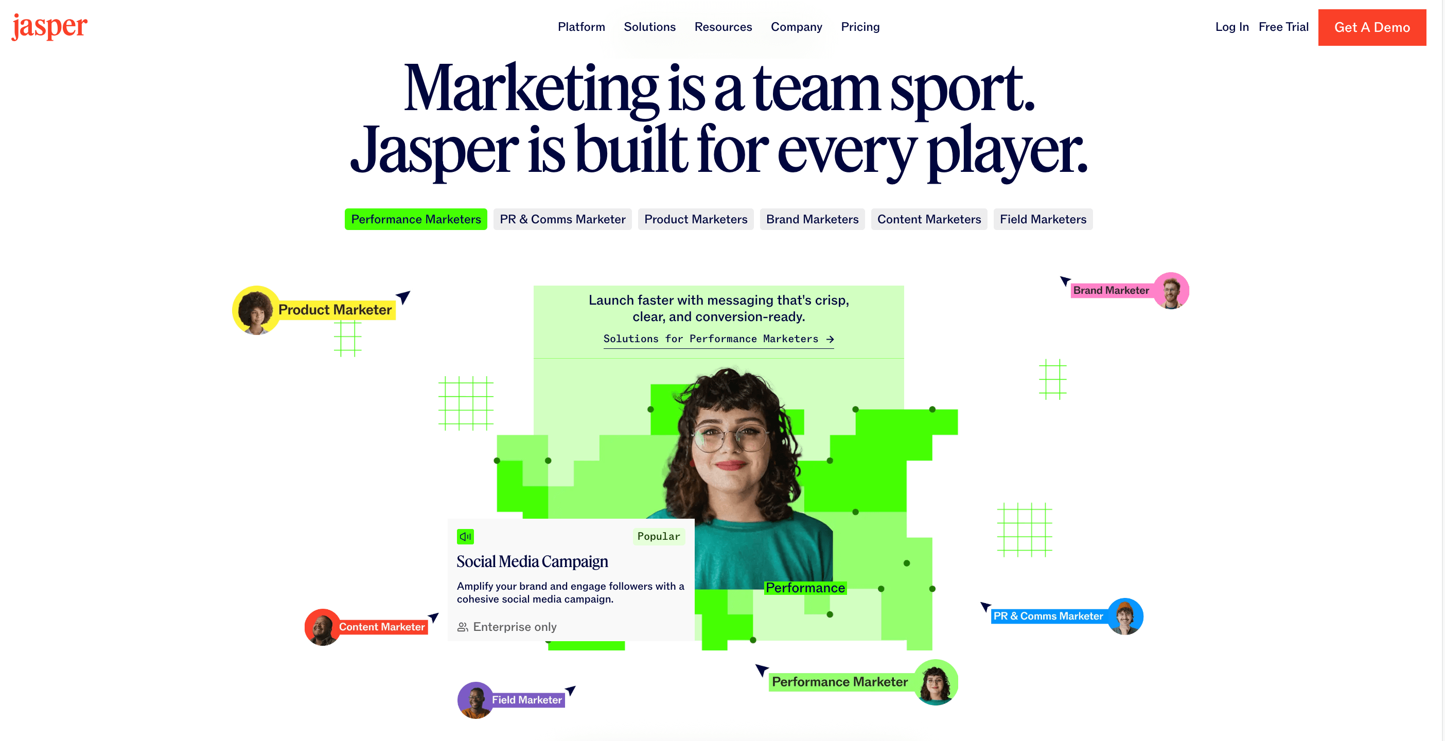
- Incorporate visuals with text: Use images with short copy elements and infographics to convey information quickly and effectively. Check out the example of Jasper.

3. Build for flexibility and scalability
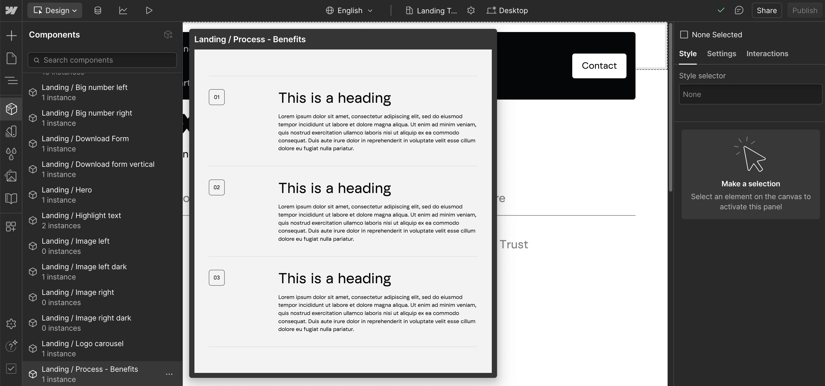
Your startup will most likely grow and so should your content. Also, you’ll need to constantly update and revise your content in order to be relevant for search engines and AI algorithms. That’s why, when doing your wireframes, you should pay attention to “reusable”, flexible sections or components. Web designers and developers can build template pages (in Webflow, for instance), which you can fill with the template sections/components you need and change their order, like playing with Lego blocks.
How can I prepare my startup website for growth?
- Use modular design: Create reusable sections that can be easily rearranged or updated without redesigning the entire page.
- Choose flexible platforms: Opt for tools like Webflow or WordPress that allow for easy updates and customization.
- Plan for scalability: Design templates that can accommodate additional content, such as new product categories or blog posts, as your startup grows.
- Incorporate dynamic content: Use CMS (Content Management System) features to automatically populate sections like “Latest Blog Posts” or “Featured Products.”
- Test for usability: Ensure that your flexible design doesn’t compromise user experience by testing different layouts and section orders.
In the screenshot, you see all the components we created for a possible landing page. We don’t have to use all of them for creating a page, but we possibly could (although the page would be quite long). The goal is to give marketers flexibility and to allow them to create pages (such as feature pages or landing pages, which use to follow a template) without web designers or developers. See the final landing page here.

4. Talk “human tech” to humans
As fast as AI gets trained, people also get trained to spot AI. Whereas customers in certain cases appreciate AI (like chatbots who deliver fast answers), in some areas, humans still need human communication. People connect with people.
How can I connect with my startup’s audience?
- Be natural: Take product walkthroughs for instance: overly scripted videos with an AI-voice might not be as successful as a real human voice guiding you around.
- Give your copy a human feel: Microcopy on forms and error messages saying “Oops, something went wrong. Let’s try that again” feels far more relatable than “Input validation failed.” When the tone is human, the experience feels more user-friendly.
- Include team videos and video testimonials: Featuring short team introduction videos or behind-the-scenes content builds credibility and shows the real people behind your startup. Video testimonials from clients or users are especially effective. They provide social proof and communicate trust in a way that text alone cannot.
5. Cover the website basics
At this stage, we assume you’ve already covered the basics of a successful web design in 2025. The following points are essential in the design and development of a good startup website.
Make sure…
Your website is visually appealing and aligned with your startup’s branding:
- Consistent visual identity (logo, color palette, typography)
- High-resolution logo in SVG format
- Clear brand messaging and tone of voice
- Favicon for browser tabs
- Visual hierarchy that supports the brand’s personality
- Accessible color contrast and scalable fonts
You instill trust in investors and potential customers:
- Video testimonials combined with written statements
- Highlights of Net Promoter Scores
- Client logos
- Case studies and success stories
Your website is fast and secure:
- Mobile-first responsive design
- Page loads under 2 seconds (on 4G/mobile)
- Web-optimized image formats (e.g., WebP)
- Minified CSS/JS files
- Secure HTTPS (SSL certificate)
- Regular backups and version control
- Error-free code and browser compatibility
Your next steps to a successful startup website
- Audit your existing website following these tips.
- Identify areas needing improvement.
- Create a six-month action plan to implement these changes.
Taking the first steps in optimizing your website today ensures a strong, scalable foundation for tomorrow’s growth.
See how our team implemented these principles in our Diamo project, helping the travel tech startup scale their platform with a flexible, beautiful website.
Sources and further reading:
https://pixolabo.com/the-ultimate-2025-website-checklist
https://www.hostinger.com/tutorials/website-launch-checklist
https://contentsnare.com/website-design-checklist
https://jasper.ai
https://lightcast.io/


.svg)