In 2025, several tech brands revisited their visual identity to clarify positioning, strengthen brand strategy, and respond to changing market expectations. Some updates sharpened perception and reinforced leadership. Others exposed gaps between design and reputation.
Here are four tech rebrands that improved brand clarity and one that raised tougher questions.
The TL;DR for those startup teams with little time:
1. Tripadvisor refocused its brand identity around user-generated content, reinforcing trust and authenticity in travel tech.
2. Ticketsolve refined its visual system and messaging to reposition from ticketing software to growth partner for arts and culture organizations.
3. Metricool shifted toward category leadership in social media management through a more human-centered brand strategy.
4. Eventbrite introduced a flexible “path” symbol that captures anticipation and strengthens recognition in event tech.
5. Amazon unified its brand architecture across sub-brands, but public criticism highlighted the limits of visual identity when reputation challenges remain unresolved.
6. More tech startup brandings that got really exciting recently.
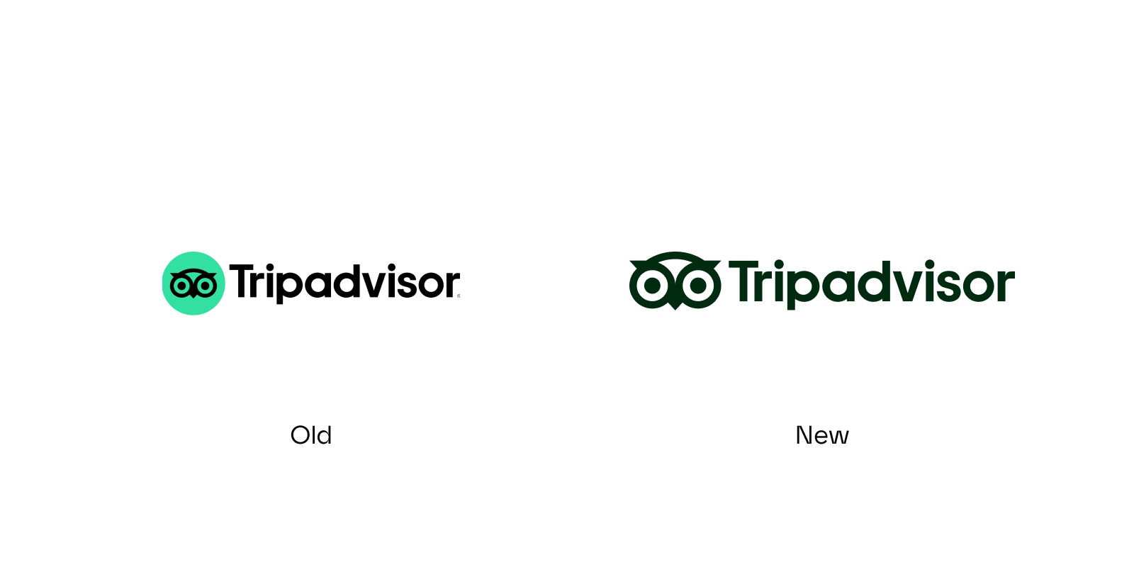
Tripadvisor: Where users have the say
After expanding from a review site to a global trip planning and booking platform, Tripadvisor needed a brand identity that could keep pace, without losing its roots. They collaborated with the design agency Koto to update their branding.
With its 2025 rebrand, Tripadvisor anticipated one of the key design directions of 2026: human-focused brands that even bring nostalgic elements back.
Instead of emphasizing scale or technology, Tripadvisor returned to its foundation: real experiences and real reviews. When unveiling the rebrand on LinkedIn, they wrote:
“If you’ve ever shared a review on Tripadvisor, congrats, you’re part of this story.”
Bringing travellers back to the center
The core idea is straightforward: real experiences over algorithms. That thinking shapes the visual identity, as Koto explained:
“The idea was simple: celebrate the wisdom and excitement of travelers everywhere, and remind the world that authentic advice still matters.”
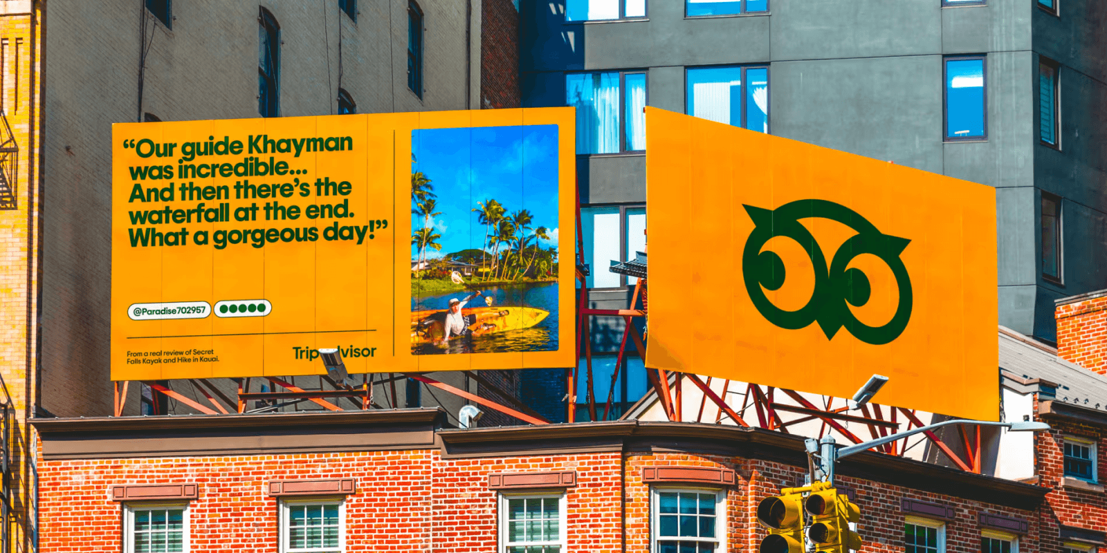
- Real photos: They are not just decorative elements; user photos now lead campaigns and brand communication. On some photos, a subtle grain effect adds a cinematic, nostalgic touch and enhances authenticity.
- Real quotes: The bolder the review, the better. They appear as central visual elements, not supporting copy.
- Real user names: 577SusanH, john2405, and thousands more are the protagonists. Usernames are credited visibly, reinforcing authorship and trust.
Refreshed brand elements
Alongside the strategic refocus, several design elements were updated:
- Brand symbol: Olli, the owl, remains. The character is more flexible and animated, which adds movement without changing the core symbol. Now, he can even peek, point, and wink! This adds more personality and playfulness to the brand.
- Brand colors: The green is warmer and slightly brighter. Additional tones such as Trip Pine and Trip White expand the palette.
- Typography: The custom typeface Trip Sans, paired with postcard-inspired frames and graphic markers, gives structure to long-form content and product UI.
Why this tech rebranding is a win
Trust through authenticity. Founded in 2000, Tripadvisor created a space where travelers could read and publish honest reviews without relying on traditional travel guides or brochures. At the time, that model challenged how travel decisions were made.
Today, the context has changed. Digital platforms are crowded with generic, automated, and AI-generated content. In that environment, a brand built on human input gains renewed relevance. Tripadvisor continues to position itself around the voices of millions of travelers who share recommendations, opinions, and lesser-known places.
“For 2026, this focus on authenticity, user-generated content, and honesty could be a main differentiator for tech brands.” (Miqui Troncoso, Brand Designer at The Branx)
In an online space where it is increasingly difficult to distinguish between real and generated content, trust carries weight. Information is abundant, but credibility is not.
Through its rebranding, Tripadvisor reinforces its identity as a travel platform centered on real stories and lived experiences.
Ticketsolve: Curtain up for a new era
As Ticketsolve expanded beyond ticketing into a broader platform for arts, culture, and events organizations, its brand needed to reflect that shift. The company was no longer “just” a ticketing system. It had evolved into a partner supporting marketing, fundraising, operations, and audience development.
We partnered with the Irish tech startup Ticketsolve on a full brand strategy and rebrand, covering messaging, visual identity, and website design. The goal was alignment: product reality and brand perception needed to match.
Correcting perception without losing recognition
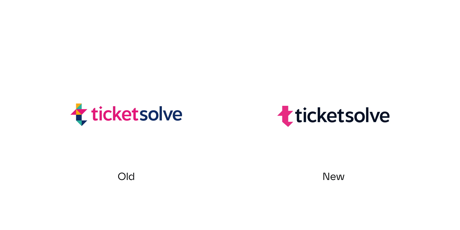
The name stayed. Recognition in the sector mattered.
The challenge was the wordmark. Visual emphasis on “ticket” narrowed perception. The solution was refinement rather than replacement.
The result:
- A unicolor wordmark with more balanced visual weight
- Reduced emphasis on “ticket”
- A simplified isotype with less decorative playfulness and stronger clarity
A cohesive and scalable visual identity
The updated visual system communicates maturity, clarity, and platform depth.
Key updates included:
- A simplified and more cohesive color palette
- Boldberry as the primary brand color, symbolizing passion and long-term impact
- Supporting tones to ensure flexibility across digital and print applications
- Illustrations as functional tools that visualize the platform’s features and usability
Why this tech rebranding is a win
This rebrand shows that effective repositioning does not require dramatic visual change. Adjusting hierarchy, messaging architecture, and design systems can shift perception meaningfully.
Ticketsolve moved from “ticketing software” to “growth partner for arts and culture organizations” through precision, not reinvention.
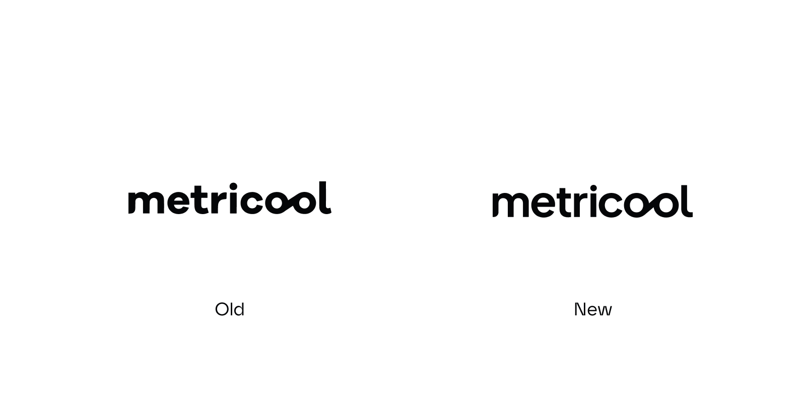
Metricool: Built for work, designed for life
Metricool outgrew its identity as a practical analytics tool. As the platform expanded globally, the brand needed to signal leadership within social media management software.
We supported the Spanish tech startup's transition with a revised brand strategy and digital rebrand focused on differentiation and category positioning.
From tech to B2H
Competitive research showed that most social media management platforms communicate in a technical, dashboard-heavy tone. Messaging centers on metrics and efficiency.
Metricool chose a different approach: business-to-human communication. The brand acknowledges the pressure professionals face when managing multiple platforms and constant updates.
Jesus Coto, CEO and Head of Design at The Branx, states:
“We wanted to break the traditional B2B and B2C vibe, aligning the brand with a focus on business-to-human (B2H).”
At the same time, user behaviour trends indicate a shift toward more human relationships, greater transparency, and a rebalancing between digital and analog life. The new Metricool brand represents this tendency.
A visual system built on contrast
While the logotype also experienced a subtle update to make it more compact and impactful, the major changes are found in the visual system. With B2H in mind, we helped Metricool create a new territory to stand out: a balance between work and life, expressed by contrasts.
- Colors: Bold yellow vs. human purple to pink tones. Bold yellow drives recognition and represents energy and productivity. The purple-to-pink tones add warmth and emotions.
- Fonts: Structured Sans vs. Oldstyle Italic. The sans-serif typeface ensures clarity and digital precision. The Oldstyle Italic brings personality and creative expression.
- Shapes: Defined strokes vs. organic forms. Sharp, defined lines communicate control and rigor. Softer shapes introduce fluidity and approachability, preventing the visual system from feeling too technical.
- Imagery: Simplified UI vs. people and illustrations. Clean UI visuals highlight functionality. Portraits and character illustrations humanize the brand, shifting focus from metrics to the people behind them.
Why this tech rebranding is a win
After the launch of the new Metricool, industry professionals described the tech brand as “a management tool as human as you”. Comments such as “more focus, less noise” show how the new brand reduces the sense of saturation typical of the social media environment, promoting a clearer, calmer, and more controlled experience.
Metricool strengthened its position in marketing technology by combining performance messaging with a human-centered visual identity.
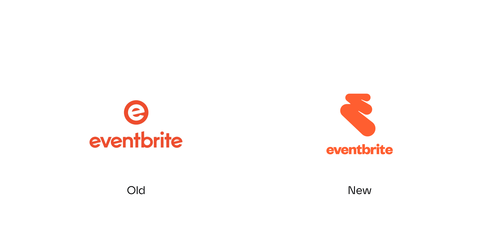
Eventbrite: A new path to success
Ticketsolve isn’t the only live experience platform that rebranded last year. Eventbrite also refreshed its brand in 2025, working with the creative agency Buck to evolve its visual system and tone.
The path: When an isotype tells the story
The former “e” mark was redesigned into a flexible “path” symbol with a story behind it. The new isotype symbolizes the event journey, from discovery to memory-making.
The path is customizable, adapting visually to different communities: vibrant, delectable treats for the foodies, lush leafy patterns for plant lovers, dynamic musical instruments for live music fans, and colorful artistic swirls for creative souls.
“We let (the path) become an ever-changing canvas, one that can take on various textures, patterns, illustration styles, or 3D effects,” senior art director Sylvia from Buck explains.
Update of main visual elements
The path is the starting point for Eventbrite’s new visual identity. All other elements are meticulously crafted around it, connected by a consistent story: authentic, real experiences.
- Colors: Highlighter hues complement the brightened oranges and yellows. The palette remains simple, inviting, iconic, and adaptable for use with photography.
- Photography: Candid event photography which feels raw, authentic, accessible, and even inspiring, making people and their experiences part of the path.
- Illustrations: Buck developed two types of illustrations, metaphorical spot illustrations and social stickers. For both, a broad character library exists, representing diversity and different communities.
Why this tech rebranding is a win
Many platforms focus on the outcome. Eventbrite focuses on anticipation. The brand captures the emotional build-up before the event begins, which differentiates it in a crowded event tech market.
Amazon: A polish without persuasion
While the above tech rebrands in 2025 clarified positioning, Amazon’s update received mixed reactions.
After more than two decades with the same logotype, Amazon introduced refinements in collaboration with Koto. The effort centered on refreshing the smile-arrow logo and unifying the visual identity across more than 50 sub-brands.
Less of an arrow, more of a smile
Amazon’s logo has undergone subtle changes:
- Logo concept: The arrow now reads more clearly as a smile than as a bridge from A to Z. The serif on the first “a” was removed, reducing the visual link across the wordmark.
- Colors: The prior nearly golden tone of the arrow has been turned into an attention-grabbing tangerine orange (Smile Orange.
- Typeface: They evolved their Kindle-specific Ember font into Ember Modern.
A coherent visual system for 50 sub-brands
The primary achievement was structural. Sub-brands now operate within a more coherent visual system. According to Koto, Amazon now delivers “as one brand, with one smile, everywhere”.
The controversy: The proof that design and brand values can’t be separated
The visual adjustments were careful. The response was divided.
While the design effort was undoubtedly big, the outcome has met criticism. From a design point of view, some critics view the orange as generic. Others miss the original A-to-Z reference.
There is one point that cannot be ignored: Amazon’s rebranding highlights the link between brand identity and brand values.
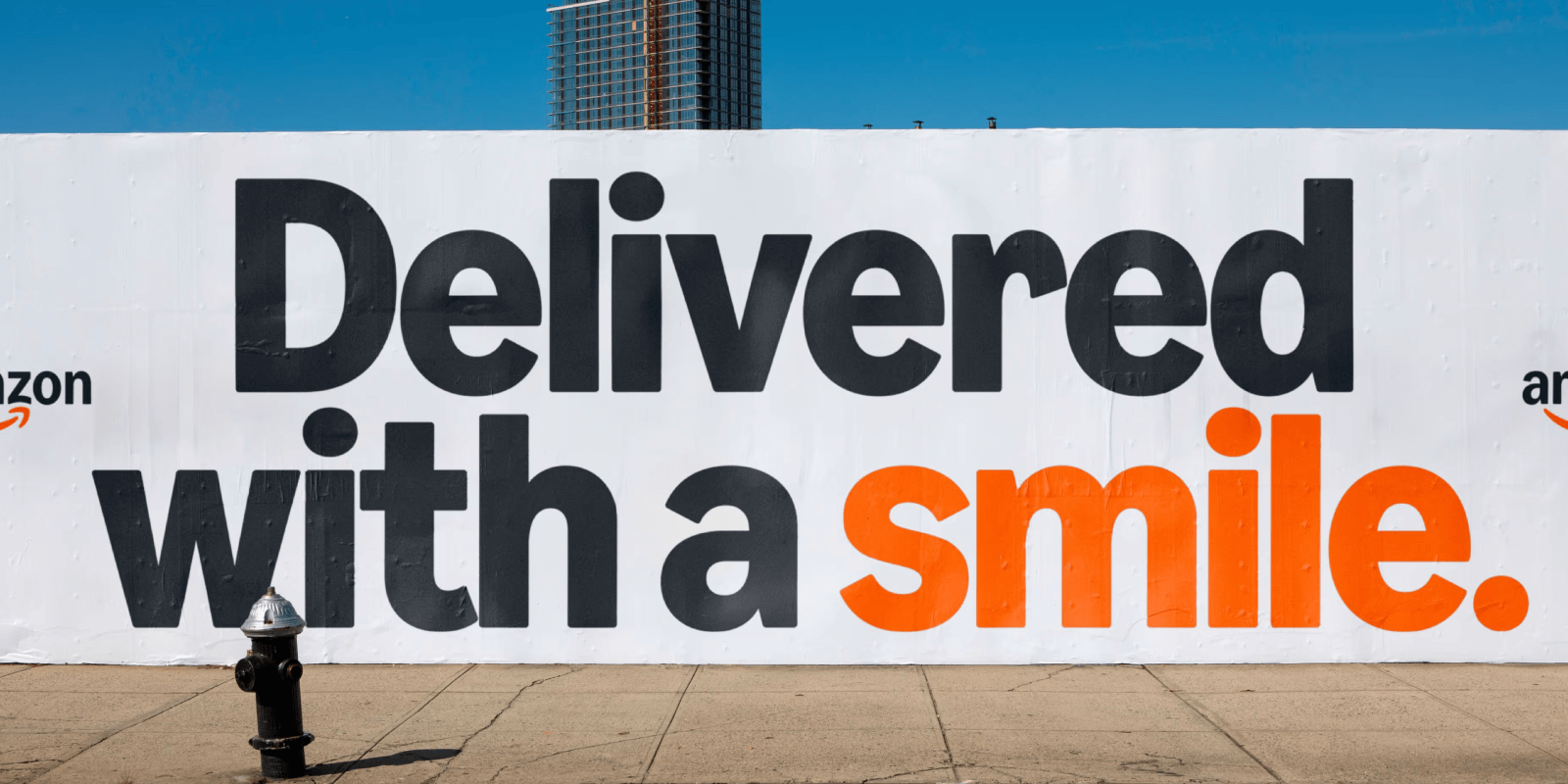
On Reddit, one user wrote: “The new logo color represents the slow accumulation of sweat and blood from their overworked employees.” The comment received more than 1,000 upvotes, followed by further criticism of working conditions. No Fortune 500 company operates without controversy, but the contrast between a smiling logo and public perception is difficult to overlook.
Amazon’s environmental footprint also remains under scrutiny, from carbon emissions to packaging waste. In addition, its management of delivery workers through the Amazon Flex platform has drawn criticism, including concerns about digital surveillance, unpredictable schedules, injury rates, and anti-union practices. In that context, the brighter smiling arrow reads less as a symbol of delight and more as a reminder that visual refinement does not resolve structural issues.
What do successful rebrandings have in common?
Successful tech rebrandings start with strategy and strong storytelling, not design. In each of the winning examples above, the visual identity follows a clear repositioning and involves a deeply human and approachable feel:
Tripadvisor doubles down on user trust, Ticketsolve reframes its partnership role within organizations, Metricool defines a work-life territory in social media management, and Eventbrite builds a system around emotional anticipation.
The design systems that will succeed in 2026 are deeply human, emotional, scalable, and tied to product reality.
If you feel that your tech company needs a visual uplift to keep momentum high in 2026, our senior design experts are happy to help. Reach out.
Check out our 2025 tech startup brands.
Sources, images, and further reading:
Tripadvisor
https://brandemia.org/nueva-identidad-tripadvisor,
https://koto.com/projects/tripadvisor
https://www.fastcompany.com/91360610/tripadvisor-rebrand
Ticketsolve
https://medium.com/the-branx/branding-ticketsolve-curtain-up-for-a-new-era-15b10d3c2cea
https://thebranx.com/work/ticketsolve
Metricool
https://thebranx.com/work/metricool
Eventbrite
https://buck.co/work/eventbrite
https://www.itsnicethat.com/articles/buck-eventbrite-graphic-design-project-100325
https://brandsthatpunch.com/blogs/top-25-rebrands-of-2025
https://www.eventbrite.com/blog/press/newsroom/eventbrite-refreshes-brand/
Amazon
https://www.dezeen.com/2025/05/09/amazon-rebrand-2025-koto-xcm/
https://koto.com/projects/amazon
https://www.reddit.com/r/logodesign/comments/1kosjur/amazon_has_changed_its_logo_after_20_years/


.webp)