When we rebuilt thebranx.com this September, the biggest decision was not a feature. It was choosing a simpler design system on purpose: one blue, one main typeface, no gradients, no shadows. A simple system is not a smaller brand. It is the choice that makes every page after it faster to build, easier to keep consistent, and still ours when AI can produce the complicated version in minutes.
This website redesign case study explains why a short list of rules beats a complicated brand in the long run, what those rules made room for on the new site, and what we would tell a founder who is planning their own redesign.
A simpler design system pays off long after launch
We started the redesign with a short list of rules instead of a moodboard. Gradients and shadows are gone, and every corner is square. The site uses one blue and one main typeface, and a thin grid runs through every page. The payoff came later: fewer rules meant faster decisions on every new page, a site that stays consistent as it grows, and more time for the details that make it ours.
Two years ago we went the other way. Our 2024 redesign introduced a metallic gradient and a mostly black theme. It looked premium at the time. Today, gradients and glow are what most AI site builders produce by default, so they no longer tell anyone who made the site.
Keeping the system this small left time for craft. Motion only moves when it has a reason, and there are small experiences waiting for whoever slows down enough to find them.
A homepage should work like the apps people already use
The homepage hero works like the stories feature in the apps people scroll every day. Every case study plays as a short story. Tap right to skip ahead, left to go back, and the center to jump straight into the project. Visitors see the newest work first, so the site feels fresh without a redesign every quarter.
We could have built a carousel with arrows and dots. We chose a pattern visitors already know, so there is nothing to learn before the work starts playing. Play the homepage on your phone to see it.
A case study should open in the client's world, not in our template
Case studies show how we work better than any other page, so each one opens on a cover coded for that brand, with its own entrance. Many covers react to you. Move your cursor over Featherless and its 3D feather turns to follow it. Click and drag on Metricool and you paint your own ribbon across the screen.
A shared template would have been faster to build and easier to update. We chose one cover per brand because a case study is the closest a visitor gets to working with us before the first call. Try the Featherless and Metricool covers yourself.
Chapter by chapter, so a long case reads like a short one
One scroll and you are inside the story: concept, logo, color, type, imagery and launch. Films and animations play as you reach them, so the page never asks you to press play.
Scroll the Letsgo case study to see how the chapters stack up.
A manifesto you can sign is harder to ignore
Our AI manifesto lists seven beliefs, and each one has a hand-drawn pixel sprite. Hover a line and its sprite comes alive, all the way down to the horse. At the end, pixel words morph as you scroll, and a quill lets you sign the manifesto yourself.
The first belief is "We don't settle at 80%." AI gets a brand to good enough fast, and the last 20% is where people decide whether to trust it. A manifesto that only sits on a page reads like a list of values on an office wall. Asking for a signature turns reading into a small commitment.
Hover the sprites and sign the AI manifesto.
Trust comes from faces and voices, not logos alone
The About page opens with the team floating across the screen, and any photo turns to color when you hover it. Ten experts work fully in-house, so the people you meet on calls are the same people who build your brand. On the reviews page, each quote lights up word by word as the client speaks.
Our clients tell their story on camera. Press play on a review and the quote follows along, so you can watch it, read it, or both. "Brand is one thing which is very hard for an AI to copy," says Ankit Jain from Aviator. We could not agree more.
Meet the team on the About page and watch the video reviews.
A logo grid should answer questions without a click
Hover a logo on our startup logos page and more of the identity behind it opens right there in the grid. There is no click and no new page, so the page keeps its calm. Nearly 70 startup logos, from AI and SaaS to Fintech and R&D, sit one glance away.
A logofolio is a reference page. People come with a question, such as "have they worked in my sector?", and leave once it is answered. Explore the startup logos page.
Fast is a feature, even with films on every page
Films and 3D covers on every page usually mean a slow site. On mobile, the new thebranx.com scores 97 for performance and 100 for accessibility, best practices and SEO in Google PageSpeed Insights. It also scores 3/3 on the new agentic browsing checks. The trick is restraint in loading: every film waits until you are about to see it.
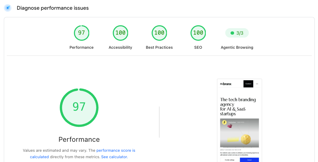
Images are served at the exact size your screen needs, and nothing jumps around while the page loads. We expect more first visits to come from AI agents reading on a buyer's behalf, so a site those agents can parse is part of the brand.
What this website redesign case study means for your startup
Your brand probably still runs on decisions from two funding rounds ago. A redesign is the moment to make new ones: what stays and what goes. Then write the harder list, the things your brand should never do, before anyone opens Figma or prompts a site builder.
Start with rules you can check. "One blue" is a rule your designer and your AI tools can both follow. "Modern and bold" is not. For the step-by-step process, read our tech website redesign guide.
Has your company outgrown its brand? Make new decisions with a startup branding agency that builds the brand and the website together, or book a call with Ines.
FAQ
What changed in the thebranx.com redesign?
We rebuilt the whole site in September 2026 around a short list of design rules: no gradients, no shadows, square corners, one blue and one main typeface on a thin grid. New features include a story-style homepage, a custom cover for each case study, a signable AI manifesto, read-along video reviews and a logo grid you explore by hovering.
Why did The Branx remove gradients and shadows from its website?
Most AI site builders produce them by default, so they no longer say who made a site. Removing them made every page rely on layout and type. It also kept the design system small, which left more time for craft in the details.
Can a minimalist website still be interactive?
Yes. Minimalist web design limits the visual system, not the experience. Our site uses one blue and one main typeface, yet case study covers react to the cursor, manifesto sprites move on hover and video reviews light up word by word. The restraint is what lets those moments stand out.
Why does branding matter for AI startups when anyone can build a website?
When a model can produce a decent website in minutes, a decent website stops being a signal. Buyers and investors look for the choices a model would not make on its own. As Ankit Jain of Aviator said in his review, brand is very hard for an AI to copy. See the AI brands we have built.
Does a strong brand affect a company's valuation?
Brand Finance reported in April 2026 that B2B companies with stronger brands trade at a 65% premium in forward price-to-earnings ratios compared with weaker peers. The data covers large companies from its Most Valuable Brands dataset and shows an association, not proof of cause. Treat it as a direction for startups, not a forecast.
Should a startup redesign its website before or after a funding round?
Before, if you can. Research by John Dawes of the Ehrenberg-Bass Institute for the LinkedIn B2B Institute suggests only about 5% of B2B buyers are in market at any given time. The other 95% will buy later, and the brand they remember from today shapes who they call when they are ready.
How much does a website redesign cost?
It depends on scope. A landing page and a ten-page site with a CMS are very different projects. Our pricing page lets you build a plan and see a ballpark estimate in a few clicks, and our startup branding cost guide breaks down typical ranges.
What should an AI startup website show first?
Show the product or the proof, not a list of features. On our homepage the newest case study plays first, and AI clients like Featherless open on a cover that reacts to the cursor. Browse more of our AI projects to see how other AI startups open their story.