The biggest rebrands of 2026 ranged from one redesigned logo to a new name. Instagram touched its wordmark. Pleo and Calendly rebuilt their identity systems. Freepik stopped being Freepik.
All decisions are based on strategy and concept. If you get this part wrong, you’ll probably get everything else wrong as well. Spotify's new icon proved it earlier this year.
Refresh, rebrand, or rename: three depths of change
A brand refresh keeps the name and the core identity and fixes the details. A rebrand replaces the identity system. A rename replaces the name and everything attached to it. The question behind brand refresh vs rebrand is simple: what no longer describes the company?
- Refresh: wordmark, logotype, details. The trigger is a brand that's right at its core but doesn't stretch to new uses. Example: Instagram.
- Rebrand: logo, color, type, imagery, voice. The trigger is a product that outgrew the brand. Examples: Pleo, Calendly, Dablam.
- Rename: a new name plus a full identity. The trigger is a name that doesn’t present the value. Examples: Magnific, Eluviant.
What are 2026’s best tech rebrandings?
Instagram: A new signature
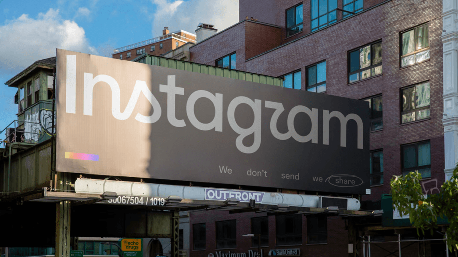
On August 25, 2026, Instagram released a refined wordmark designed by Koto. The biggest change sits in the "gr" ligature. The simplified "r" returns to the original script and becomes a new signature gesture for the brand.
The change didn’t happen out of nowhere: The branding team studied the past. The original wordmark was closely tied to the early days of mobile apps, and it used distinctive gestures and handcrafted details to convey personality and nostalgia. It had high recognition but limited range.
It had to work across marketing campaigns, product surfaces, the creator ecosystem, and new apps like Instants and Edits. So Instagram kept the handwritten character and fixed the letterforms that didn't scale.
This is what a refresh is for. When 15 years of recognition speak for themselves, you protect the core and fix what breaks.
Lessons from Instagram’s logo change
Like Brandemia also mentions in their analysis of Instagram’s logo redesign, a brand’s identity holds far more than graphic decisions. It brings trust, recognition, and associations. That’s why each decision has to be backed with a concept and reasoning.
More about branding & trust: Recently, we talked with the CEO of Aviator, Ankit Jain, about the importance of keeping their main yellow color and their logotype after four years of growth. Listen to the interview here.
Pleo: from expense tool to spend platform, still pink
Pleo started as expense management for SMEs. In September 2026, it relaunched as a complete spend platform for mid-market and enterprise finance teams, with a new identity by Porto Rocha.
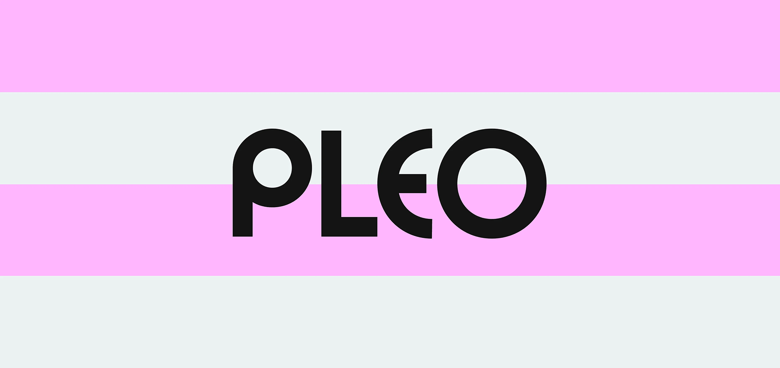
The pink stayed. It moved a few shades cooler and brighter, and it kept the differentiation Pleo built in a category full of blue. That's a lesson in fintech branding: the color that made you different is rarely the thing to drop. We made the same case in Can fintech be pink?
Around the pink, almost everything else changed. The logo is bolder and more geometric. Stripes inspired by marked-up spreadsheets became the graphic motif. A bespoke typeface, Pleo Scandi Gellix, pairs a geometric grotesque with Scandinavian functionalism. The voice moved toward credibility delivered with care, and the product navigation was rebuilt around real workflows.
Lessons from Pleo’s rebranding
No big rebrand usually comes without a change in the value proposition. If you feel that your brand is out of date, you’ve been evolving and will most probably have changed your offering, even if it’s just a slight adjustment. A mission that doesn’t align with 2026’s circumstances, a product feature that evolved from being a side note to your biggest advantage, etc.
That’s why, before you start your work with a branding agency, go a step back and reconsider your pillars. Make sure your mission, vision, purpose, values, USP, and brand personality still align with what your new brand needs to communicate.
Calendly: a scheduling link becomes an AI platform
Calendly added an AI email assistant and a meeting notetaker, and the brand still said "scheduling tool". Smith & Diction led the rebrand, launched in August 2026.
Just like Pleo, they wanted to signal a big shift in what they do, not just how they look, as Smith & Diction comments. Calendly is all about making scheduling easier and that should be said with a brand that would feel “like an absolute breath of fresh air, calm and confident”.
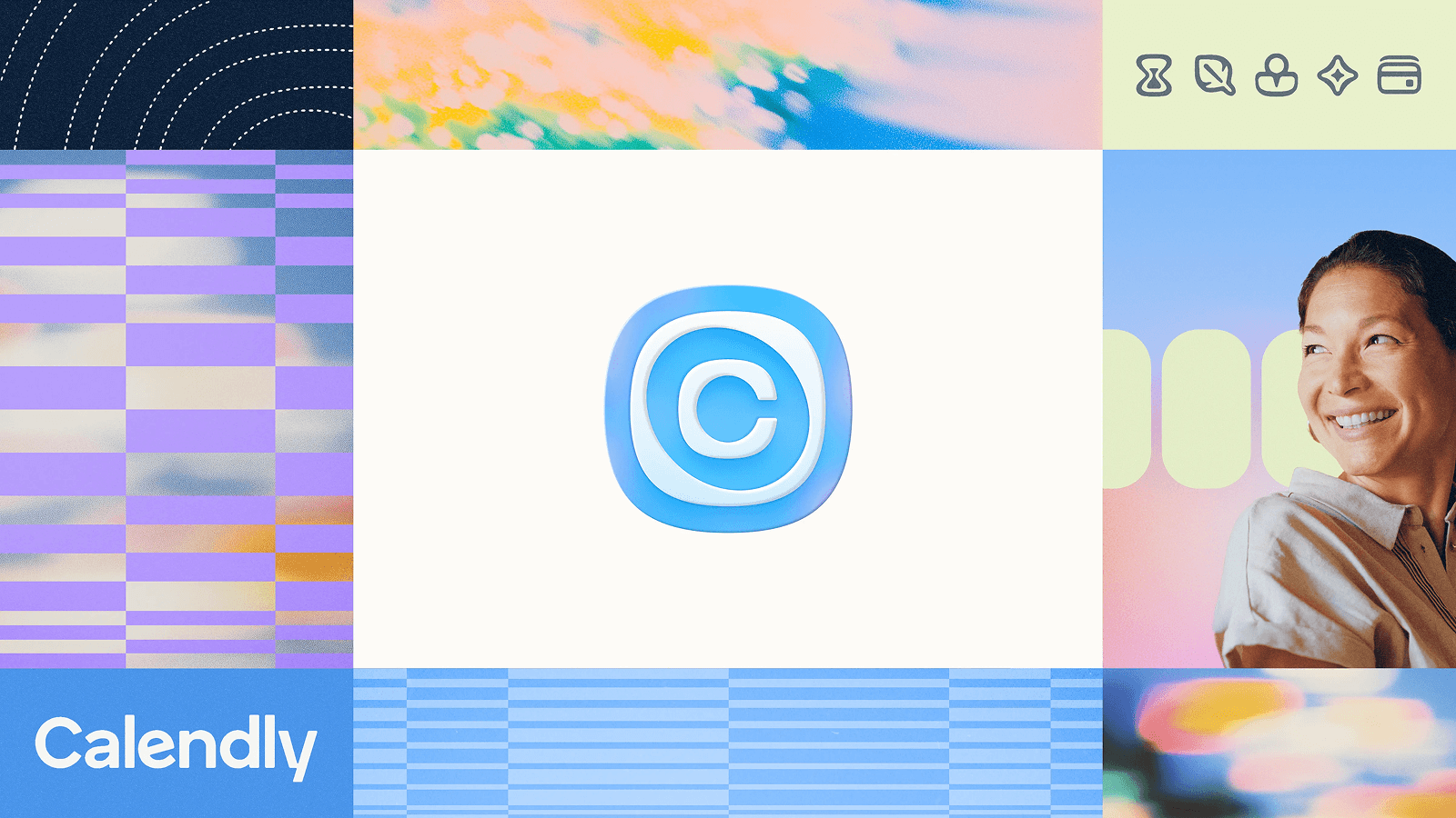
The new symbol is a "C" wrapped in a ripple, simplified into a squircle. The idea: one meeting link can change the trajectory of a business. The neon palette, hard to print, gave way to pastels built around the core blue. Organic "gloop" shapes connect five new product icons, and the wordmark flows as one line, with the tail of the "C" merging into the "a".
Lessons from Calendly’s rebranding
Build one system for several products. Calendly now has five products: scheduling, notetaker, contacts, AI assistant and payments. Each got its own icon (hourglass, quill, figure, star, credit card), and the "gloop" shapes tie them together. That's the job of an AI-era rebrand: hold several products under one identity without it looking like a bundle.
Dablam: from managed service to AEO SaaS
Dablam is a UK startup in answer engine optimization (AEO). It began as a boutique managed service and grew into a SaaS platform powered by LLMs and data analytics. The rebrand we built had two jobs: professionalize the identity for a customer-facing product, and move the story from founder-led mountain imagery to the value Dablam delivers.
We kept the mountain and changed its role. Ama Dablam became a vantage point, a place for perspective and insight. The visual language comes from Alpenglow, the red light that hits peaks at sunrise and sunset, used as a gradient across the system. Deep blues form the base, with a gold accent. Anek Latin carries the headlines. Inter handles text-heavy work.
Lessons from Dablam’s rebranding
We went through many iterations on Dablam’s isotype, but in the end, the client and our team chose one of the first proposals. Lesson learned: sometimes you have to explore every path just to return to where you started and realize your initial instinct was right all along.
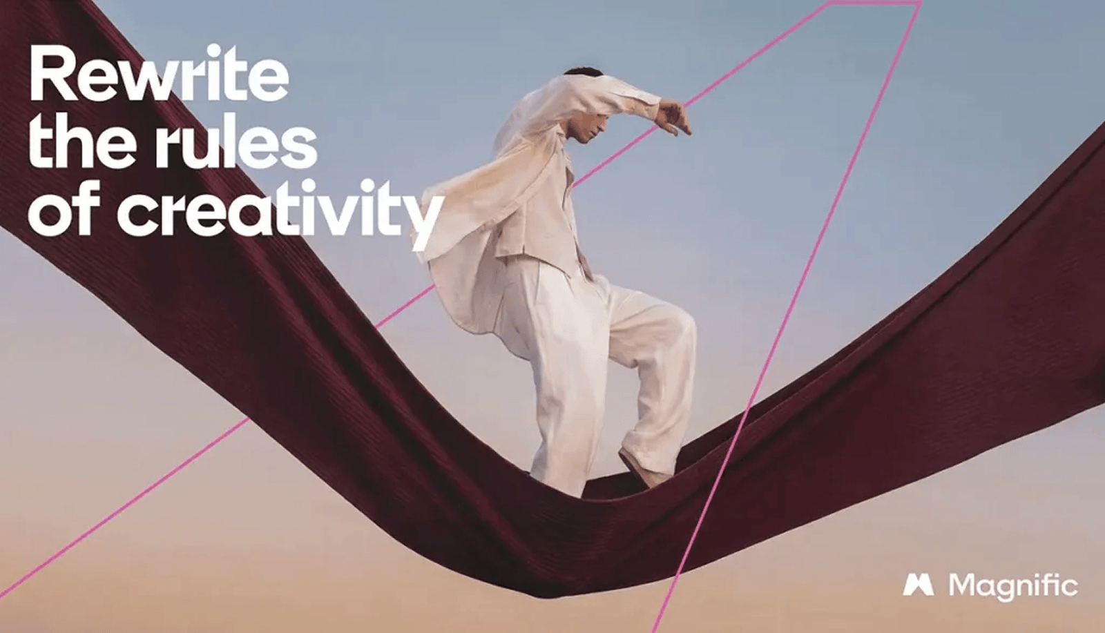
Freepik becomes Magnific
Freepik launched in 2010 as a search engine for graphic resources. It grew into a full platform of AI tools for image, video, and audio, with a library of more than 250 million stock assets and over 1 million subscribers, from solo creators to major studios.
The company says it directly: "The tools and the library evolved faster than the brand." Freepik no longer described what people were using every day. Magnific does.
The identity by AREA 17 is built around the Monumental M, a mark inspired by structures like the pyramids and Stonehenge. The hero color, Magnific Magenta, is a deliberate break from the cool gradients and soft blues most AI brands default to. The typeface, ES Klarheit Plakat FP, echoes the M with angled cuts. A morphing shape drives the motion language.
Lessons from the new Magnific brand
A more abstract name gives the product room to grow. "Freepik" pointed to free stock images. "Magnific" doesn't point to any category, so the product can add video, audio, or 3D without outgrowing the name again.
IntelexVision becomes Eluviant
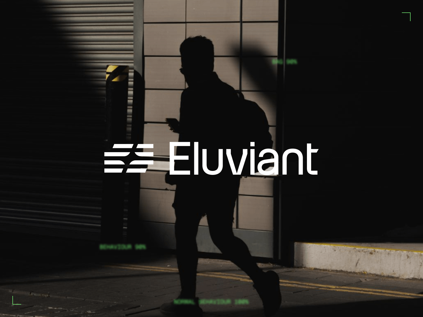
Eluviant, formerly IntelexVision, is a London deeptech company in AI video analytics. The new name came with a new structure: one master brand and two product sub-brands, Sentry and MMS.
The concept is "Operational clarity in a noisy world." The isotype has two parts. The Matrix stands for the noise of a global camera network. The visual system was created based on the optical hash of surveillance images. Green anchors the system, with a deeper green for Sentry and orange for MMS. Geist and Geist Mono cover brand and technical contexts, and a proprietary pixel-art tool turns photography into grid compositions.
Lessons from Eluviant’s branding
The optical hash of surveillance images served as the basis of the visual system, creating a modern and structured aesthetic and hinting at the technical value of the platform. Miqui Troncoso, brand designer at The Branx, points out:
When value proposition and branding concept align, that’s what makes the difference between a mediocre brand and a brand that will help grow the company.
By the way, we at The Branx have also uplifted our brand. Navigate through our website and see what changed.
What successful rebranding examples of 2026 have in common
Put these rebranding examples side by side and three patterns show up.
- Concept before prompt. There’s no brand identity without a strong concept behind it. None of these rebrandings would have been possible without humans racking their brains about brand values, visual systems, the market landscape, and color psychology etc. Everything has meaning in a strong brand; and that’s what makes these tech brands gain trust and reputation. Once designers and strategists have everything settled down, you can use AI to expand and explore.
- Systems beat logos. One identity and one system, but flexible and scalable enough to grow with the company, from branded icon systems to pattern creators and pixel effect tools.
- Brands are built to be read by machines. Brands gained a new user persona: AI agents. You need to optimize your brand to expand fast. And fast expansion means using genAI. We prepare each of our brands to be easily digested and understood by Claude Design and Co.
3 things to consider before changing your branding
The design is the last decision in a rebrand. Answer these first.
- Is the name still accurate? If it describes a value you no longer sell, you're looking at a rename.
- Does the identity scale to the new product? If it breaks across new features or markets, you need a rebrand.
- Is recognition worth protecting? If people know you on sight, refresh and keep the equity.
Our guide on how to rebrand your tech startup covers the process step by step. For budgets & timeline, see our live startup pricing calculator.
Frequently asked questions
What's the difference between a brand refresh and a rebrand?
A brand refresh updates details of an existing identity, like a wordmark or a color shade, and keeps the name and core system. A rebrand replaces the identity system: logo, color, typography, imagery, and often voice. A rename goes one step further and changes the company name too.
What were the biggest tech rebrands of 2026?
Instagram refined its wordmark with Koto. Pleo rebranded with Porto Rocha, and Calendly with Smith & Diction. Freepik renamed itself Magnific with AREA 17. The Branx rebranded Dablam and Eluviant.
What changed in Instagram's new logo in 2026?
The change is limited to the wordmark. Instagram refined the letterforms, and the "r" in the "gr" ligature returns to the original script as a new signature gesture.
Why did Instagram change its wordmark?
The previous wordmark had high recognition but limited range. The refined version works across campaigns, product surfaces, the creator ecosystem, and new apps like Instants and Edits.
Did Pleo change its pink?
Only slightly. The signature pink moved a few shades cooler and brighter. Pleo kept it because it sets the brand apart in a fintech category dominated by blue.
What does Calendly's new logo mean?
The "C" is wrapped in a ripple, simplified into a squircle. It stands for how sending one meeting link can change the trajectory of a business.
What is Dablam?
Dablam is a UK SaaS startup in answer engine optimization (AEO). Its platform uses LLMs and data analytics, and it grew out of a boutique managed service.
Why did Freepik change its name to Magnific?
Freepik started in 2010 as a search engine for graphic resources and grew into an AI platform for image, video, and audio. The name no longer described what people used every day, so the company renamed itself Magnific.
What is Eluviant?
Eluviant is a London deeptech company in AI video analytics. It was formerly called IntelexVision. Its technology turns the noise from large camera networks into clear operational intelligence for security and risk teams. The Branx renamed and rebranded the company around the concept "Operational clarity in a noisy world." That included a master brand and two product sub-brands, Sentry and MMS.
Sources:
Magnific about their new branding
The Brand Identity about Magnific
Smith & Diction on Medium about Calendly
Pleo about their new branding
Brandemia about the Instagram logo change
The Branx Eluviant case study
The Branx Dablam case study