
A Series A term sheet doesn't die in the data room. It dies somewhere between the website, the pitch deck, and the founder's LinkedIn; in the 90 seconds an investor spends forming a gut read before the first call.
Investors talk about product, traction, and team. They also quietly assess whether the brand looks like it belongs to a company worth $50M. Most AI founders don't realize this part of due diligence exists until it's working against them.
In this article, we talk about the part of the diligence process nobody puts on the checklist: your tech brand. What it signals, where it breaks, and how to build one that holds up when a partner pulls up five tabs at once.
What is brand due diligence?
Brand due diligence is the informal audit investors run on how your company presents itself. It sits alongside the 5 areas venture capital firms formally evaluate: market size and growth potential, traction and evidence of demand, product strength and scalability, founder capability and execution, and exit potential and return profile.
Those 5 have frameworks. The brand has a gut read, formed in the 90 seconds before the first call.
That gut read is built from what the partner sees when they start digging: your homepage, your deck, your LinkedIn, two case studies, a product demo, and a competitor pulled up for comparison. The impression lands fast and sticks.
Why a strong brand matters more for AI companies
AI is a category where the product is often invisible, the claims are often abstract, and the differentiation is often a month old. Brand is what the investor can actually evaluate when the technology is too new or too technical to judge on the spot.
Every company has a brand. The question is whether it's working for you or against you. If customers believe in the business, if they'd choose it even at a higher price point, if they refer it without being asked, if they give the company the benefit of the doubt when something goes wrong, that's an asset.
The brand elements investors assess
Consistency and clarity
The first thing that gets checked is whether your story is the same story across every surface. The website says one thing. The deck says another. The founder's LinkedIn bio says a third. Inconsistency doesn't read as strategy in motion. It reads as a team that hasn't decided what they're building.
Clarity is the twin of consistency. If an investor can't explain what you do after 30 seconds on your homepage, they won't try harder in the deck. They'll move on.
Brand identity and storytelling
Does the identity match the company's ambition and technology? A Series A AI infrastructure company dressed in a Canva template reads as a weekend project.
Identity is also where positioning gets proven. A well-built brand tells the investor what kind of company you are before they read a single word of the deck. Serious, playful, enterprise, consumer, frontier, practical, … all of that is communicated visually before it's communicated with words.
User-centric design
AI products increasingly run on natural language. That makes design harder, not easier. The interface has to feel obvious to a user who won't read instructions, and legible to a language model parsing it on the user's behalf.
Brands that design for both (human users and the LLMs that will increasingly mediate the experience) signal technical sophistication. Brands that don't, don't.
A scalable brand operating system
This is the part most founders miss. A logo is not a brand. A brand book is not a system. What holds up under growth is a brand operating system: living infrastructure, not a PDF.
What is Brand OS?
A Brand OS is the single source of truth for everything your company says and shows. Strategy, identity, voice, components, and rules, all structured so your team can ship on-brand assets without a designer in the loop for everyone. It replaces the 80-page guidelines document that nobody opens with a working system people actually use.
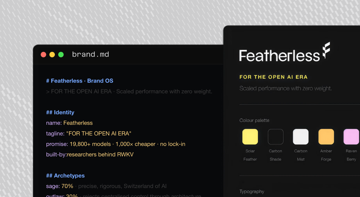
What is brand.md?
It's the machine-readable layer of the Brand OS. A structured document your team, and your tools, can read the same way an engineer reads a config file. When your copywriter, your designer, and your LLM all pull from the same brand.md, your brand stays coherent at startup speed. That's the difference between a brand that scales with the company and a brand the company outgrows by Series B.
Red flags: How messy branding hurts AI startups
Inconsistent messaging
When the product description on your homepage, the one-liner in your deck, and the pitch your founder gives at a dinner are three different sentences, the investor's conclusion is "they don't know what this is yet".
Unprofessional or outdated visuals
Sloppy design is never just sloppy design. It's a proxy for attention to detail across the company. If the logo is pixelated on the pitch deck cover, the investor's next thought is about the state of the codebase.
Branding that doesn't scale
A brand built for the pre-seed deck breaks at Seed. A brand built for Seed breaks at Series A. Investors have seen this pattern enough times to recognize it in the first five minutes. They're not just asking whether the brand works today. They're asking whether the team planned for the brand they'll need in 18 months.
AI startups with brands that actually work
What these three have in common: the brand makes the technology easier to trust, not harder.
Featherless
Featherless is an AI optimization platform for deploying and running open-source models without managing infrastructure. Our rebrand moved the company from a specs-heavy technical look to a story-driven identity built to scale. The key moves:
- Concept: Origami. Complex, structural outcomes from a single light sheet of paper, no glue, no heavy supports. It mirrors the product: innovation without the drag of legacy infrastructure.
- Logo: A geometric, origami-inspired isotype that subtly forms the letter F, paired with a refined sans-serif wordmark.
- Color: Solar Feather, a high-visibility yellow, balanced with technical neutrals for professional authority.
- Illustration system: A modular 2D-to-3D ecosystem of paper sculptures and dashed line drawings that scales across every touchpoint.
- The result: A brand that feels as light as the product promises, and a visual system that stands out in a crowded deep tech category.
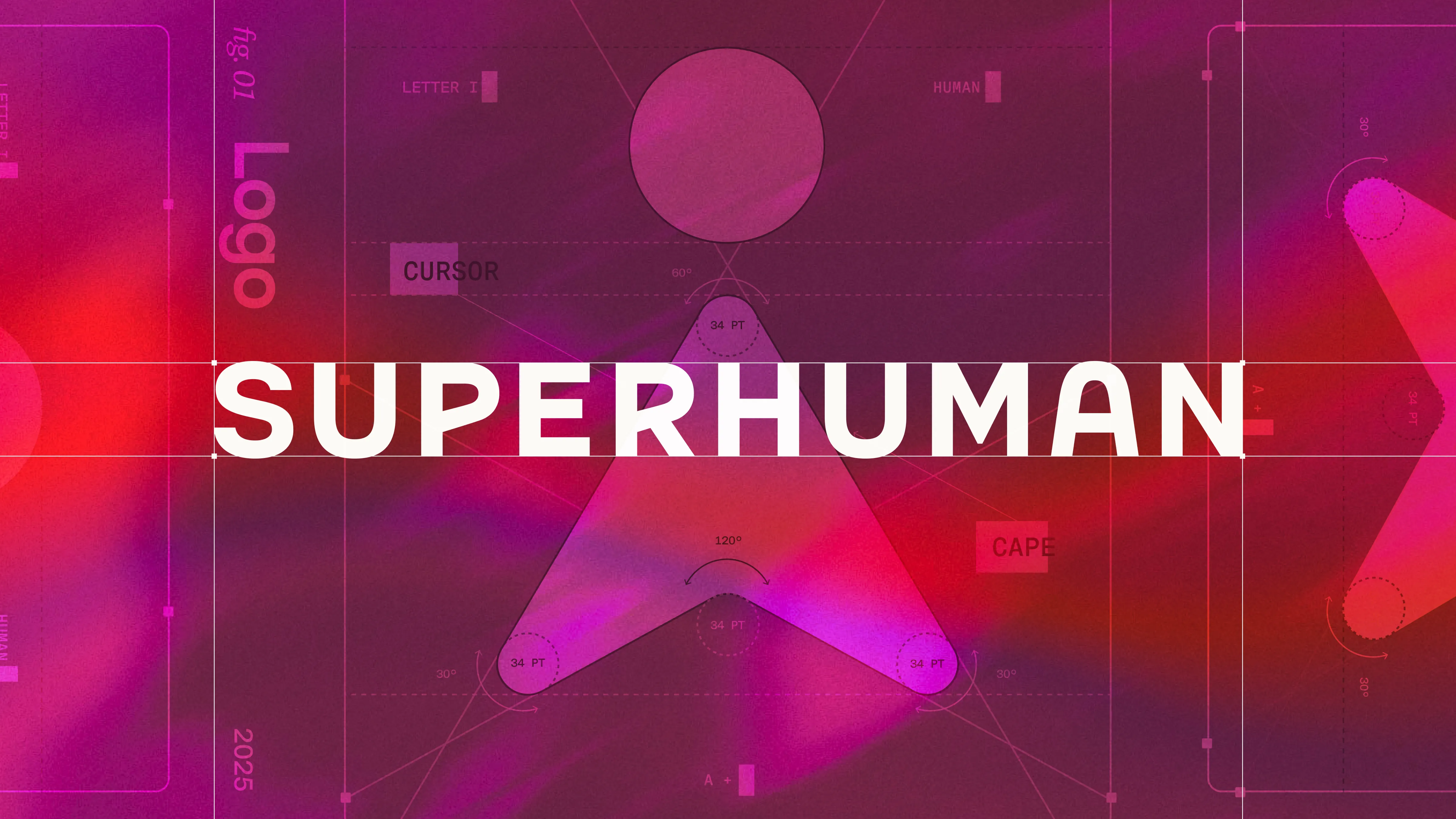
Superhuman
A full rebrand built for a three-way merger: Grammarly acquired Coda, then Superhuman, then took the Superhuman name. The identity had to carry three products, a new CEO, and a category shift toward AI-native workspaces. Key moves:
- Concept: Super and human. Magic and mystery on one side, warmth and professionalism on the other. The brand splits the name into two feelings and builds the system around the tension between them.
- Logo: Hero. A mascot built from two primitives, a cursor arrow and a dot, that reads as both a pointer and a caped figure. Motion was part of the logo from round one, not a post-launch add-on.
- Typography: Custom Super Sans and Super Serif, based on Messina, with rounded punctuation and tittles to match Hero. One super family across marketing, product, and code.
- Color and system: Mysteria, a purple that sits between blue and twilight, paired with Heart, a deep maroon. A five-layer content system (human, idea, technical, tonal, output) that gives the brand room to scale across surfaces without fragmenting.
- The result: A brand that absorbed three companies' equity without collapsing into one of theirs, and a modular identity built to evolve as the product rolls out through 2026.
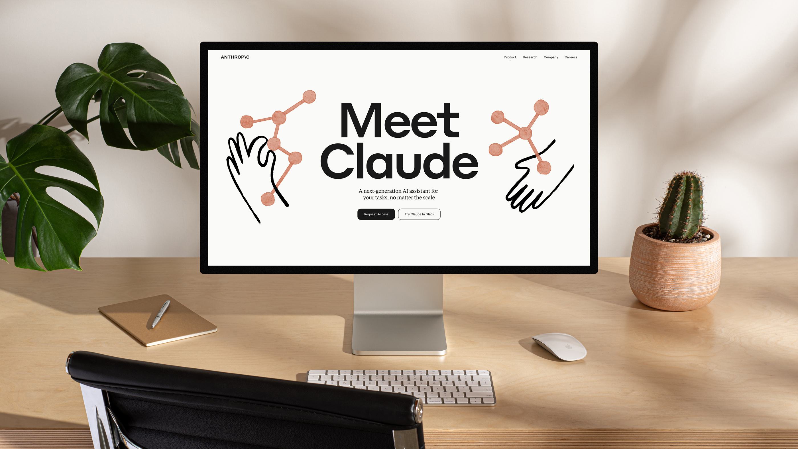
Claude and Anthropic
Claude and Anthropic. The AI safety lab behind Claude, positioned from stealth through product launch with a brand that stands apart in a category full of tech tropes. The identity was built to signal human values and technical craft at the same time. Key moves:
- Concept: Align AI with human values. The brand captures the company's human-centered mission and the craft behind the research, in a category where most visual languages lean towards sci-fi or sterile.
- Logo: A pure typographic mark with one standout detail — the slash, a reference to the code beneath AI and a nod to what's ahead.
- Typography: Styrene paired with Tiempos. Technically refined, charmingly quirky, built to carry both research writing and product UI.
- Color and illustration: A warm palette that handles marketing and product surfaces without breaking, and an illustration language that centers the human values driving the company.
- The result: A brand that made Anthropic's difference legible from day one, scaled from a stealth-mode site to a full product launch, and helped position Claude as the considered alternative in a crowded AI assistant category.
Best practices for building an investment-ready AI brand
Align the brand to the company's actual vision
Your brand should be a compressed version of your strategy. If your company is betting on human-AI collaboration, the brand should feel collaborative. If you're betting on raw capability, it should feel capable. Human creativity and emotional intelligence are what get you from a strategy document to a brand people can feel.
Stay consistent across every surface
Every touchpoint is diligence material. Homepage, deck, LinkedIn, Loom demos, invoice PDFs, hiring pages. A brand that holds together across all of them signals operational discipline. One that falls apart on the careers page signals the opposite.
Build for your actual pace
Your startup ships daily. Your brand has to keep up. That means a brand operating system: strategy, identity, voice, and components structured so your team can produce on-brand work without waiting for an agency round-trip. When the system is right, branding stops being a bottleneck and starts being infrastructure.
The part investors don't say out loud
Brand strength is a leading indicator of a founding team's judgment. Investors read it that way, whether or not they'd articulate it in a partner meeting. A coherent, considered, scalable brand says the team knows how to make decisions, prioritize, and build things that last. A messy one says the opposite.
The cost of getting it wrong isn't aesthetic. It's the term sheet that never arrives, the intro that never converts, the call that ends politely after twenty minutes. For an AI startup running into Series A, the brand isn't the last thing to get right. It's one of the first.
Btw, if you're curious about how we use AI at The Branx, check out our Intelligent Branding Manifesto.
Sources and further reading:
https://medium.com/smith-diction/branding-superhuman-and-grammarly-and-coda-8c57f970bead
https://geist.co/work/anthropic
https://thebranx.com/work/featherless
https://www.moonshotnx.com/capital/how-venture-evaluates-startups
https://www.atomicdust.com/brand-due-diligence-the-risk-youre-not-measuring
.webp)