In 2025, the best tech startup websites won on clarity. In 2026, they also won on nerve. The sites that earned the most attention this year came from freight forwarding, truck yards, defense, nuclear energy and the open ocean: industries that rarely spent money on their websites, now launching some of the most ambitious ones on the web.
They have one thing in common: they show the real thing. A globe with real shipping routes, the reactor itself, a live view of the yard, the boat on the water. Gradients and glowing blobs are what most AI site builders produce by default, so they no longer say who made a site. When we rebuilt thebranx.com this year we dropped them for the same reason, and we explain the thinking in our website redesign case study.
We recorded every homepage below on desktop in November 2026, from the first second of loading, so you can see the entrance as well as the scroll.
The 2026 list at a glance
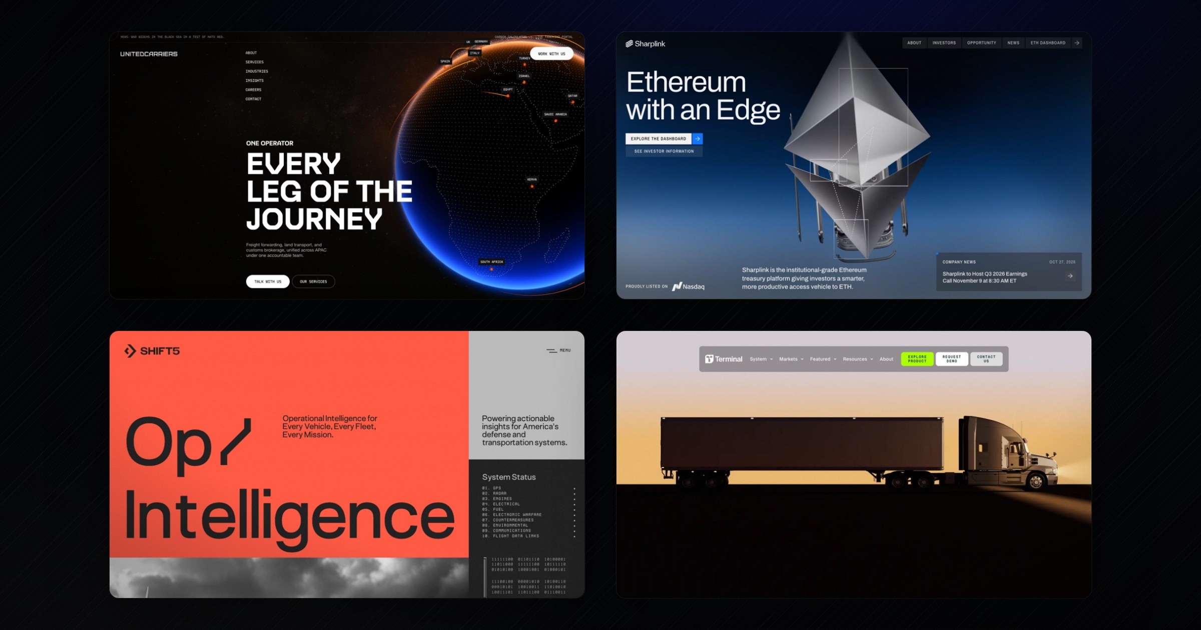
- United Carriers: a freight forwarder that opens on a 3D globe and dives through the atmosphere into its numbers.
- SharpLink: a Nasdaq-listed Ethereum treasury company that turns an abstract asset into a machine you can look inside.
- Shift5: defense software with a cockpit-instrument look, huge type and one loud color.
- Terminal Industries: yard software introduced like a film, from golden hour to machine vision.
- TypeSafe AI: a new AI lab that launched its first model with a website that looks like an early personal computer, in hot pink.
- Cerebrium, Seasats and ZettaJoule: three more 2026 award winners from AI infrastructure, ocean autonomy and nuclear energy.
2026’s best tech websites
#1: United Carriers
United Carriers is a freight forwarding and logistics company. It handles freight forwarding, land transport and customs brokerage across APAC under one accountable team. Its new website, by the studio Bearplus, was an Awwwards Site of the Day in September 2026.[1]
Logistics websites usually open on a stock photo of a container ship. United Carriers opens on a dotted world map that loads into a glowing 3D globe, with orange routes arcing between the countries it serves. The headline is a line a client can repeat: “Every leg of the journey”.
Key features:
- One continuous camera move: scrolling pushes the camera into the globe, through a blue atmosphere and out into a white page. The change of scene doubles as the change of topic, from network to proof.
- Big numbers, big type: “We move freight. We own the outcome.” sits next to three figures set as large as the headline: shipments per month, on-time delivery rate and years in operation.
- The physical work, animated: further down, a container crane stacks boxes as you scroll. The service is shown, not described.
What we especially liked: the restraint around the spectacle. The palette is black, white and one electric blue, and the condensed display type does the rest.
What could be improved: the loader and the globe take a few seconds before the first word appears. For a returning client who just wants the tracking portal, that is a few seconds too many.
Design lesson:
A boring category is an opportunity, not an excuse.
When every competitor looks the same, the first company to invest in its website owns the whole category's attention.
#2: SharpLink
SharpLink describes itself as “the institutional-grade Ethereum treasury platform giving investors a smarter, more productive access vehicle to ETH”. It is listed on Nasdaq. Its site, by Studio Freight, was an Awwwards Site of the Day in August 2026.[2]
Crypto websites tend to go one of two ways: neon or bank. SharpLink does neither. A chrome-and-glass machine comes apart in the hero and reassembles as an Ethereum crystal, which turns a digital asset into an object you can look at from every angle.
Key features:
- The asset as an object: precise 3D renders in steel and glass make Ethereum feel engineered, which is exactly what an institutional investor wants to hear.
- Live proof: the “Pioneering productivity” section shows a holdings card with total ETH held and staking rewards, linked to a full ETH dashboard.
- One object, many chapters: a metal cylinder stays on screen while the propositions change beside it, from leadership to transparency to partners.
What we especially liked: the way the background moves from deep blue to almost white as you scroll. The page gets lighter as the arguments get more concrete.
What could be improved: the secondary text is small and low in contrast on the blue gradients. For a page aimed at investors, the facts deserve the same weight as the renders.
Design lesson:
Make the abstract tangible.
If your product can't be photographed, give it a form people can picture and remember.
#3: Shift5
Shift5 builds “Operational Intelligence for Every Vehicle, Every Fleet, Every Mission” for America's defense and transportation systems. Its site, by Non-Linear Studio, was an Awwwards Site of the Day in March 2026.[3]
Most defense websites are dark, blue and full of drones at night. Shift5 chose red-orange, warm grey and black, and a headline so large it barely fits: “Op/ Intelligence”.
Key features:
- An instrument panel, not a hero image: next to the headline, a “System Status” list counts ten systems, from GPS and radar to flight data links, in a monospaced typeface. It reads like a cockpit display, which is the product's world.
- Photography as proof: black-and-white photos of a military truck, an airliner and a fighter jet rotate in the hero, showing every kind of vehicle the platform covers.
- Graphic icons for each solution: a wireframe globe, a blurred halo and a starburst give Cyber/EW, predictive maintenance and fleet compliance a visual identity each.
What we especially liked: the confidence of the color. One saturated orange, used in big flat panels, makes Shift5 recognizable from a single screenshot.
What could be improved: the news section packs a lot of small monospaced text into dense columns. It looks great and reads slowly.
Design lesson:
Your category's colors are a choice, not a rule.
Defense doesn't have to be navy. A distinctive palette is one of the cheapest ways to stand out in a crowded market.
#4: Terminal Industries
Terminal Industries makes a yard operating system: “AI-native technology” that manages the space between a warehouse gate and its dock. Its website, by REJOUICE and Propagande, launched in 2025 and was an Awwwards Site of the Day in September 2025.[4] We include it because it kept collecting recognition this year, including a 2026 Webby nomination for Best User Experience.[5]
The homepage plays like the opening of a film. A truck crosses the frame at sunset, the headline types itself over the yard, and then the same scene switches to the way Terminal's computer vision sees it: wireframes, points and data.
Key features:
- Show the product's point of view: the switch from photoreal footage to a machine-vision wireframe explains what the AI does without a single diagram.
- Typing headlines: each line of the story writes itself as you scroll, with the last letter highlighted in the brand's acid green.
- Clear paths after the film: below the hero, three cards speak to three kinds of buyer, from “Fix one problem in the yard” to “I run a network of yards”, followed by a yard cost calculator.
What we especially liked: the logo grid arrives right after the cinematic intro. Emotion first, then proof from brands like DSV, Goodyear and HP.
What could be improved: it takes several screens of story before you reach a concrete benefit. Impatient buyers may need a shortcut.
Design lesson:
Let people see what your AI sees.
If your product works in the physical world, the most convincing demo is its own view of that world.
#5: TypeSafe AI
TypeSafe AI is an AI lab from San Francisco. Its model, Jev, returns typed decisions that software can act on, with a confidence score, instead of conversational text. The company came out of stealth in September 2026 with $40M in seed funding led by DCVC.[6] Its launch website was built in Framer with the agency Fuzzco, in four active build days.[7]
Most AI labs launch on a dark page with a glowing orb. TypeSafe opens with a loading window from an early personal computer, then grainy pink and blue clouds and one of the biggest headlines on this list: “The First (Public) System One Model; Jev Gives AI The Properties Of Code”.
Key features:
- A desktop from the early days of computing: the product is explained in overlapping windows set in a bitmap terminal font, from older kinds of models (LM, RLHF, RLVR) to Jev's own approach. A working clock widget even shows the visitor's time. The retro interface makes a new kind of model feel like a tool, not a chatbot.
- Benchmarks as the centerpiece: speed and cost bars compare Jev with Claude and GPT models, then “193.6x Faster, 444.6x Cheaper.” is set as large as the headline, with a link to the proof.
- One loud color: long hot-pink sections with dot-grid and halftone textures make the site recognizable from a single screenshot.
What we especially liked: the humor. The news window at the top of the page simply reads “We raised a really big Series A led by a16z”. A lab that sells to developers sounds like developers, and it worked: Framer reports more than 4.8 million unique visitors in the weeks after launch.[7]
What could be improved: the benchmark figures are TypeSafe's own, and they carry most of the page. Customer proof, such as its case study with Jack & Jill, sits near the very bottom. Moving it closer to the numbers would make them easier to trust.
Design lesson:
A point of view on design signals a point of view on the product.
When every AI lab looks the same, the one that dares to look different is the one people remember, and share.
Need a site like these? Startup web design agency →
More 2026 tech websites worth a look
Cerebrium
Cerebrium is serverless GPU infrastructure for real-time AI, such as voice agents and video models. Its site was an Awwwards Site of the Day in September 2026.[8] Magenta 3D ribbons move behind the headline, and the first proof is a chart of cold start times against other providers. For a developer audience, a benchmark beats a slogan.
Seasats
Seasats builds uncrewed surface vessels for defense, science and commercial missions. Its site, by Raw Materials and Owls Department, was an Awwwards Site of the Day in September 2026.[9] Instead of the usual military night vision, it opens on a calm, misty sea. As you scroll, the camera rides along on the boat while lines such as “The path of hurricanes” light up, each with a small image of the mission.
ZettaJoule
ZettaJoule develops small modular reactors that supply clean heat and electricity for industry. Its site, by Zypsy, was an Awwwards Site of the Day in May 2026.[10] The reactor sits right inside the headline, “Powering the World”, and the page explains the name in one line: a zettajoule is a billion trillion joules. Nuclear energy made light, literally.
Tech web design trends 2026
The real thing, in 3D
Abstract shapes are out; the product itself is in. United Carriers renders its network, SharpLink its asset and ZettaJoule its reactor. 3D is no longer decoration. It is the explanation.
Product shown as live data
Instead of screenshots, the best sites show working numbers: SharpLink's holdings card, Shift5's system status list, Terminal's cost calculator, and the benchmark charts of Cerebrium and TypeSafe. A figure that looks live feels more credible than one in a slide.
Huge type with a monospaced layer
Headlines got bigger, and next to them sits a second voice in small capitals or monospaced type that reads like an instrument panel. Shift5, United Carriers, Terminal, Cerebrium and TypeSafe all use it. It says “engineering company” before you read a word.
Scroll as a film
United Carriers, Terminal and Seasats treat the scroll bar like a timeline: pinned scenes, camera moves and text that appears in sync. It works when every scene carries an argument, and gets tiring when it doesn't.
Industrial tech goes award-level
Freight, truck yards, defense, nuclear and maritime companies all won Site of the Day awards this year. The most ambitious websites no longer come only from consumer apps and design tools. For B2B companies in “boring” categories, that is a window: being the first to look this good still stands out.
What's next for 2027
- Websites for agents as well as people. Cloudflare data cited by Fortune shows bots overtook humans in June 2026, generating 57.5% of webpage requests.[11] More first visits will come from AI agents reading on a buyer's behalf, so structure, clear text and fast pages become part of the brand. It is one of the reasons we built the new thebranx.com to be easy for agents to read, as we explain in our redesign case study.
- Sites that agents can use, not just read. Chrome opened an origin trial for WebMCP in June 2026, in Chrome 149.[12] It lets a website offer its actions to AI agents as structured tools. It is still experimental, but it points to websites designed for tasks as much as for pages.
- llms.txt is not a shortcut. An Ahrefs study published in June 2026 found that 97% of llms.txt files received zero requests in May 2026.[13] Clear content and clean structure still matter more than any single file.
- More real-time 3D, with stricter budgets. WebGPU is now supported in Chrome, Edge, Firefox and Safari.[14] Expect richer 3D in 2027, and expect the best sites to load it only when the visitor is about to see it, because speed is part of the experience.
- Human detail over AI polish. As AI makes a decent website cheap, the details a model wouldn't choose become the signal. We saw the same shift in branding this year, which we cover in 2026 in tech branding: what worked, what flopped, and what's next.
Key web design takeaways
TL;DR? Here are your main takeaways:
- Show the real thing: your product, your network, your machine. Not a gradient that any tool could generate.
- Make proof feel live: dashboards, calculators and real figures earn more trust than claims.
- Own one bold choice: a color, a typeface or a metaphor that people remember after one visit.
- Spectacle needs a reason: every animation should carry an argument, and none should block the visitor who is in a hurry.
- Design for agents too: the next visitor to your site may be an AI reading for a buyer.
Whether you're building your first startup website or redesigning an existing one, these examples set the bar for 2027. For the step-by-step process, read our tech website redesign guide.
Also, look at this collection of tech startup websites.
FAQ
What makes a great tech startup website in 2026?
It explains the product in seconds, shows real proof, loads fast and looks like no one else in its category. The best examples this year paired one memorable visual idea, such as United Carriers' globe or Shift5's orange, with live figures and clear paths to the next step.
Are 3D and WebGL worth it for a B2B website?
When the 3D explains something, yes. ZettaJoule's reactor and Terminal's machine-vision view teach you about the product as you look at them. When 3D is only decoration, it adds loading time and little else.
Which web design trends will matter in 2027?
Websites that AI agents can read and use, real-time 3D loaded only when needed, product shown as live data, and human details that set a brand apart from AI-generated sites.
Sources
- Awwwards: United Carriers, Site of the Day (Sep 6, 2026)
- Awwwards: Sharplink, Site of the Day (Aug 27, 2026)
- Awwwards: Shift 5, Site of the Day (Mar 2, 2026)
- Awwwards: Terminal Industries, Site of the Day (Sep 3, 2025)
- The Webby Awards: Terminal Industries, nominee, Best User Experience (2026)
- SiliconANGLE: TypeSafe AI exits stealth with $40M to build AI for use by software (Sep 16, 2026)
- Framer Stories: How TypeSafe AI built their site for a big launch (Nov 19, 2026)
- Awwwards: Cerebrium, Site of the Day (Sep 10, 2026)
- Awwwards: Seasats, Site of the Day (Sep 8, 2026)
- Awwwards: ZettaJoule, Site of the Day (May 30, 2026)
- Fortune: Turns out Dead Internet Theory was right: AI agents are eating the Web (Jul 23, 2026)
- Chrome for Developers: WebMCP origin trial (Jun 9, 2026)
- Ahrefs: We analyzed 137K sites: 97% of llms.txt files never get read (Jun 15, 2026)
- web.dev: WebGPU is now supported in major browsers (Nov 25, 2025)