The future of training, powered by AI. A condensed walk-through of the complete Magneo identity system — strategy, logo, colour, typography, voice, imagery and applications.
To democratise elite-level training. AI-driven plans that adapt in real time — built to grow with you, not against you.
Hero 60 / Magician 40. The champion who unlocks potential meets the transformer who turns effort into insight. Data becomes direction.
Movement turned into mastery. From reps to rest, we optimise the full spectrum of your fitness journey — every workout compounds into the next.
Magneo's logotype is built from the Symbol and the custom Wordmark. The two stand on their own and can sit side-by-side, but the brand does not use a stacked / vertical lockup. To preserve the clarity and impact of the logo, it must always be surrounded by a clear space — the exclusion zone — equal to the height of the Symbol (X).
The Magneo Symbol on its own — a stylised M that reads as a heartbeat, a signal and a crown. Use as favicon, app icon, social avatar and smartwatch face — wherever space is tight or the name is already established. Click the card to copy the SVG.
The bespoke Magneo wordmark — custom letterforms drawn for the brand. Never recreate it in another typeface. The default identity in headers, decks, signage and packaging. Click the card to copy the SVG.
Note · Logo on backgrounds. To guarantee legibility, maintain high contrast between the logo and background. Use overlays when placing the logo over photography; per EU accessibility standards, placing logos directly on imagery should be avoided whenever possible.
The Magneo palette runs on two electric primaries — Magneo Blue and Magneo Cyan — supported by a near-black / off-white spine and a warm cream secondary family for editorial and packaging. Magneo Blue is the brand's authority. Magneo Cyan is its pulse.
Note · Magneo Black #171616 replaces pure #000000 across every Magneo surface. The slight warmth of Magneo Black sits more comfortably next to Magneo Blue and the cream secondaries.
Magneo uses a tightly disciplined two-typeface system. Big Shoulders Text — bold, condensed — carries titles, overlines and buttons. Helvetica — clean, neutral, timeless — carries body and subtitles. Both sit in Magneo Dark #171616 on light surfaces, never pure black.
Every heading or specimen gets a small uppercase Big Shoulders Text overline above it. This is the brandbook's signature rhythm: Big Shoulders Text for the structural cues, Helvetica for the prose.
Track, optimize, achieve. Finally reach your fitness goals.
A dynamic chart provides detailed insights into your workout: calories burned per minute, exercise duration, and the number of activity phases. Easily track your progress, stay motivated, and optimize your workouts for better results.
#171616.#000000 body text.Park, track, street or home. The athlete is always the protagonist; the camera respects the work, not the appearance. A subtle 5–10% cool grade toward Magneo Blue keeps the imagery on-brand without over-stylising.
Magneo speaks like an elite coach who has already done the work: calm under pressure, exact, motivating without shouting. No hype, no fear, no "don't miss out". Verbs lead. Body shape never enters the room.
From a 6 m billboard to a 38 mm watch face, Magneo applies the same two-typeface stack — Big Shoulders Text + Helvetica — and the same 50/30/20 ratio. The "+" glyph appears in every hero, never in every paragraph.


The full Brand.md file lives alongside this brandbook. Walk it top-down: soul → personality → verbal system → visual system → asset URLs. Every section ends with ✓ ON-BRAND / × OFF-BRAND heuristics you can apply as a checklist.
# Magneo — Brand Intelligence (`Brand.md`) ## 1. The Soul of the Brand 
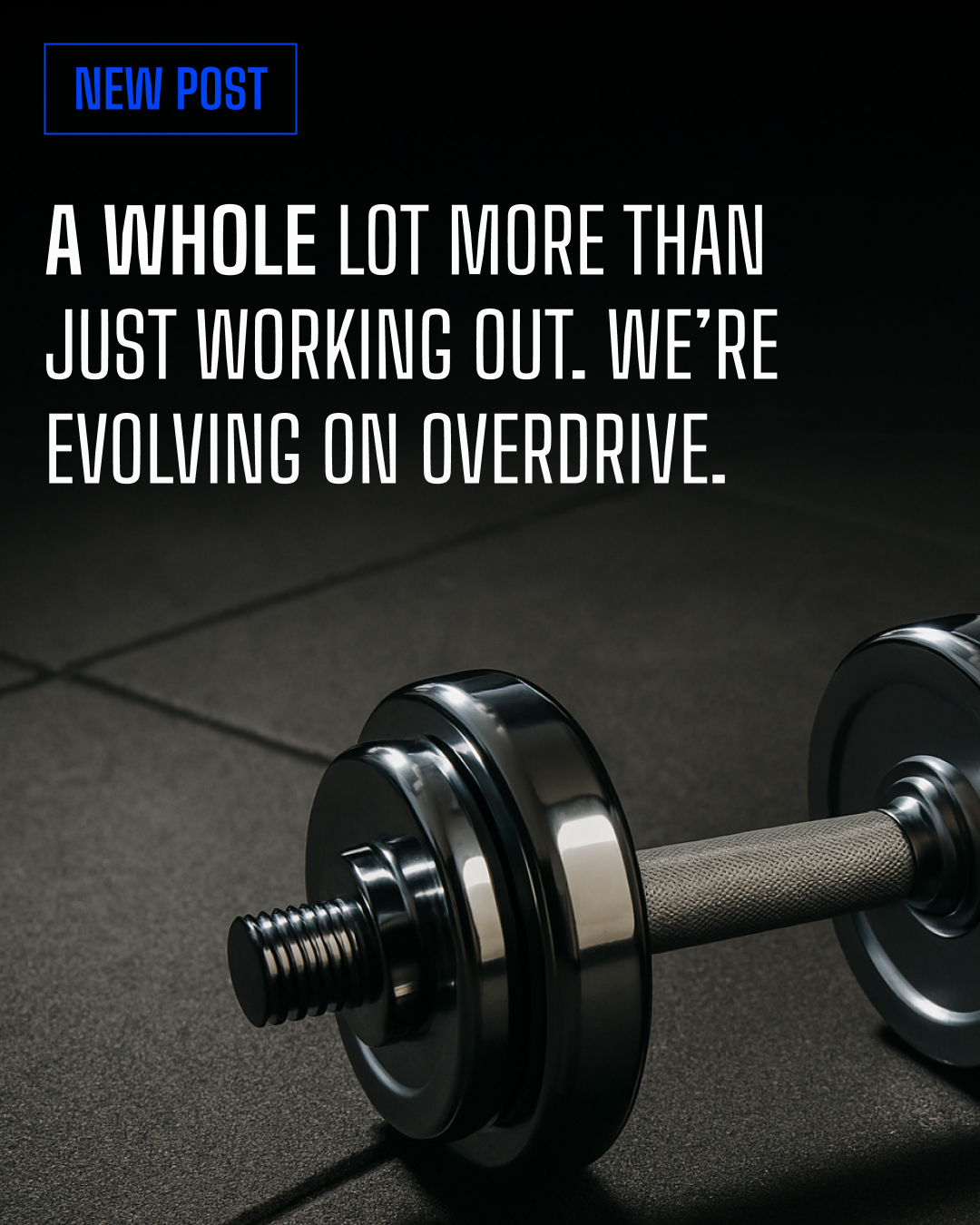
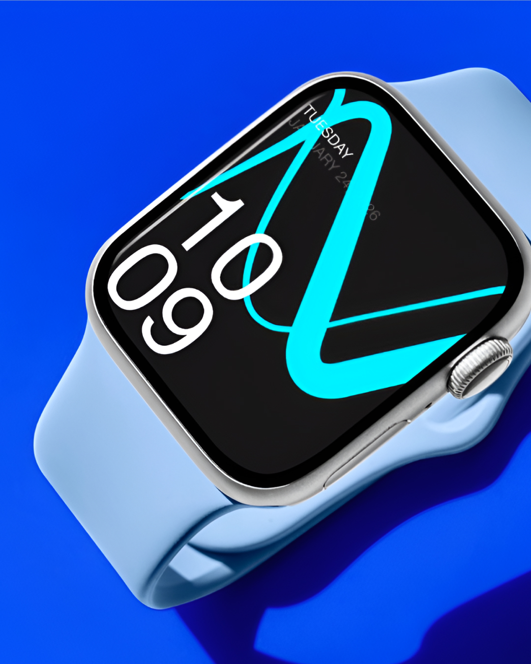
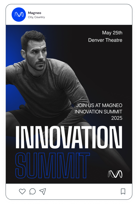
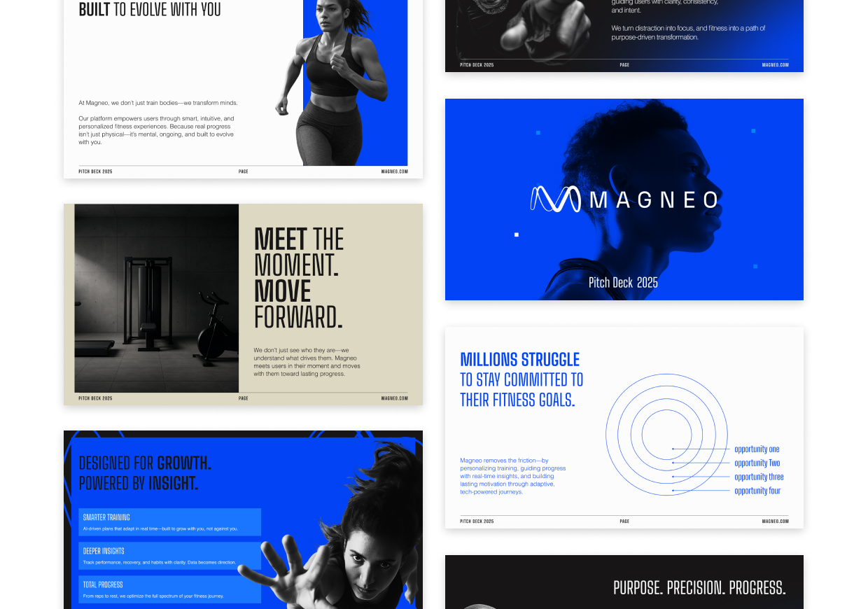
Magneo is a B2C sports & fitness technology brand — the future of training, powered by AI. Positioned as a Dynamic Lifestyle identity inside The Branx's family of startup brand systems: a hero brand dedicated to personal growth, motivation and transformation. ### 1.3 Brand Archetype — HERO 60% / MAGICIAN 40% This is the single most important rule in this document. - 
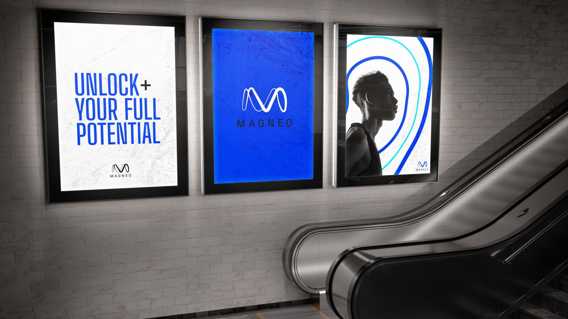
HERO — "Unlock your full potential." Courage, discipline, momentum. - MAGICIAN — "The future of training powered by AI." Technology as alchemy. > 
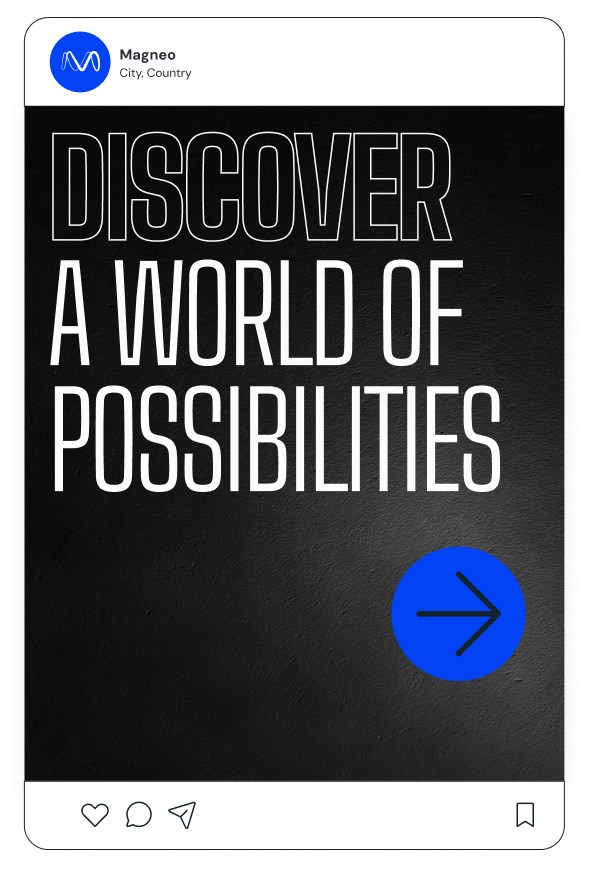
Master tagline: "Unlock+ your full potential." ## 2. Tone of Voice 1. Confident, not cocky. Elite coach voice — calm under pressure. 2. Action-oriented. Verbs lead. Three-beat declarative: Track. Optimize. Achieve. 3. Tech-fluent but human. AI is the means, the athlete is the subject. 4. Rhythmic. Park, track, street or home. 5. Inclusive of every level. Never gatekeep. Never assume the reader is fit. ## 
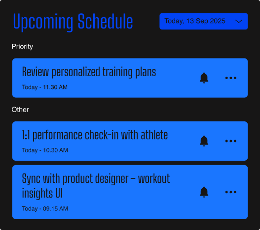
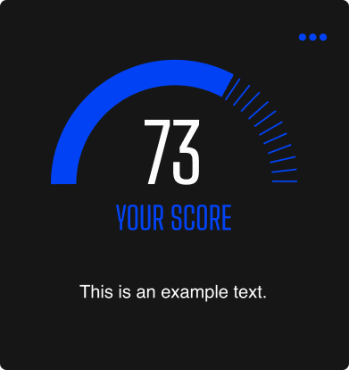
5. Colour System — 50 / 30 / 20 - 
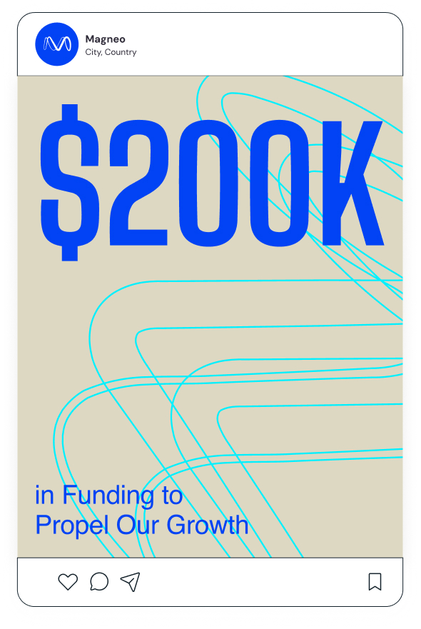
BLue #0143F4 — 50% — Authority, hero surfaces, primary CTAs (the "shout") - Grey light (White) #FCFCFC — 30% — Operational calm, whitespace - Cyan #00F0FF — 20% — The Symbol, the "+", CTAs, in-product highlights - Dark #171616 — Body ink everywhere (replaces pure #000000) ## 6. Typography - Big Shoulders Text — Titles, overlines, buttons, hero shout. UPPERCASE only. - Helvetica — Subtitles (Light 32px L130) and paragraphs (Regular 16px L130). Default body ink: #171616 (Magneo Dark) — never pure #000000. ## 11. Quick reference card 1. Soul — HERO 60 / MAGICIAN 40 · movement → mastery 2. Voice — confident-not-cocky · three-beat · no body-image talk 3. Architecture — Monolithic · no sub-brands · no Magneo+ · "+" is a typographic accent only 4. Logo — four approved variants · 1× clearspace · Isotype-only at small sizes 5. Colour — 50/30/20 · Magneo Cyan as the single electric accent · Magneo Dark replaces pure black 6. Type — Big Shoulders Text + Helvetica only 
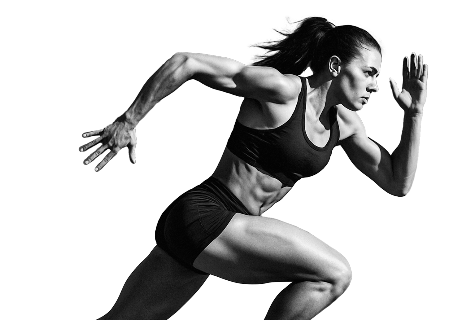
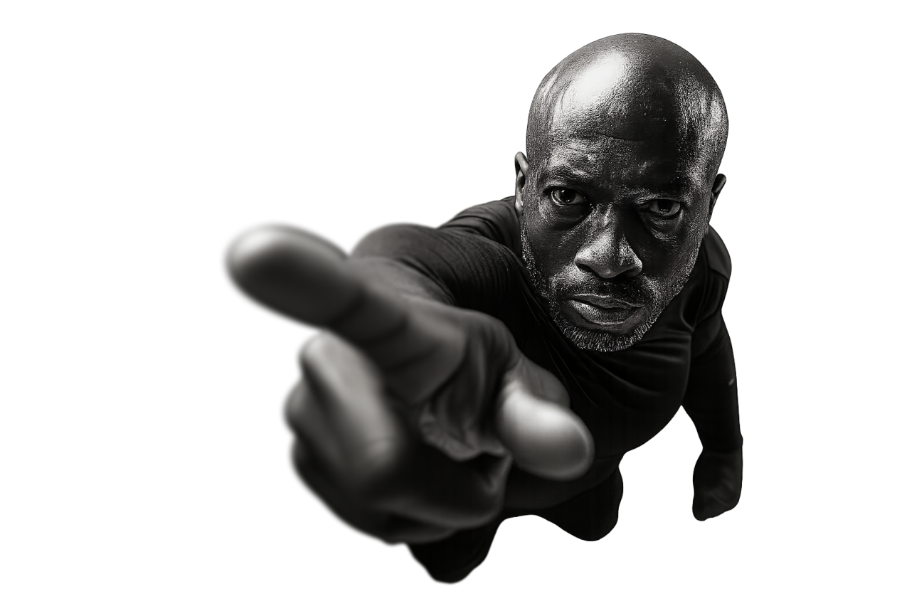
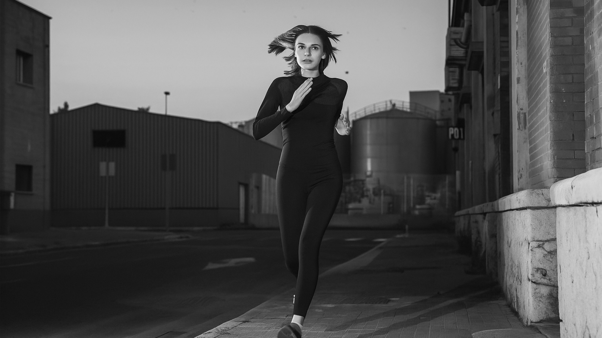
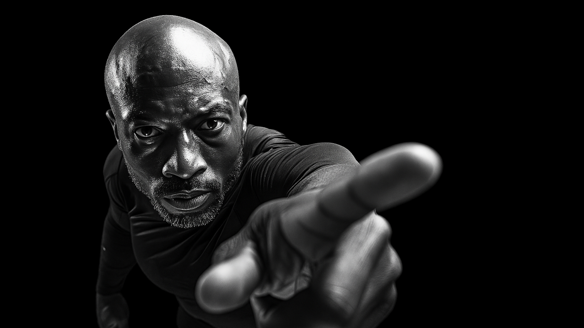
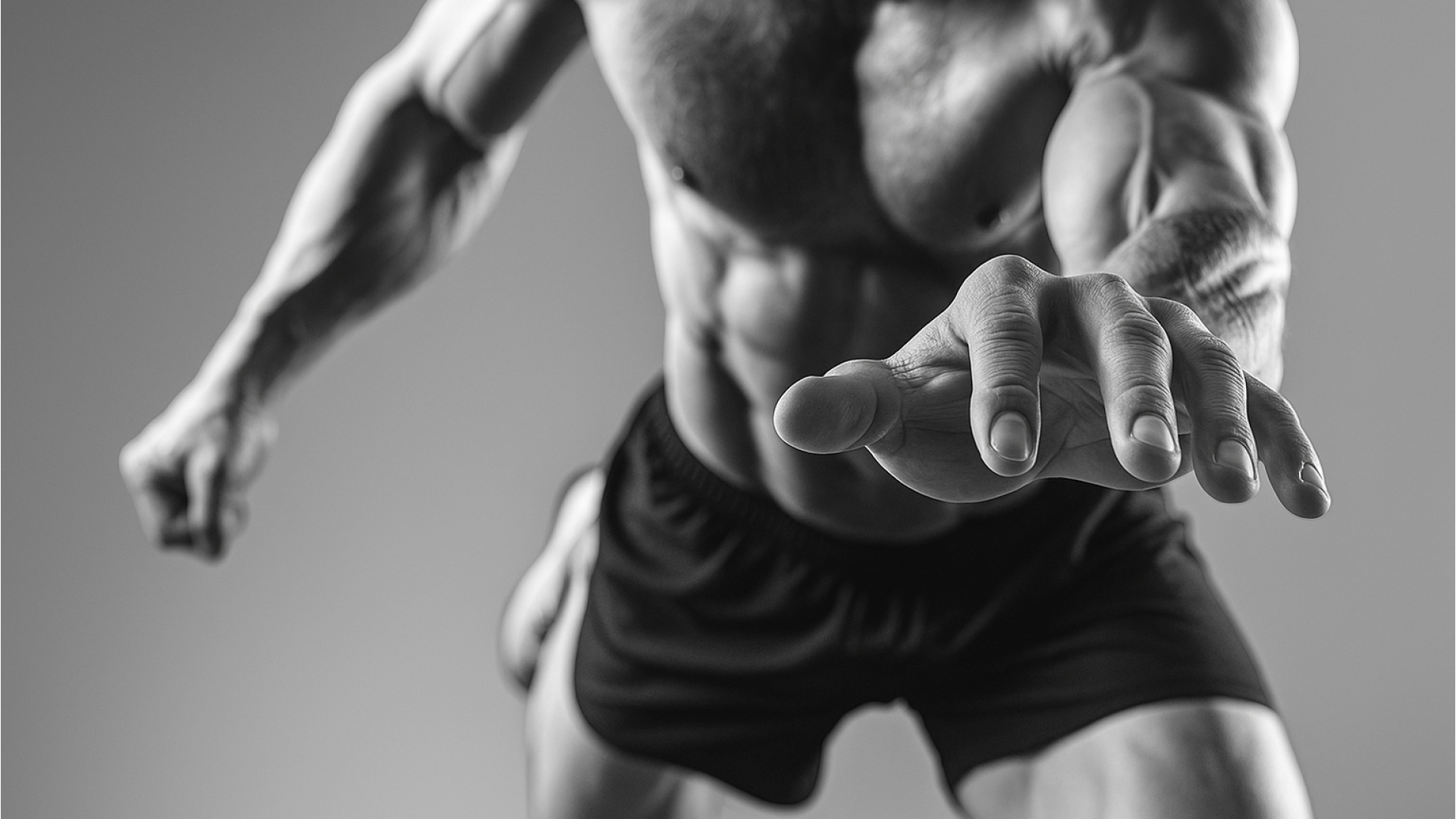
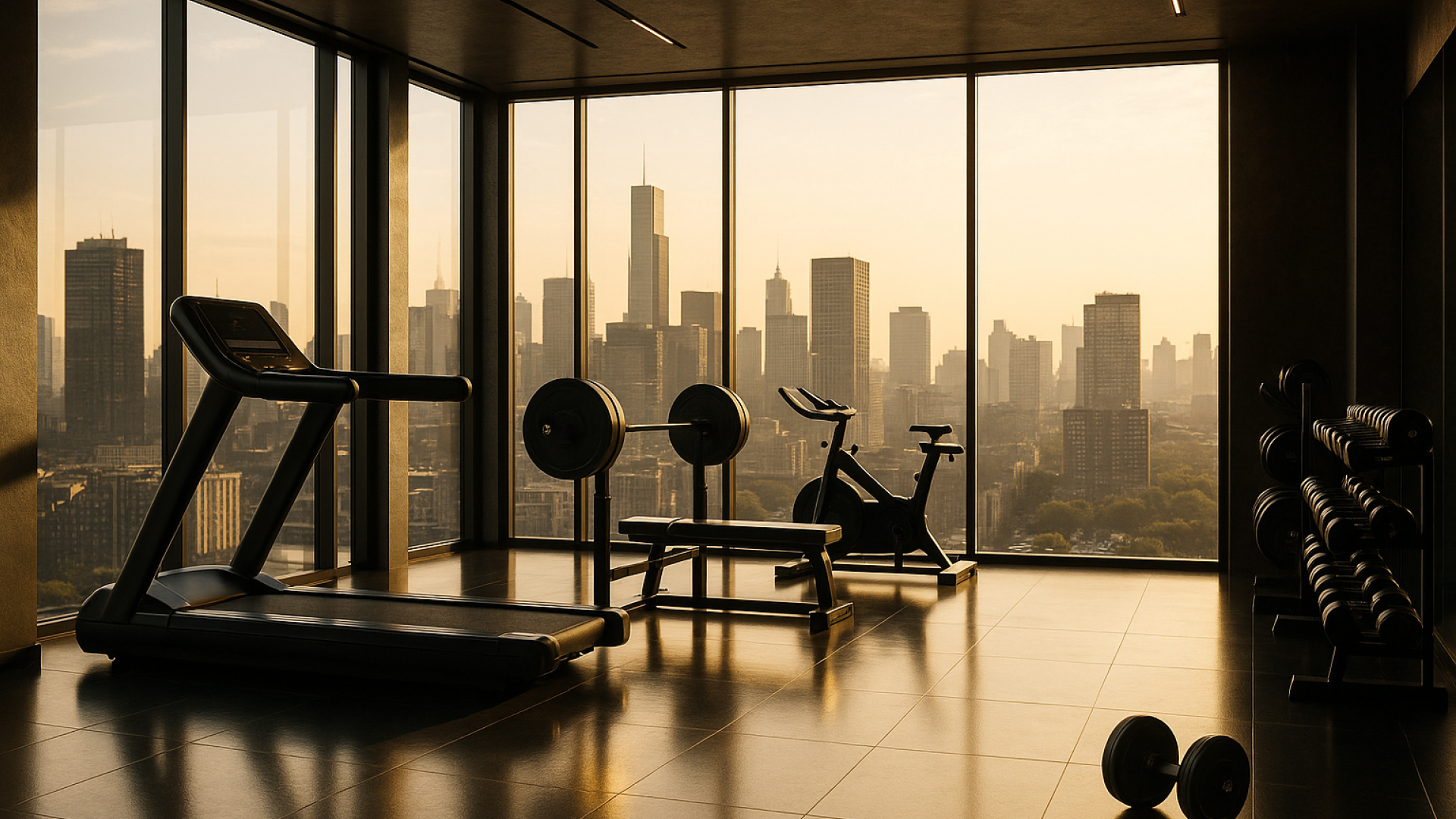
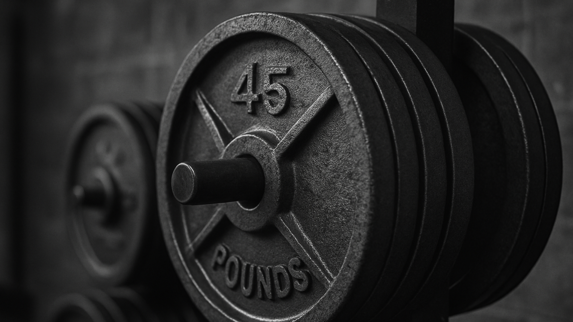
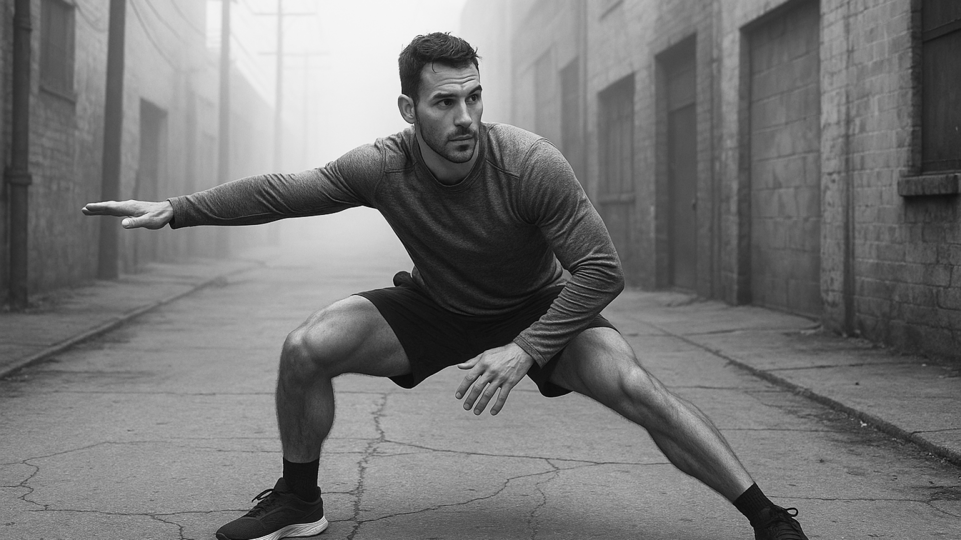
7. Photography — bodies in motion · diverse · no before/after 8. Layout — cyan chip overline · 60px margins · rounded cards If all eight pass, the artefact is on-brand. ## 12. Document provenance - Branding package: Magneo — Dynamic Lifestyle, by The Branx Europe S.L. — v 1.0 · 2026 · prepared for Magneo / The Branx Europe S.L. — (Showing summary. The full Brand.md ships with the brandbook.) —
Magneo's brand system runs from a 6 m billboard down to a 38 mm watch face without changing register. One typographic stack, one ratio, one signature glyph.